
The Basics - Getting Started April 30, 2001
The Basics - Getting Started April 30, 2001
The Basics - Setting Type in FCP
Lower Third Text Generator
By Phil Ashby
Words of warning.
The good news is that FCP includes so many pro-grade compositing features that are adjustable: the downside to this is that you can spend an infinite amount of time doing the adjustments. Be aware that, once you start compositing, you enter a different universe: one (apparent) hour of compositing time can swallow one of your conventional editing days!
The top down approach.
No longer favourite in management theory, top down is definitely the way to think in the world of FCP compositing. The basic idea is that the topmost video track is the top dog: unless it has transparent areas, the top video track is all you'll see.
Basic Titling.
The simplest, and most common, composite is the 'superimposed' text caption. The text sits in the upper track (V2), over the background video which is on V1.
We'll use FCP's built-in 'Lower Third' text generator to do this, which is
simple to use. One of the advantages to using the FCP Lower Third
text generator is that you can use different fonts, colors and sizes for each of the two
lines. If you use the simple 'Text' generator in FCP you're restricted to
just the one font, color, size - but you can stack up different lines in
different layers on the timeline. (If you need more design elements in the text, you can use text designed in other graphic apps such as Photoshop, or specialised programs such as Boris Graffiti.)
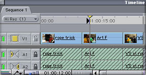
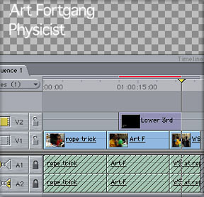
The starting point is shown above, where I have the background clip (here it's the talking head, or interviewee) in the V1 track. I should point out that, for some of the illustrations, I have chosen the largest display option, plus thumbnails, on the video track in the timeline for this demonstration. On the V1 track, I've already marked an In point on the timeline, in the shot marked 'Art F' which is where I'll want the 'super' to start. Now this point might have been at the beginning of a clip (in which case I'd have 'snapped' the insertion point to it using the up or down arrow keys with 'snapping' ON) but in this case I have chosen a point when the speaker paused to take a breath, a little way into the shot - it's one of many aesthetic / pacing decisions that might define the style of your cut.
You may have noticed that I've locked the audio tracks (see the shading in the diagram above). Even though (unlike in the diagram!!) I'm fairly good about remembering to un-target audio tracks when doing this sort of work, locking tracks builds a safeguard against inadvertently losing a chunk of sound track. You may well find that you are working with 6, maybe 8, soundtracks, by this stage in an edit and it's certain that you won't have them all in view in the timeline. So, to avoid damaging tracks you can't even see are there, lock them!
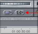
Next point will be to generate the text itself in the Viewer: click on the drop down icon and select Text > lower 3rd. (Lower Third refers to the conventional position on screen for a title).
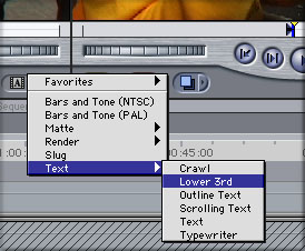
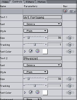
This selects the Text generator with the words 'Sample Text' in two lines and will display in the Viewer. Fill in the correct details for your caption in the control box shown below.
What I do, before making any more adjustments, is to edit this text clip into the sequence. The plan then will be to make further changes once I see what the overall effect is, with the text sitting over the background picture.
So, the next step is to place the text on the V2 track, positioned at the point I've marked. As you'll have noticed, the duration of the text is generated with default in and out points in the Viewer (these can be adjusted later).
But, there is no V2 track: what to do? So many choices - either make a 'superimpose' edit by hitting key F12, which automatically creates a new track. Or control click in the timeline in the space above V1 to bring up a menu to generate the track. If you do that, don't forget to Target V2 before doing the Overwrite edit (F10).
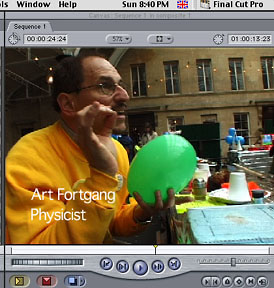
Now, to help finalise the design of the caption, place the playhead within the caption region, so that the Canvas shows the composite shot
Now (and this step is so easily forgotten) click on the text clip IN THE TIMELINE to select it in the viewer - otherwise none of the adjustments you make will be reflected in the sequence.
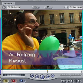
Remember what I said about transparent areas in the topmost video? When you create text using the FCP generator, you're creating a video clip with a transparent background (that's shown by default as a checkerboard pattern in the Viewer screen). The text itself has (unless modified) 100% opacity - so in the areas of picture where there's text, that's what you see lying on top of the background V1 picture. You can change this by modifying the Opacity of the text clip (i.e. making the lettering more or less transparent). Within the viewer, move the Opacity slider which you find under the 'Motion' tab. 100% opacity = 0% transparency. As you make adjustments, you can see the effect in the Canvas.
Apart from letter style and spacing, you may want to add a background of colour (known as a 'strap'), which is commonly used to help readability. This can be done within the controls for the text clip. Select background>Solid, and then adjust the Opacity and Colour in the controls just underneath.
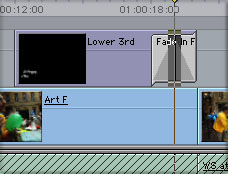
You may also have noticed that a render bar has appeared in the timeline, indicating that, although you can preview stills, you can't run the sequence until you render it. Do this by hitting Option (Alt on my keyboard!!) R
The final adjustment to be made is the duration of the text: you can alter this within the timeline by moving the end of the clip (use the roll tool) or the usual methods of changing a clip's duration by shifting the out point in the Viewer.
You may prefer to fade out the text, the easiest way to do this is to add a 'fade out' filter (Video Transition) to the end of the text clip in the timeline.
And that's it for your first text 'super'. If you're going to do several and you want to keep the style, drag the clip from the viewer to the Browser - and rename it in the Browser to something like 'name style'. You can then use that as a master clip, changing just the text itself, but keeping the rest of the style.
The points about FCP's compositing you should notice here are:
The clip in V2 takes precedence over V1 - this holds true for all video tracks, the 'topmost' rules the roost and controls what is shown of lower tracks. This continues all down the line with multiple Video tracks.
The text clip has been generated with 'transparent' areas. If there were no text, all of the V1 clip would be visible. The transparent areas of the text clip show up as checkerboard in the Viewer. (Default setting). This holds true for ALL clips: video too can have transparent areas.
You aren't limited to two layers. Other text clips could be layered onto higher V tracks.
Phil Ashby is producer / editor for production company Bright Filament, who
specialise in science/technology and education based programmes in all
electronic formats known to man and woman. His biggest fears for the
future are that one day Apple will perfect FCP and there will be no problems
left to solve, the accumulated weight of manuals will overstress the
structure of his house and that render times will shrink to negative
numbers, thus increasing the working day.
copyright © Phil Ashby 2001
All screen captures, images, and textual references are the property and trademark of their creators/owners/publishers.