
Basics - Color Correction/Finishing in FCP September 9, 2002
Color Correction/Finishing in FCP
Basics - Color Correction/Finishing in FCP September 9, 2002
Color Correction/Finishing in FCP
The new color correction tools in Final Cut Pro 3 have opened up the door to achieve some powerful, professional control over our images. We can create natural or stylized looks and anything in-between. Most importantly, we have the ability to be able to isolate certain elements of the image, and manipulate only what we want. For example, we can make the shadows of a scene darker without darkening the entire image, we can change a dingy sky to bright blue or change a shirt from one color to another. We can even create a look similar to that found in the film "Pleasantville", where the entire image is black and white except for one colored object in the frame.
The Tools
There are several new tools that we can utilize, some are video filters for color correction, and the others are displays for monitoring the video image that we use along with the color correction tools.
Color Correction Filters: Broadcast Safe, Color Corrector 3 Way, Color Corrector, Desaturate Highlights, Desaturate Lows, RGB Balance, as well as other effects filters found under the Image Control Bin.
Monitoring Tools: Waveform Monitor, Vectorscope, RGB Parade, Histogram and Range Check.
This is a lot of new tools, too many tools for this article. Instead, this article will focus on the basics, so that we can focus on getting a handle on color correcting and keeping it all legal. What's legal? This is a broad term for determining whether our images fit in certain specifications for broadcast, and we'll take a look at this subject later in the article.
Primary Color Correction
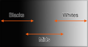
Primary color correction refers to rebalancing the video image. The image can basically be broken down into three sections, the Whites, the Mids, and the Blacks. These three areas are the "range" of the image. The Whites determine the highlights in the frame. How white is the brightest object, how much detail is in the highlights, and what is the color balance or hue of those highlights. The Blacks define the shadow area of the picture. How black is the darkest object in the frame, how much detail is in the shadows and the color balance in that area. The Mids define pretty much everything in-between. This area is often the real focus of the frame, like where faces are. This is the area of the frame that has the most detail.
What is so good about having discreet control over these three areas of the frame? Well, it gives us the ability to change one thing without affecting other things to the same degree. For instance, a face in the frame is a little to dark. If we brought up the luminance level of the whole image to make the face brighter, then we would also be making our shadows less dark and milky. We would also be making our highlights go to bright, and possibly lose some good detail. But if we just increase the luminance of the Mids, we can bring up the face and still have sharp shadows, and maintain the detail in the highlights.
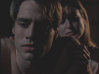
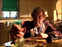
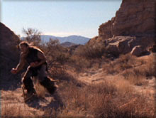
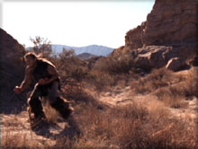
The next set of images really illustrate this well. In the image below, we start with an uncorrected shot. It is a low key scene, but we may wish to see more detail in the faces.
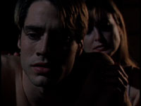
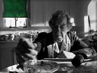
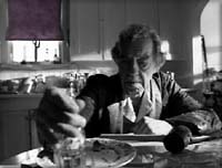
If we were to use a Brightness filter to lighten the image, then the image would become mushy, as everything in the image becomes brighter, and the shadows are now gray instead of black. But if we use a filter to lighten only the Mids, the middle gray area of the image, then our black will stay black, but we can see more detail in the faces.
| Brigtness/Contrast filter | Color Corrector 3 Way filter | |
Scene loses contrast, mushy blacks |

Scene has more detail, shadows remain sharp |
It is also important to know that as you adjust one part of the image, there is still an impact to some degree on other parts of the image. The following illustration shows a gradient stretching from black to white. Notice that the Mids overlap into the Blacks and the Whites. This means that when we are manipulating the Mids, i t may also have an impact on some of the brighter shadows and the darker highlights.
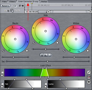
One of the color correction filters in FCP allows us full control of the image while performing primary color correction: the Color Corrector 3 Way.
To apply this filter, go to the Effects Tab of the Browser>Video Filters>Color Correction and drag the filter on to a Clip in the Timeline. Additionally, you can apply a filter by selecting a Clip in the Timeline, and then go to the Effects menu and choose it from the list of Video Filters.
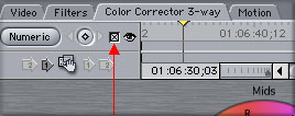
After applying the filter, open the Clip into the Viewer to make adjustments. If you go to the Filters tab, you can make changes with numerical values. I don't prefer to work this way, so instead click on the Color Corrector 3 Way tab (Red arrow below) that is joined to the Clip to bring up the Visuals tab.
Color Corrector 3 Way Filter
Tip: While color correcting, a good workflow is to open the Clip to be corrected into the Viewer. Go to the Color Corrector tab. Park the Playhead in the Timeline over the Clip that is being adjusted in the Viewer. This way, whatever you do in the Viewer on the Color Corrector tab, will be instantly seen in the Canvas.
Luminance Controls
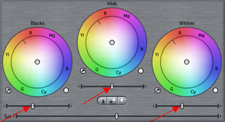
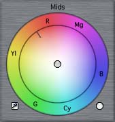
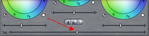
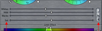
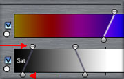
On the color correction tab, near the top, are three color wheels, each representing the three different parts of the image: Black, Mids, Whites.
To adjust luminance of the Blacks, Mids or Whites, there are sliders under the three color wheels (Red arrows below). Drag the slider left or right.
Tip: Clicking on the little arrows on the ends of the sliders will let you move the sliders in smaller, finer increments.
Remember, these adjustments affect just how much detail is seen in the various areas, and if you go too far, you may lose valuable detail.
Color Controls
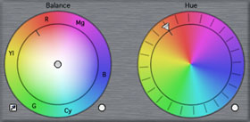
To adjust color, we will work in one of three color wheels. Notice that the colors are distributed along any of the wheels in the same way as in the Vectorscope.
|
|
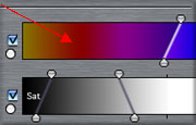
To adjust the color of any of the three sections of the image, grab the button at the center of the wheel (Red arrow below), and drag away toward one of the edges of the wheel.
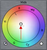
The farther away from the center, the more of that particular color you are adding. If an image is too blue, for example, then you would drag in the opposite direction of that color, toward yellow. By adding yellow, you begin to nullify the blue cast of the image. By going too far, you end up with an image with a yellow tint. To amplify a color, you would add more of that same color, by dragging toward the side of the wheel of that same color.
Tip: When dragging the little button in the color wheel, it will move in small increments (slowly) for fine adjustments. If you hold down the Command key while dragging, it will move in larger degrees (faster).
To adjust overall color saturation of the image, drag the Saturation slider left or right.
The Easy Controls
When beginning to color correct, there are some controls that can help get you "in the ballpark". In other words, we can use some automatic controls to get our image closer to "normal" color balance and contrast, and then go back and use the controls described previously to make fine adjustments.
For luminance, there are controls to automatically set white and black levels. These are found under the Mids color wheel. These three buttons represent Auto Black, Auto Contrast (white and black) and Auto White.
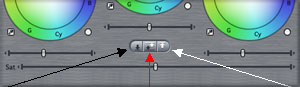
To begin, try using one of these controls to see the impact on the image. If there are objects in the frame that should represent true white and true black, then these auto controls may work well. If there are many shades of gray, but nothing that should be white, then this control will lighten the higlights of the image too much. The same is true for black. If there are no true black objects in the frame, then this will compensate by making the darkest shade of gray go to black, making the image too contrasty. Remember, just because there is a white and black on the scale of the waveform monitor, doesn't mean all of our images should stretch out to those levels (Later in the article, we'll talk about the waveform monitor in more detail).
For color balancing, especially trying to match differently setup cameras, or incorrectly setup cameras, we have the ability to "neutralize" the scene. Basically, we can use auto color controls to remove a color tint from an image.
Next to each color wheel is a small eyedropper. Clicking on an eyedropper makes it active. Start with the eyedropper next to White and click on it.
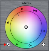
Next, go to the Canvas, and click on a part of the image that should be a neutral white. This will automatically rebalance the image in the highlights, which will also have an impact on the rest of the image. This one control may be all that is needed to create a natural look for color.
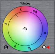
If further adjustments are needed, simply go to the particular color wheel and reposition the balance manually. You may also use the eyedroppers under the Mids for middle gray, or the eyedropper under Blacks for the shadows.
Resetting Controls
To reset any one color wheel, click on the white button to the bottom right of the wheel.
Tip: To reset all color wheels, and all luminance adjustments, then Shift/click on the white button next to any of the three color wheels.
Additionally, you can go back to the Filters tab and click on the red X across from the filter to reset all controls on the filter.
Tips While Color Correcting
1. Use a good workflow. Start by setting the luminance range of the scene. Start with setting the black level, then the whites, and then finally the Mids. As you adjust one, other controls may need to be tweaked a little again after their first adjustments. Next, start to work on the color of the scene. At first, if there is nothing white in the scene, then begin by balancing the color wheel of the Mids, and then make adjustments as needed to the White and Black color wheels. If there is a white object in the scene, use the White eyedropper as the first step to obtaining a neutral color balance.
2. Check the color correction against the un-altered Clip (original). Click on the Disable Filter checkbox at the top of the window to toggle the color correction on and off. This is helpful when making subtle adjustments, as your eye will start to get used to the new image, making it difficult to see the correction you applied. Toggling the filter on/off will clarify the distinction between the two versions of the image.
3. Use keyboard shortcuts to match to other shots. These controls temporarily move you to previous and next shots in the Timeline, helping you view how the color correction matches the balance of other Clips around it in the scene. As soon as you release the key commands, the Playhead moves back to the current Clip.
| Control/up arrow | Previous shot | |
| Control/Shift/up arrow | 2 shots previous | |
| Control/down arrow | Next shot | |
| Control/Shift/down arrow | 2 shots next |
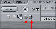
4. Use filter copy controls. These controls, found in the top of the visuals tab of the color correction filter, allow you to apply the current color correction to the next Clip in the Timeline, or the 2nd Clip down in the Timeline. Copying to the next Clip forward is a great way to begin on color correcting the reverse angle of a scene. This will get you into the ballpark if the two shots were filmed or taped similarly. Copying to the 2nd Clip forward is helpful when you are cutting back and forth between two angles of a scene, like two close ups. Every 2nd Clip is the same angle, so copying the filter helps to avoid color correcting the same Clip over and over.
Color Corrector Filter
This filter is similar in many of the controls found in the Color Corrector 3 Way, but it also gives a slightly different approach to color balance and hue.
The controls that work similarly are shown below.
The other controls, for color, are setup as shown below. This type of color correction is more basic than the Color Corrector 3 Way, as there is only one Color Balance wheel, and this wheel affects the overall color balance, instead of affecting the balance in just the Whites, Mids or Blacks. This may be a good filter when first starting out, as you don't have to try and guess what section of the image needs adjustment differently than other areas.
There is also a Hue color wheel, which will basically apply a tint to the image in the direction that you dial the wheel, which can be done clockwise or counter-clockwise. This can be used alone or in conjunction with the Color Balance wheel. I find this only useful when I want to tint the image by another color, and for this, I generally will use the Sepia or Tint filter instead.
I don't tend to use this filter for most primary color correction, and tend to stick with the Color Corrector 3 Way instead. Although, I do make use of this filter when performing secondary color correction, as we will look at later in the article.
Secondary Color Correction
This type of color correction refers to being able to adjust one color value in a scene without affecting other colors, also referred to as selective color correction. This can be used to change the color of a sky or intensify the blue in a sky without affecting the rest of the scene. It can be used to change any colored object in an image, like a shirt, from one color to another. And, as I promised earlier in the article, we can even create a black and white image, with only one colored object in the frame, even when the original image was filmed in full color.
This technique is similar to blue screen effects, where the blue screen is keyed out (made transparent) to replace the blue background with another scene. But instead of making those areas of the frame transparent, secondary color correction will let you alter the appearance of the color that you define.
To perform this color correction, we can use the Color Corrector 3 Way or Color Corrector filters. The controls are the same for each filter. I prefer to use the Color Corrector filter for this task, as it gives me a lot of flexibility for quickly changing the color to anything I want.
To Begin
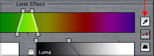
Apply the Color Corrector filter to a Clip, and go to the Color Corrector tab. At the bottom of the tab, there is a section defined as Limit Effect. All of the controls below this line help us define what color in the frame we want to apply this effect to.
Define The Color To Be Manipulated
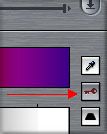
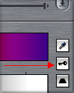
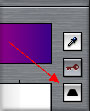
Click on the eyedropper under Limit Effect to make it active. Then click in the canvas on the colored object that you want to affect. This sets the three controls under Limit Effect to define this particular color. Chances are, you will still need to make adjustments before this color is accurately defined.
To see if the color is properly keyed(defined), click on the little key button under Limit Effect. Clicking it once will turn the key from gray to white.
Key when gray |
Key when white |
The image in the Canvas will be displayed in black and white. White will represent the keyed color, and black will represent sections not selected.
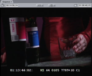
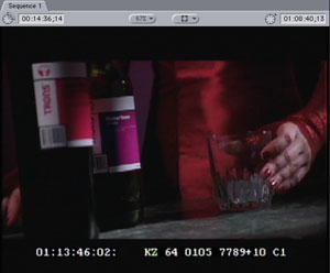
On the sample below, on the left you see the original image. The object that is being selected is the blue bottle.
In the next image on the left, you see the selection chosen with the eyedropper (when the key button is white). It has only selected part of the bottle label that I wanted to affect. To select the entire object, we will need to expand the selection. when finished, the selection should look like the image on the right.
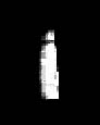
First selection with eyedropper |
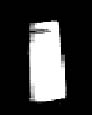
After selection is expanded |
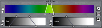
To accomplish this, we can use the Color Selection, Luma and Saturation controls under Limit Effect as shown below.
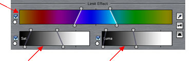
If part of the object is darker than the part selected, expand the selection under the Luma control to include that darker shade of the color. If part of the color is a slightly different hue, then expand the Color Selection. If part of the color is more saturated than the selection, then expand the Saturation selection.
To make an adjustment, we can drag the top handles, the bottom handles, or drag the range displayed.
The top handles of a control adjust the overall range also called Tolerance. The bottom handles adjust the Softness of the selection, which basically feathers out the selection softer than the top handles.
You may also click and drag in the bar itself to drag the overall selection left or right. The cursor will turn into a little hand while you are over the bar.
Continue to adjust any or all controls until the white part of the Canvas is accurately representing the entire object. I tend to find that there is less science here, and more test-and-see to make it work. Adjust the top handles of all three controls until the object is almost fully white. Then go back and adjust the bottom handles to feather out the selection to completely define the object.
Perform Secondary Color Correction
Now that the area or object to be manipulated has been defined, we can modify it. Click on the key button once, and it will turn blue. This shows the image without any color correction. Click on it once again until it is gray. Now it shows you what the final image will look like. Since we haven't actually done anything yet, there will be no difference in the image.
Now, to modify that defined object, use any of the color correction controls on the top of the Color Corrector tab. You can use the Color Balance wheel, or the Hue wheel. I find the Hue wheel best for making drastic adjustments to the color. Notice that anything that you do in the filter will only be applied to the defined object. In this example, we turned the blue bottle into purple.
Creating the Pleasantville Look
Creating a black and white image with only one colored object is similar to the process above, with a couple of distinctions. First, select the color that should remain in color, using the controls under Limit Effect to define the color as we did above.
Once the color is defined, then click on the Invert button under Limit Effect.
Now, instead of the individual object being selected, the entire image except that object is selected. Go up to the Saturation slider in the color correction controls, and drag all the way to the left, as shown below.
The entire image will become black and white except for that one color.
Next, there are more examples of secondary color correction, but this time, the colored object changes hue, and is less saturated. The way this is accomplished is by adding a second Color Corrector filter after the first filter.
The first filter is used to isolate the color, and turn the scene black & white except for the one color.
The second filter is used to change the hue of the scene, and desaturate all color, which in this case, is only the one colored object.
When using color correction, we can always apply one filter over another for even more control than a single filter can give us.
Tips On Secondary Color Correction
One of the toughest parts of secondary color correction in being able to define the object that should be affected(or the object that will remain unaffected), is trying to keep other objects in the frame from being selected as well. If secondary color correction is going to be used in a project for an overall effect, or used often, then care should be taken when planning out the shoot. Just like when preparing for blue or green screen, a color should be used that is unique and different from other colors in the scene to avoid selecting more than the one color with the Limit Effect controls. The more distinct the color is when you are shooting, the more chances you will be successful with it in post production.
Additionally, if there are similar colors in the scene, but you don't want them all selected, you can use one of the plugins from CGM Volume 2. We all get volume 1 for free with the purchase of FCP, and this additional set is worth buying.Their secondary color correction filters, called Selective Color Corrector, will perform the same task as FCP's filters, but include a mask (either 4 point or 8 point) so that you can start by selecting a portion of the frame, and then the color. This mask can then be keyframed to move along with the image on the screen.
Also, there is a handy trick to selecting a "range" with the eyedropper instead of just one particular color. Use the eyedropper as you would normally. After the first selection, hold down the Shift key, click on the eyedropper and then click in a new area of the Canvas (still holding down the Shift key). Continue to use Shift/eyedropper/select until you have selected the entire color range that you are trying to isolate. This technique can be used to help find a better staring point than just a single selection with the eyedropper tool.
It is important to get to know the color correction tools and start to develop an eye for color. But, just as important, we will also need to consider other factors (and I'm not talking about whether the client has sugar for their coffee). Specifically, we will at all times need to be aware that our final color corrected images are "broadcast legal". Whatever we do, our final concern is that these beautiful new images won't be rejected by the broadcaster. Even if the program is not going to be broadcast, but distributed on DVD or another medium, we still have to keep these goals in mind for the images to be accurately represented on consumer level televisions. Sometimes our color correction has less to do with creating a look, and more to do with making it legal.
We will look at the standards for North American NTSC, but to be accurate and safe, it is a good idea to get a specifications sheet from the intended broadcaster. Some are more strict than others. A good safe guideline would be the specs for PBS as they are pretty conservative. To be able to determine what is legal, we would use a waveform monitor and vectorscope to analyze the video signal.
Basically, we are looking for two things with a video image:
1) Luminance range limits
If we are strictly monitoring in the analog world (using external hardware waveform monitors), then the following are our guidelines:
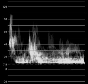
Luminance
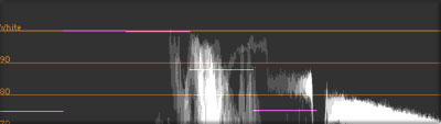
For luminance, video signals are measured by levels of voltage. We want to make sure that our blackest black does not fall below 7.5 IRE. Our whitest white should not go above 100 IRE.
The following is a representation of an analog waveform monitor showing the luminance values of an image.
2) Color saturation limits
The waveform monitor that we find in FCP is set up a little differently, and it is extremely important to know the differences between FCP's scope and an external NTSC scope. FCP's waveform monitor is very accurate, but it uses a digital scale for signals instead of a scale based on voltage. We will discuss this in more detail when we look at FCP's waveform monitor in the next section of this article : Using The Scopes.
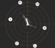
Color
Color saturation (and hue) may be examined on a vectorscope. It is basically a color wheel representing the three primary colors (red, green and blue) and the secondary colors (yellow, cyan and magenta). When there is a color in the frame, it will be represented on the vectorscope going in the direction of that side of this color wheel.
The following is an illustration of an image that has a lot of red values in the frame. The vectorscope shows a majority of its values along the red side of the color wheel. Additionally, the more saturated a color, the more it stretches out away from the center to the edges of the color wheel. The less saturated a color, the closer it will be toward the center of the wheel.
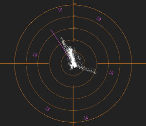
To determine legal saturation levels, we will want to look at the color "targets" along the vectorscope. These targets are used for calibrating color bars, but they also serve as the limits for our color saturation. In general, we do not want any color's saturation to ever extend past the center of the target along any sides of the vectorscope.
Using The Scopes
As I mentioned earlier, we will need to examine the image's color and luminance values, so let's look at the two tools we will use.
To begin, you can go to the Tools menu>Video Scopes to launch the Tool Bench window, with the Video Scopes tab in front.
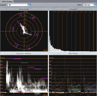
Additionally, another method of bringing up this window is to go to Window>Arrange>Three Up. This re-arranges the windows on the screen to see everything including the video scopes.
Opening the window will bring up a 4-up display showing all four monitors. We will only be concerned with the Waveform monitor and Vectorscope. Toggling down the drop down menu in the window will let you choose between the various scopes, like a full window of the waveform monitor.
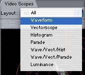
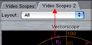
I personally like to see two full window displays, one of the Waveform monitor and one of the Vectorscope. You can do this easily. After opening the Video Scopes window, go back to the Tools menu, and choose Video Scopes again. This will open a separate scopes tab on to the Tool Bench window. Click on the tab of the newly opened scopes tab, and drag it away from the main window. This "breaks off" this tab, and now you have two different windows, where they can each be set separately.
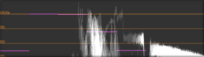
The Waveform Monitor
As we discussed earlier, the waveform monitor in FCP is set up differently than external waveform monitors. Instead of using analog representations of voltage levels, it uses a digital scale representing percentages from black to white. The scale starts at 0 for black, represented on the scale at the word "Black". The scale tops out at 100 for white, represented on the scale with the word "White". All of the grayscale values between black and white is represented numerically between 0-100.
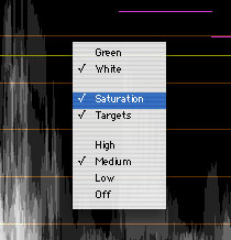
Tip: Control/click somewhere over the Waveform monitor and choose Saturation from the drop down menu. This view can be left on in most situations, and gives more information about the video signal.
The scale also represents the different areas of the video frame horizontally across the window. For example, in the next illustration, a bright white object is near the middle of the screen, and is represented in the middle of the waveform monitor. Deep shadows on the right side of the image are represented along the right side of the waveform monitor.
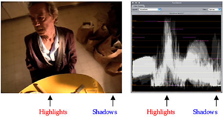
So, what are our goals when using this waveform monitor? This, in my opinion, is the most misunderstood part of color correcting in FCP, and the most important subject for us to get straight.
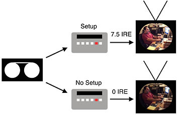
For white, we do not want to go above 100 (White on the scale). For black levels, we want to aim for 0 (Black on the scale). That's right. You heard correctly: 0 for black. Not 7.5. Remember, we are working with digital percentages, not IRE units. Although NTSC's setup level(black level) is 7.5 IRE, that is not what we are aiming for in this scope. We are aiming for 0. In fact, whether we are creating images for NTSC, PAL or Japanese NTSC, we are always aiming for 0 on this scope. This 0 level in FCP will be correctly displayed as 7.5 IRE for NTSC once it is played back in the analog world.
Let's talk about DV, because it is this format which can cause the most confusion. You may have heard at times that "this camera is NTSC", or "this camera is manufactured in Japan and is not American NTSC", or "this camera is 7.5 IRE, and this camera is 0 IRE". This is all bunk. Every digital camera records black at 0. It is only a function of the analog outputs of the deck or camera that either have "setup" or do not have "setup". In other words, the analog outputs of the deck or camera will convert this signal to 7.5 IRE if it is set up for NTSC, and will not change the signal if playing out of a PAL or Japanese NTSC deck or camera and will remain at 0 IRE. So if you are shooting with two different cameras, they will both record at the same black level, and they will both be represented at 0 in FCP's waveform monitor. Personally, I think the reason that FCP describes 0 as "Black" and 100 as "White" is to help avoid confusion: Aim for Black for your black levels, and White for your white levels.
Where is this setup located on my camera/deck? Here's the bad news about DV. If you are using a consumer level camera, or even a lot of prosumer level decks, like the Sony DSR11, DSR20 or DSR40, there is no setup, and the analog outputs will always be at 0 IRE (too dark). In fact, if you set up an analog waveform monitor to this deck, it will be inaccurate, as it will see a signal that it expects to have setup, and it thinks your black levels are at 0 IRE, instead of 7.5 IRE. Using this setup, you can incorrectly lighten the black levels too much.
Here's the good news. If your camera does not have NTSC setup in the analog outputs, and you need to make good analog dubs (like VHS, 3/4" or Beta), then you still don't have to be concerned about the recorded black level of the DV footage. It is recorded properly. If it is played back in a deck that has setup, then the dubs will be fine. If you use a higher end DV Cam deck like a Sony DSR 1500, then this deck has options to "Add Setup". This does not affect the digital recording, it only affects anything played out of the analog outputs, and dubs through this output will be correct for NTSC. In fact, Setup should be left on with these decks. Also good news is the fact that your Sony Mini DV material may also be played back on DV Cam decks without any problem.
The Vectorscope
This tool behaves similarly in the analog world and in FCP. As mentioned earlier, for broadcast, simply make sure that any color saturation does not fall outside the targets found on the wheel.
Tip: Additionally, for a more detailed view of the center portion of the vectorscope, Control/click anywhere over the vectorscope and choose Magnify from the drop down menu.
We can also use the vectorscope to aid in color correcting single or multiple images.
Not only will it display whether colors are legal, but it helps to eliminate color casts. You may look at an image and know that it is a little off, but exactly what color is the image leaning toward? You can see this on the vectorscope, as the main grouping of spikes will lean toward the balance of the image. In the color correction filter, drag toward the opposite side of the wheel as the direction of color in the Vectorscope.
You can also use this to as a guide to help balance several images to one another, as you don't have to rely on the accuracy of your eye as much. Look at the vectorscope display of one image, and compare the color display to that of another image.
This is an interesting filter that is also included in the Color Correction Bin. The purpose of this filter is to limit the top end of an image, the white values. Using this filter can help to clamp values above a certain point, to ensure that you are still "legal". I find it very important to have the waveform monitor open while making adjustments with this filter. I think that people tend to think of this very literally as a "Legalize" filter, and do not contemplate just exactly how it is "legalizing" the image.
This filter approaches the task by taking values above a certain point and clamping them, or "cutting them off". It also will give you the flexibility of determining just where that cut off point is, as well as where it starts to pull higher end values down the scale, so basically shifting the high end a little darker.
You should use this filter with caution. If you color correct so that a majority of the highlights fall fairly high on the scale, above 100, and then apply this filter to cut off the top end, you may end up with undesirable results. This will cause a flattening of the image in the highlights, which appears as dull, flat sections of white, instead of gradations of highlights. This is similar to what you will find when over-exposing while shooting video. There will be blanket areas of white, with no detail in them.
Broadcast Safe Filter
Highlights with Gradation |
Flat Highlights |
When using this filter, I suggest that instead the whites should roll off a bit, before being clamped. This can be done while using the Color Corrector 3 Way or Color Corrector filter. Adjust the highlights so that the majority of spikes fall below 100. If the top end of a few spikes still fall above 100, but you are happy with the image as a whole, then this would be the time to apply the Broadcast Safe filter.
Whites clipped (with filter)
With the filter applied, open up the Clip into the Viewer and go to the Filters tab. There is a drop down menu offering different choices on where the white values can be clamped. The best choice here for broadcast work is to set the filter to Extremely Conservative. This maxes out values at 100.
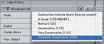
If you feel brave, then you can set the drop down menu to Custom. Once this is set, use the controls under Luminance and Saturation Limiting to control the clamping point, adjust the range of the falloff, and where the top end sits on the scale.
As mentioned above, this filter should be used with caution when trying to create natural scenes. It is generally more pleasing to see gradation in the highlights, even if it is subtle. If one of the reasons for raising the white levels was to bring more contrast into the scene, then this can better be accomplished by a well balanced scene, then by overdoing the whites. Having a true black in the frame along with a true white will give the image more punch, and more of a feeling of intense white in the highlights. An image with just a lot of clamped white values will not feel contrasty, but instead just flat.
When using any of the color correction tools in FCP, we will also want a good way of monitoring what we are doing. The following is a basic list of the items that you will want at your disposal.
1. High grade NTSC video monitor: We should be careful not to use our internal computer monitor while color correcting. It has very different properties than an NTSC monitor, and is not an accurate reflection of the final product. Contrast and color reproduction are very different on a computer monitor, as well as the fact that a computer monitor displays images in progressive scan, but our final images will be shown on NTSC interlace scanned televisions. Additionally, it is also helpful to have a consumer television on hand as a good representation of how the images will probably end up looking to the average viewer. Switching back and forth between the two NTSC sets can help you decide if the some of the work you are doing on the good monitor will be too extreme or too subtle on a regular television.
2. Color Bars: Find a good set of accurate color bars to setup your external NTSC monitor. If your monitor is set up incorrectly, you will be color correcting based on bad information. For example, if the monitor is set up too bright, then all your images will end up being color corrected too dark. For a good description of setting up a monitor to color bars, there is a great online source: go to http://videouniversity.com/tvbars2.htm
3. Waveform monitor and vectorscope: You can hook up external analog scopes if you desire, but the internal scopes of FCP are very accurate and in some cases, may be more reliable than external scopes. In particular, if you are using DV, and your external device is a consumer level model like a camcorder, or even prosumer decks like the Sony DSR11, DSR20 or DSR40 then external scopes attached to these decks will not be set up correctly as these decks do not add setup. Black levels will appear on an external waveform monitor (connected to these decks) as lower than they actually are.
After reading this article, you will notice that we only covered a few of the color correction tools available to us. These are the basics and you can always expand your arsenal of tools by learning how to use the rest of the scopes and the other filters.
There is one display feature that you may have noticed that I left out. This is Range Check. Range Check is an overlay that lets you see if any luma or chroma values are exceeding legal limits. I think its a nice quick way of determining if something is way out of whack, but the waveform monitor and vectorscope will give much more useful information.
Also, now that you have an array of tools to choose from, its good to know just what is possible and what is not. It is not possible to restore detail in highlights that was shot very overexposed to begin with. Its not possible to take an extremely dark, underexposed shot, with little contrast, and make it look better balanced without introducing unwanted artifacts, like grain or noise. It is also true that the original video format will play into the picture. If you start with DV, which is 5:1 compressed, in a 4:1:1 color space, your results, especially in secondary color correction, will not be as clean as if you had started with Digital Betacam which uses a 4:2:2 color space and is captured uncompressed through a capture card.
Through time you can begin to master these controls, but there is a reason why color correction artists make the big bucks. They have a good eye, and a lot of experience.
Written by Andrew Balis
copyright © www.kenstone.net 2002
Preparation For Color Correction
After graduating from NYU's Tisch School of the Arts for film, Andrew Balis has been in the film industry for over a decade, working in both production and post production. Currently, his time is shared working as a cinematographer and editor, consultant and instructor in Final Cut Pro. Andrew has also written and co-written the Apple certified Final Cut Pro student guides for the FCP 101, 201 and 210 classes used by Apple certified education centers, developed at the Moviola Education center, as well as having written chapters in other books on Final Cut Pro.