
Basics - Color Correction/Finishing in FCP 4 February 16, 2004
Color Correction/Finishing in FCP 4
Basics - Color Correction/Finishing in FCP 4 February 16, 2004
Color Correction/Finishing in FCP 4
Last year I wrote an article for Ken Stone's web site about color correction in FCP 3. At the time the tools were new, but intuitive to use and advanced in options. Now, with Final Cut Pro 4, there are new features and options, maturing an already strong set of tools.
In addition to filters to manipulate the image, everything is at your fingertips, from multiple ways to compare different images to one another, to automating parts of the process, "legalizing" the program, monitoring the image with built-in video scopes, and also using previous corrections to help when correcting other images.
The Tools
There are more filters, features and options than can be covered in this article, so we'll focus on the most important and useful options. As a summary of the items we'll cover:
- Color Corrector filter
- Color Corrector 3 Way filter
The Blacks, Mids and Whites
In the next sections we'll explore the two filters Color Corrector 3 Way and Color Corrector. Before that, let's take a quick look at how their different filter controls are used to target different components of the video image.

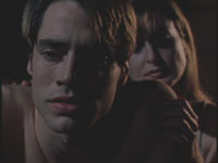
It is a low key scene, dark overall. If we were to use a simple Brightness/Contrast filter to lighten the image, then the image would become mushy, as everything gets brighter, and the shadows are more gray than black. But if the goal is to see more detail in the faces without affecting the shadows, then it would be best to use a filter that has a control for the Mids as it targets the middle gray area, where the faces are. Lightening the Mids can bring up the light level on the face, but leave the dark shadows alone, so the blacks remain black.
| Brigtness/Contrast filter | Color Corrector 3 Way filter | |
Scene loses contrast, mushy blacks |
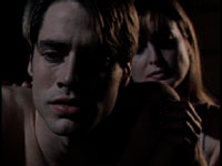
Scene has more detail, shadows remain sharp |
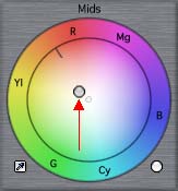
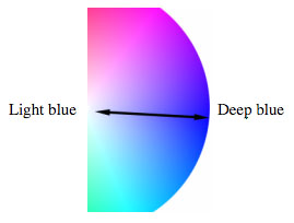
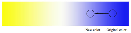
Although the influence of a color correction control for the Blacks, Mids or Whites is greatest in a particular range, all three controls do overlap one another to some degree.
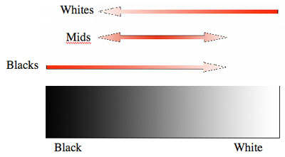
In the above diagram, the black and white gradient represents the range of luminance in the video image. The color correction controls, represented by the arrows, displays the approximate range of the image that each control affects. The bright red indicates the primary influence of the control, and as the red fades, so does the control's influence. For instance, the control for the Blacks is greatest in the darkest portion of the image, but it still affects brighter shades, just not to the same degree.
Because of this overlap, you may often find that after adjusting one control, you need to go back and fine-tune another control that you previously set.
This is one of two main color correction filters, and probably the one you'll turn to the most.
To apply this filter, highlight a clip in the timeline and choose Effects menu > Video Filters > Color Correction > Color Corrector 3-Way. By the way, in FCP 4, if a clip in the timeline is not selected, the filter will be placed on any clip at the playhead position (as long as the auto select button for that track is on).
Alternately, you can drag the filter from the Effects tab of the Browser to a clip in the Timeline.
After the filter is added to the clip, open it into the Viewer to make adjustments. If you go to the Filters tab, you can make changes with numerical values. This wouldn't be a very intuitive way to work, and so we are given a more dynamic and graphical way to work.
Click on the button labeled Visual (on the Filters tab) or click directly on the Color Corrector tab to switch to it.
Color Corrector 3 Way Filter
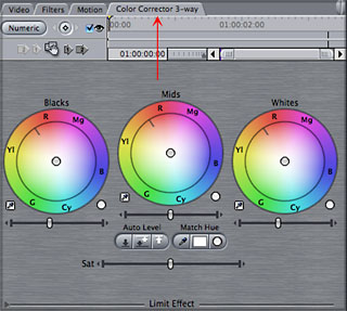
Luminance Controls
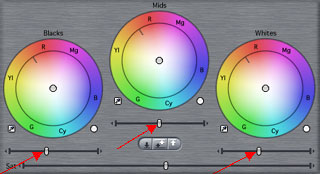
On the color correction tab, near the top, are three color wheels, each representing the three different parts of the image: Black, Mids, Whites.
To adjust luminance of the Blacks, Mids or Whites, there are sliders under the three color wheels (Red arrows below). Drag the slider left or right.
Tip: Clicking on the little arrows on the ends of the sliders will let you move the sliders in smaller, finer increments.
Think of these luminance sliders as brightness sliders, but they brighten different parts of the image. Dragging a slider left darkens a particular region in the frame. Dragging a slider right brightens that part of the image. Later in the article we'll explore using the Waveform monitor in conjunction with these luminance controls to compare images and be sure that you're adjustments are broadcast legal.
Color Balance Controls
Any of the three color wheels can be manipulated by clicking and dragging on the balance indicator found by default in the center of each wheel. Dragging toward any side of the wheel balances color in that direction. The further away from the center that you drag, the more intense the color that you add.
Note: When you first click and drag it may seem as though nothing is moving. Drag in larger increments or hold down the Command key as you drag which will increase the movements you make.
Color Balance
Ok, that's how to make the adjustments, but not much help if you don't know what kind of adjustment to make. Next, let's look at how these controls are used to manipulate the color palette of the scene.
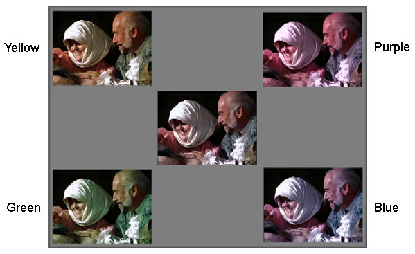
To start, a photographed image has a particular color balance. During photography, if the lighting balance does not match the camera's white balance or the film stock, and there is no compensation with camera filters, then the image will appear to have a color cast or tint. If the lighting matches the balance of the video camera or film stock, then the scene will have a natural color balance. The light in the scene appears white, or neutral, and all the objects in the scene appear to have a somewhat natural appearance. Below are examples of a neutral color balance (the center image) and images with different color casts. For the purposes of this article, the variations are somewhat extreme.
You may want to enhance a color cast with color correction, or in other scenarios, you may wish to remove one. In addition, aside from any artistic considerations like setting the mood or tone of the scene with color, color balancing is used to match any slight variations in color balance from the multiple angles of a scene so that they appear as a natural continuation of one another.
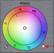
The Color Wheel
Each of the three color controls is in the shape of a wheel, a color wheel. When we later explore the Vectorscope, we will see a similar type of color wheel used there to monitor the colors of a scene.
A color wheel interface may have many uses, but at the core, it is simply a way to identify different colors, and the different mixtures of colors. The different colors, or hues, are laid out around the wheel.
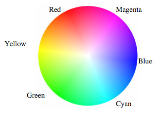
Color saturation, or color intensity is depicted on a color wheel as the distance outward from the center of the wheel. The further outward on the wheel, the more saturated or intense the color. In the other direction, moving toward the center of the wheel, there is less saturation.
In the Color Corrector 3 Way filter you will find the same six colors (shown above) represented along the wheel, each identified by an abbreviation. Why these six colors and why should you even care? Once you know how dragging a control toward one side of the wheel will affect the balance of colors in the photographed scene, you can begin to have predictable results when color correcting.
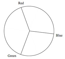
To start off, the wheel can first be broken down to identify three main colors, known as primary colors. These are: red, green and blue.
The other three colors on the wheel, yellow, cyan and magenta are each a result of adding two primary colors together. For instance, yellow is a combination of red and green, and therefore found on the wheel between red and green. Notice that on the wheel, directly across from each primary is one of these secondary colors. Any two colors opposite from one another are also known as complementary colors.
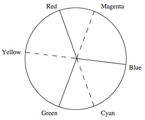
These complementary colors, like blue and yellow for example, have a direct impact on one another when color correcting. They not only fall on opposite sides of the wheel, they also act as opposites on one another.
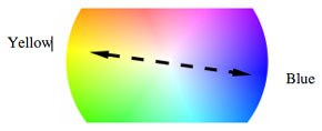
For instance, if you start out with a color in the video that is a saturated blue, then drag a balance indicator toward yellow, the result is a blue with less saturation. In other words, you're dragging away from blue when you move toward yellow.
Therefore, if your overall scene has a slightly bluish cast, balancing toward yellow a bit will nullify the cast.
Which Color Wheel Do I Use?
We discussed that all three luminance sliders may be needed to re-balance the contrast. In color balancing, it may work a bit differently. We may find only one control needed, or maybe two. In general, you may want to begin with the Mids color wheel, and only use other controls if needed. Why? As the Mids wheel affects the entire mid-range of the program, it will affect all but the brightest highlights and darkest shadows, and in turn, the overall majority of color information in the scene.
Now of course every shot is unique, and the above mentioned approach is quite basic, but may suffice in a lot of scenarios, especially while you're just getting your feet wet in color correction.
Color Saturation
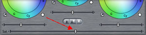
To adjust the overall saturation of the image use the Sat slider. To decrease saturation, drag to the left, to increase, drag to the right. At extreme left, the image is black and white.
Auto Controls
There are some controls that can help get you "in the ballpark" automatically and instantly.
For luminance, there are controls to automatically set white and black levels. These are found under the Mids luminance slider. Auto black sets the darkest part of the frame, auto white sets the brightest, and auto contrast sets both.
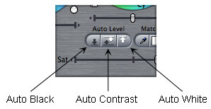
I don't want to focus on the auto contrast controls as this area is too subjective and can take images to the extreme. Then again, its not a bad idea to see a more extreme correction to compare to a more subtle(manual) correction. Anyway, you can always do an undo.
On the other hand, I find the auto color controls can be very helpful for novices and experts alike. These controls are designed to re-balance the color of the scene for a more natural rendition. This can be very helpful when an image has a slight color shift, but you can't quite figure out which color. Even when a color tint is intended, it can be a quick way to compare against a more neutral version.
Also, when working with small, subtle shifts in color as our eyes alone may have a hard time detecting the tint. The longer we stare at an image with a color cast, the harder it will be to detect the tint. Our eyes try to adapt! This may be great in real life, but its hardly objective when color correcting. Later we'll look at other tools at our disposal for helping detect shifts in color, including the Video Scopes and the Frame Viewer.
Next to each color wheel is a small eyedropper. Clicking on an eyedropper makes it active. Start with the eyedropper next to White and click on it.
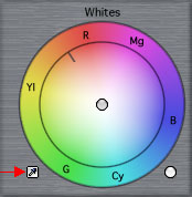
Next, go to the Canvas, and click on a part of the image that should be a neutral white. This will automatically rebalance the image in the highlights, which will also have an impact on the rest of the image. This one control may be all that is needed to create a natural look for color.
If further adjustments are needed, simply go to the particular color wheel and reposition the balance manually. You may also use the eyedroppers under the Mids for middle gray, or the eyedropper under Blacks for the shadows.
Resetting Controls
To reset any one color wheel, click on the white button to the bottom right of the wheel.
Tip: To reset all color wheels, and all luminance adjustments, then Shift/click on the white button next to any of the three color wheels.
Additionally, you can go back to the Filters tab and click on the red X across from the filter to reset all controls on the filter.
Scene to Scene Color Correction
Color correcting one image alone is fine, but what about matching the different shots of a scene? Next is a look at putting together a few different things in FCP to create a workflow when color correcting multiple shots.
If your display is unable to be set to 1280 or greater, then the Multiple Edits layout is unavailable (and not seen in the menu), but another layout, almost as good, is available. In this case, in FCP, choose Window > Arrange > Color Correction.
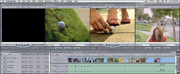
On the other hand, if the Multiple Edits layout is chosen, your screen will look like the following illustration.
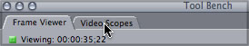
At the top of the screen is four windows (from left to right): the Viewer, a Frame Viewer window, the Canvas, and another Frame Viewer window. On the Frame Viewer to the right, notice that the window has two tabs, a Frame Viewer, and behind it, a Video Scopes tab. Click on the Video Scopes tab to bring it to the front.
This will give you a little bit of everything while you work:
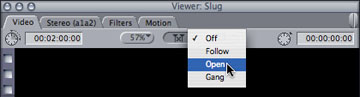
Once set to Open, the symbol on the button will look like the next illustration.
In the Timeline, move the playhead forward or back to other clips. As you do so, notice that the clip at the playhead position is automatically opened into the Viewer. In the Viewer, click on the Color Corrector tab to bring it to the front. As each clip already has a color correction filter (and tab), then as you move from clip to clip in the timeline, that particular clip is opened, and the color corrector tab is brought to the front. This means that you can look at an image in the Canvas, and immediately move to the color correction controls in the Viewer. You won't have to worry about opening the clip or working on the controls of the "right" clip, as whatever is in the Canvas is also automatically in the Viewer.
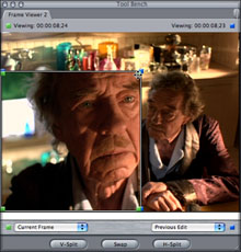
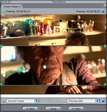
What's even better? You can click and drag on the corners of the split screen or click and drag over one side to slide it one way or another. Whatever the content of the two clips, these options help you to compare different parts of each clip, to get just the comparison you want.
The buttons at the bottom of the Frame Viewer are also a quick way to jump into a vertical or horizontal split screen, or reverse the layout of the two images in the split screen.
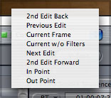
The other options found in the two drop down menus are helpful for a variety of scenarios. Here's just a couple: One of the options from either menu is Current w/o Filters. Choosing this is a great way to quickly see the original image when designing a look, especially if the look involves using several filters together. Then, this Frame Viewer option is a much quicker way to see the original without disabling several filters.
Another helpful option from a Frame Viewer menus is In or Out. If you Set a timeline In point then choose In from a Frame Viewer menu, you can view any frame from any point in the timeline, instead of just the presets found in the menu.
Below is a list of options found under the "left" menu in the Frame Viewer.
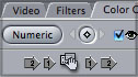
At the top/left of each Color Corrector tab in the Viewer, notice the Copy Filter controls. They are the little arrows with 1 or 2, on either side of a little hand icon.
In brief, if you click on an arrow to the left of the hand, it copies the settings of a previous clip (the first or second clip to the left in the Timeline). If you click on an arrow to the right of the hand, then it copies the settings of the current clip to one of the next clips in the Timeline (first or second clip to the right).
The hand is a "drag filter" control. Click and drag on the hand to another clip in the timeline. This copies the entire filter (not just the settings) to the clip. Just be careful when using this, click and hold, then drag to a timeline clip. If you accidentally click and let go on the hand, then the filter is copied back onto the same clip (which of course makes the result on the original clip too heavy). This drag filter control is helpful when you want to copy the color correction to a clip beyond the 1 or 2 clip range of the arrow controls.
This type of color correction refers to being able to adjust one color value in a scene without affecting other colors, also referred to as selective color correction. This can be used to change the color of a sky or intensify the blue in a sky without affecting the rest of the scene. It can be used to change any colored object in an image, like a shirt, from one color to another.
This technique is similar to blue screen effects, where the blue screen is keyed out (made transparent) to replace the blue background with another scene.
To perform this color correction, we can use the Color Corrector 3 Way or Color Corrector filters. The controls are the same for each filter. I like the Color Corrector filter for this, as it gives a lot of flexibility for modifying the chosen color, even if the desired color shift is substantial.
This filter is similar in many of the controls found in the Color Corrector 3 Way, but it also gives a slightly different approach to color balance and hue.
The controls that work similarly are shown below. There are three luminance sliders and a saturation slider.
If you use the Color Correction layout (instead of Multiple Edits), then you would simply have one window housing both Frame Viewer and Video Scopes tabs. Simply click on the appropriate tab to access either window as you need.
![]()
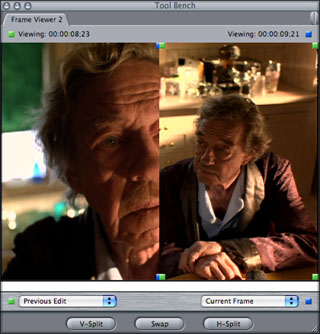
When trying to match to images to one another, there is nothing more handy than the new Frame Viewer window. If you choose the Multiple Edits or Color Correction window layout you open a Frame Viewer (although they open with different default settings).
A Frame Viewer can be set to display one or two images, depending on what is chosen from the two drop down menus found at the bottom of the Frame Viewer. One helpful configuration for color correction is to set the left menu to Previous Edit and the right menu to Current. Correspondingly, you would then see a split screen of the clip to the left of the timeline playhead and the current clip at the playhead, as shown next.
![]()
We also have a quick way of copying the filter settings from one clip to another. This is helpful when multiple clips in the timeline are shot under similar lighting and/or exposure. Even when the exposure (or color) varies a bit from shot to shot, you might still find that a previous color correction done in the same scene can at least be used for a starting point for correcting another shot.
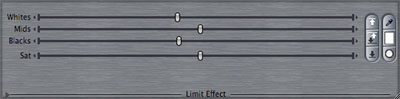
The other controls, for color, are setup as shown below. This type of color correction is more basic than the Color Corrector 3 Way, as there is only one Color Balance wheel, and this wheel affects the overall color balance, instead of affecting the balance in just the Whites, Mids or Blacks.
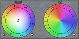
There is also a Hue color wheel, and the wheel is controlled by dialing clockwise or counter-clockwise. This can be used alone or in conjunction with the Color Balance wheel.
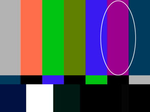
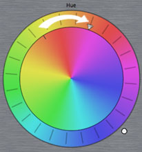
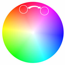
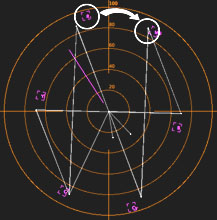
The Hue wheel basically re-maps color around the color wheel. One way to demonstrate how the Hue wheel works is viewing color bars with this Color Corrector filter. We'll focus just on the red bar of the color bars. The next three illustrations next show the red bar, and where it falls on our reference color wheel, and where it would be found in the vectorscope (which will be explored in more depth later).
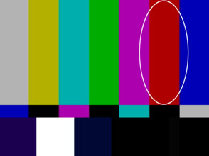
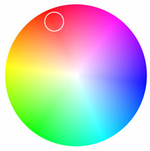
When dialing a bit clockwise around the Hue wheel, the red bar becomes magenta.
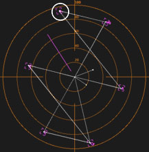
This can be explained by the next set of illustrations, which shows the direction the control is dialed, the resulting color as it travels around the color wheel and the vectorscope.
To Begin Secondary Color Correction
Apply the Color Corrector filter to a clip, and click on the Color Corrector tab. At the bottom/left corner of the window is a little disclosure triangle, then the words Limit Effect.
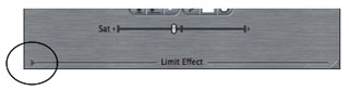
Click on the disclosure triangle and the Limit Effect section pops open.
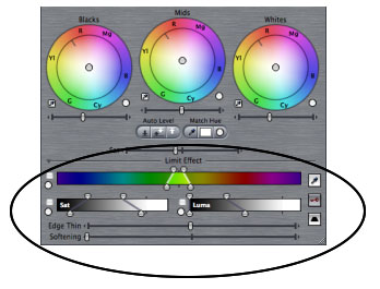
All of the controls under Limit Effect help us define what color in the frame we want to apply an effect. Once we select a color, then any changes made in the top part of the filter only apply to the selected color.
Define The Color To Be Manipulated
Click on the eyedropper under Limit Effect to make it active.
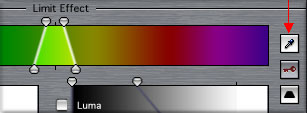
Then click in the canvas on the colored object that you want to affect. This sets the three controls under Limit Effect to define this particular color. Chances are, you will still need to make adjustments before this color is accurately defined.
To see if the color is properly keyed(defined), click on the little key button under Limit Effect. Clicking it once will turn the key's background from gray to white.
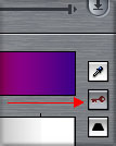
Key when gray |
Key when white |
The image in the Canvas will be displayed in black and white. White will represent the keyed color, and black will represent sections not selected.
Note: To return the Canvas back to view the �final� image, click on the key twice more (once to change key background to blue, then click it again and the key background goes back to gray).
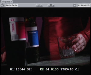
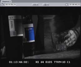
On the sample below, on the left you see the original image. The object that is being selected is the blue bottle.
In the next image on the left, you see the selection chosen with the eyedropper (when the key button is white). It has only selected part of the bottle label that I wanted to affect. To select the entire object, we will need to expand the selection. when finished, the selection should look like the image on the right.
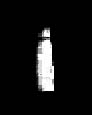
First selection with eyedropper |
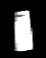
After selection is expanded |
To accomplish this, you can try "adding" to the selection using the eyedropper again, or you can manually modify the ranges at the bottom of the filter. Since the eyedropper is so simple and effective, I would suggest this route first.
After the initial selection is made with the Limit Effect eyedropper, then click on the eyedropper again to make it active. This time, before clicking in the Canvas, hold down the Shift key. When you then click on a new area, that color sample is added to the selection. You can keep Shift/clicking until almost the entire object (color) is chosen. Just remember to hold down the Shift key each time before you click in the Canvas or you'll end up replacing the selection, not adding to it.
The other way to modify the selected color is to use the handles found in each of the three regions in the Limit Effect section.
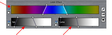
If part of the object is darker than the part selected, expand the selection under the Luma control to include that darker shade of the color. If part of the color is a slightly different hue, then expand the Color Selection. If part of the color is more saturated than the selection, then expand the Saturation selection.
To make an adjustment, we can drag the top handles, the bottom handles, or drag the range displayed.
The top handles of a control adjust the overall range also called Tolerance. The bottom handles adjust the Softness of the selection, which basically feathers out the selection softer than the top handles.
You may also click and drag in the bar itself to drag the overall selection left or right. The cursor will turn into a little hand while you are over the bar.
Continue to adjust any or all controls until the white part of the Canvas is accurately representing the entire object. I tend to find that there is less science here, and more test-and-see to make it work. Adjust the top handles of all three controls until the object is almost fully white. Then go back and adjust the bottom handles to feather out the selection to completely define the object.
Making Secondary Corrections
Once you make a selection, any or all of the checkmarks will be checked in the Limit Effect section. As long as these checkmarks are checked, then any corrections in the top of the filter are limited to only the selected color.
You can use contrast and/or color controls to modify the chosen color. When you need to make a drastic change in color, then the Hue wheel might provide the best approach. In the following example, the blue bottle is made purple. This is a fairly dramatic change, but it could have also been a more subtle adjustment.
Cleaning Up the Edges
Once you start to make your desired color change, you will see how the selection holds up around the edges of the chosen color. Similar to keying, you may need to treat the edges in an attempt to distract the audience's attention to the least realistic part of the effect.
Two sliders at your disposal, at the bottom of the Limit Effect section.
Softening is used to soften the edges of the selection. A little bit goes a long way. Edge Thin is also helpful as a way to subtly expand or contract the overall selection. Use this slider in conjunction with Softening.
For everyday tasks like tweaking a sky's color a little bit, or slightly enhancing the green of grass, or warming up skin color without an impact on the rest of the scene, we will find that our color selection does not need to be very precise or clean. As the color adjustments are subtle, a quick, rough selection is fine. If the desired color adjustment is substantial, then the selection of the color needs to be fairly precise. If it is not, then you may produce a sort of halo, a colored edge. Or you may see "holes" in the selection, where the holes are a different color.
Also, just a quick note about what to expect and what not to expect. With secondary color correction, its somewhat effortless to make subtle color or luminance shifts with a variety of video formats, including DV, but if you need large shifts in color, and its critical that the edges of the "selection" look realistic and believable, then in general, you should have one or more factors working for you.
Since you can't end up with better resolution than the weakest link in your post production workflow, then its also important to capture and work with these formats through one of the following methods:In the previous example of the bottle, this footage was originally shot on film but ultimately transferred to DV. Although DV, this still worked well as there is no other remotely similar color in the frame to the blue, and the edges are somewhat dark. So, all in all it depends on what you're trying to do, the limits of the format, but also the content of the shot and how isolated the color is.A capture card that allows for uncompressed capture of the material, such as: - Blackmagic's Decklink(with Blackmagic's or Apple's codecs)
- AJA's KonaDVC Pro 50 can be captured natively through FireWire on such equipped decks (very cool!) And, not to be left out in the rain, in the analog world, Beta SP masters also can do well if digitized uncompressed through a capture card.
Creating the Pleasantville Look
Creating a black and white image with only one colored object is similar to the process above, with a couple of distinctions. First, select the color that should remain in color, using the controls under Limit Effect to define the color as we did above.
Once the color is defined, then click on the Invert button under Limit Effect.
Now, instead of the individual object being selected, the entire image except that object is selected. Go up to the Saturation slider in the color correction controls, and drag all the way to the left, as shown below.
The entire image will become black and white except for that one color.
Next, there are more examples of secondary color correction, but this time, the colored object changes hue, and is less saturated. The way this is accomplished is by adding a second Color Corrector filter after the first filter.
The first filter is used to isolate the color, and turn the scene black & white except for the one color. This can be either the Color Corrector 3 Way or the Color Corrector filter. After selecting the color with Limit Effect controls and clicking on the Invert button, drag the Sat slider all the way to the left.
A second filter could then be applied. This would be a good one for the Color Corrector filter and its Hue wheel. Dialing the Hue wheel will change the chosen color, the only color left in the frame.
When using color correction, we can always apply one filter over another for even more control than a single filter can give us.
Keeping It Legal
I know I've so far neglected to mention anything about FCP's video scopes. Maybe you were hoping I'd forget. Then again, I guess it would be just as easy for you to just close this article away at this point, but don't... just yet. This next part is kind of important.
We can use the video scopes two ways. For one, it can help us identify and compare components of our images. Just how much of a color tint? Or, how bright is the window in the background compared to the window from another similar shot? We'll come back to this in a minute.
The other, and more primary use of the video scopes is to determine whether our images fall within certain specifications. Often referred to as "broadcast legal", its about keeping luminance levels within a certain range and keeping a cap on color saturation. This not only ensures that the image is viewed as well as it can on a variety of televisions, but that it adheres to the standards of the broadcaster. We will look at some general standards, but you should check with the intended broadcaster to be sure of all requirements that they have.
To begin, if you have the Mutliple Edits or Color Correction window arrangement, then the video scopes window is already open.
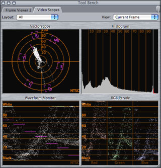
Opening the window will bring up a 4-up display showing all four monitors. We will only be concerned with the Waveform monitor and Vectorscope. Toggling down the drop down menu in the window will let you choose between the various scopes, like a full window of the waveform monitor.
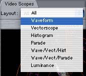
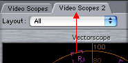
I personally like to see two full window displays, one of the Waveform monitor and one of the Vectorscope. You can do this easily. After opening the Video Scopes window, go back to the Tools menu, and choose Video Scopes again. This will open a separate scopes tab on to the Tool Bench window. Click on the tab of the newly opened scopes tab, and drag it away from the main window. This "breaks off" this tab, and now you have two different windows, where they can each be set separately.
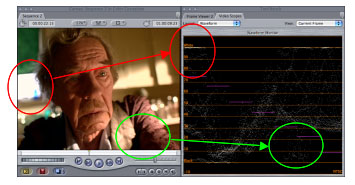
The Waveform Monitor
From the Layout menu in the video scopes, choose Waveform.
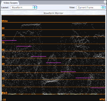
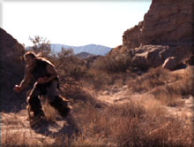
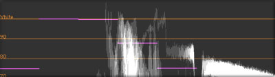
This display is used to evaluate the brightness range of the image. The scale along the left side of the window spans from Black to White, corresponding to 0 to 100. Depending on an object's brightness, it will be plotted out as dots somewhere along this scale. For instance, a bright window is displayed as dots near the top of the scale, in this case, topping out below the line for White.
To keep our image within an acceptable range, for NTSC or PAL, we want the darkest blacks of the frame to map to Black (0). We want the brightest white to top out at White (100) and not go above. That's the basic mantra to keep in mind: keep it between 0 and 100.
Note: If you're the curious type, or you've heard that in NTSC black should be set to 7.5 IRE, than you may wonder about the soundness of my previous advice. Without going into much detail, terms like 7.5 IRE, setup level or black level are completely irrelevant when working inside FCP. These are analog terms, not to be confused with how FCP reads and displays information, which is as digital percentages. When recording to digital mediums, NTSC and PAL considerations are not different from one another. Black is 0%. Period. If you really want a more detailed rant on the subject, you can read the article at Ken's site for FCP 3 that I did last year (which, in retrospect, was a little too much info for the article).
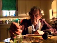
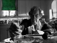
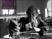
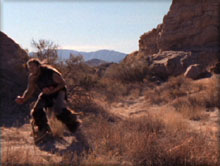
To understand better how the waveform monitor represents or corresponds to the video image, let's look at the next two images.
On the left is the video image, with highlights and shadows. In the image to the right is the waveform display of the video. The Waveform monitor displays information from left to right in the same relationship as the video. More specifically, in this example, the window is on the left side in the video frame, and is the same distance inwards from the left in the waveform display. The shadow on the man's robe, which is close to the right side of the frame, is seen in the Waveform monitor near the right side of the screen.
Tip: To keep imported graphics and FCP generators (like text) from blooming too brightly for NTSC, then go to the Sequence Settings > Video Processing tab, and choose Process Maximum White As: White.
The Vectorscope
This tool behaves similarly in the analog world and in FCP.
Color saturation (and hue) may be examined on a vectorscope. It is basically a color wheel representing the three primary colors (red, green and blue) and the secondary colors (yellow, cyan and magenta). When there is a color in the frame, it will be represented on the vectorscope going in the direction of that side of this color wheel.
The following is an illustration of an image that has a lot of red values in the frame. The vectorscope shows a majority of its values along the red side of the color wheel. Additionally, the more saturated a color, the more it stretches out away from the center to the edges of the color wheel. The less saturated a color, the closer it will be toward the center of the wheel.
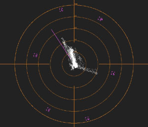
To determine legal saturation levels, we will want to look at the color "targets" along the vectorscope. These targets are used for calibrating color bars, but they also serve as the limits for our color saturation. In general, we do not want any color's saturation to ever extend past the center of the target along any sides of the vectorscope.
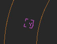
Tip: Additionally, for a more detailed view of the center portion of the vectorscope, Control/click anywhere over the vectorscope and choose Magnify from the drop down menu.
We can also use the vectorscope to aid in color correcting single or multiple images.
Not only will it display whether colors are legal, but it helps to eliminate color casts. You may look at an image and know that it is a little off, but exactly what color is the image leaning toward? You can see this on the vectorscope, as the main grouping of spikes will lean toward the balance of the image. In the color correction filter, drag toward the opposite side of the wheel as the direction of color in the Vectorscope.
You can also use this to as a guide to help balance several images to one another, as you don't have to rely on the accuracy of your eye as much. Look at the vectorscope display of one image, and compare the color display to that of another image.
This is an interesting filter that is also included in the Color Correction Bin. The purpose of this filter is to limit the top end of an image, the white values. Using this filter can help to clamp values above a certain point, to ensure that you are still "legal". I find it very important to have the waveform monitor open while making adjustments with this filter. I think that people tend to think of this very literally as a "Legalize" filter, and do not contemplate just exactly how it is "legalizing" the image.
This filter approaches the task by taking values above a certain point and clamping them, or "cutting them off". It also will give you the flexibility of determining just where that cut off point is, as well as where it starts to pull higher end values down the scale, so basically shifting the high end a little darker.
You should use this filter with caution. If you color correct so that a majority of the highlights fall fairly high on the scale, above 100, and then apply this filter to cut off the top end, you may end up with undesirable results. This will cause a flattening of the image in the highlights, which appears as dull, flat sections of white, instead of gradations of highlights. This is similar to what you will find when over-exposing while shooting video. There will be blanket areas of white, with no detail in them.
Highlights with Gradation |
Flat Highlights |
When using this filter, I suggest that instead the whites should roll off a bit, before being clamped. This can be done while using the Color Corrector 3 Way or Color Corrector filter. Adjust the highlights so that the majority of spikes fall below 100. If the top end of a few spikes still fall above 100, but you are happy with the image as a whole, then this would be the time to apply the Broadcast Safe filter.
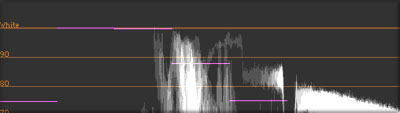
Whites clipped (with filter)
On the Filters tab, there are several options, but the default is often sufficient.
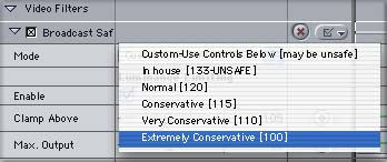
If you feel brave, then you can set the drop down menu to Custom. Once this is set, use the controls under Luminance and Saturation Limiting to control the clamping point, adjust the range of the falloff, and where the top end sits on the scale.
As mentioned above, this filter should be used with caution when trying to create natural scenes. It is generally more pleasing to see gradation in the highlights, even if it is subtle. If one of the reasons for raising the white levels was to bring more contrast into the scene, then this can better be accomplished by a well balanced scene, then by overdoing the whites. Having a true black in the frame along with a true white will give the image more punch, and more of a feeling of intense white in the highlights.
On the other hand, the Broadcast Safe filter is a great aid when trying to create high contrast looks. With a color corrector filter, then a Broadcast Safe filter, you can keep pushing up the Mids and Whites sliders without the whites going above 100.
For even more detail than this article, as well as how to use several additional features, more tips and for some real-world examples to practice on, I hope you check out the just released book Advanced Editing and Finishing Techniques in Final Cut Pro 4 from Peachpit Press. In there I wrote five chapters on color correction, and there is enough media examples and exercises on the included DVD to hopefully keep you busy for a while.
Written by Andrew Balis
copyright © www.kenstone.net 2004
A Final Note
Andrew Balis is a cinematographer, editor, post production consultant and Apple certified instructor teaching classes in Final Cut Pro to industry professionals at Moviola Education and UCLA. He is co-author of the Apple Pro Series book Advanced Editing Techniques in Final Cut Pro 4. Andrew co-authored the original Apple certified curriculum for beginner, advanced, and effects classes developed at Moviola Education, and wrote the Final Cut Pro curriculum for the Apple Education/CNN Video Journalism classes offered in the K-12 market.