January 8, 2007
Repairing and styling colour, featuring 'The Grading Sweet.'
The Grading Sweet is available at:
www.thegradingsweet.com
Standard Sweet: $89.00 USD
Grading Sweet Pro: $750.00 USD
By Jude Cotter
Recently I was asked to review a new set of plug-ins for FCP devised by Sydney cinematographer Ben Allen (ACS). But the way I figure it, you don't really want to know whether I think a product is great. After all, who the hell am I anyway? Why should you care what I think?
What you really want to know, what I always want to know, is how I use this thing, and how can it make my work, and therefore my life, easier.
So I thought that instead of a review, I would write a tutorial on how to repair and style your colour in FCP using the plug-in set 'The Grading Sweet'.
The Grading Sweet can be purchased as two separate packages - the Standard set or the Pro suite, or all together as a unit known as the Grading Sweet Pro.
The Standard Sweet package contains the filters Colour Kit, Colour Temperature, CrimeScene, DayForNight, Exposure Corrector, Highlights, Vignette and Sweetener, which is all the filters you are likely to need up to a quite serious level.
The Pro additions set contains filters that you would more likely need if you were part of a professional workflow, with filters such as Pro Airbrush, Pro Bleach-Bypass, Pro Window and Pro Workprint.
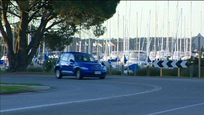
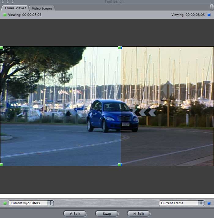
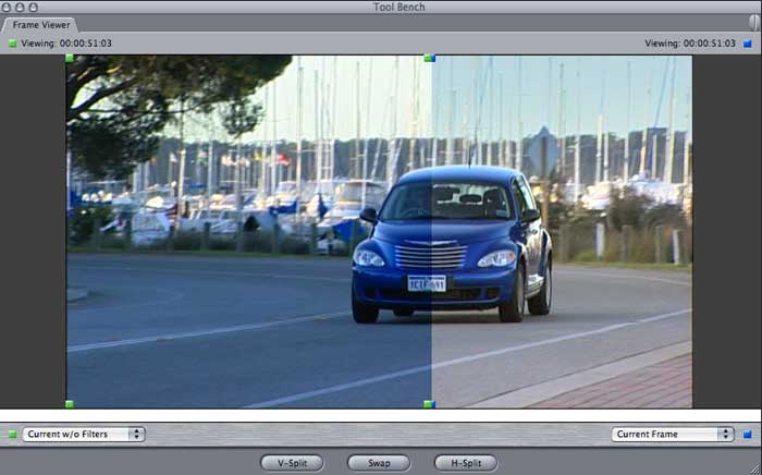
Starting with the standard set, lets first look at repairing this rather awkward clip.
A tip here is that when working on colour in FCP it's a good
idea to invoke the Colour Correction Window set-up, which you
can find under Window > Arrange Colour Correction or Dual
Screen Colour Correction. This will open an extra set of windows
at the top right that contain your video scopes and the frame
viewer, which can give you a live split-screen update of your
picture before and after any effects have been applied.
Also, it's very important to have a broadcast video monitor, or at the very least a television to view your work on when manipulating colour. Computer monitors do not accurately represent video brightness or colour, so in all likelihood any adjustments you make using them as a guide will be wrong for television. The exception to this rule is, of course, if you are grading for the internet, or for any final production that will be viewed on a computer screen, such as an art installation.
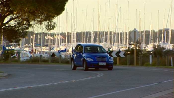
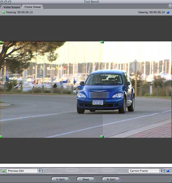
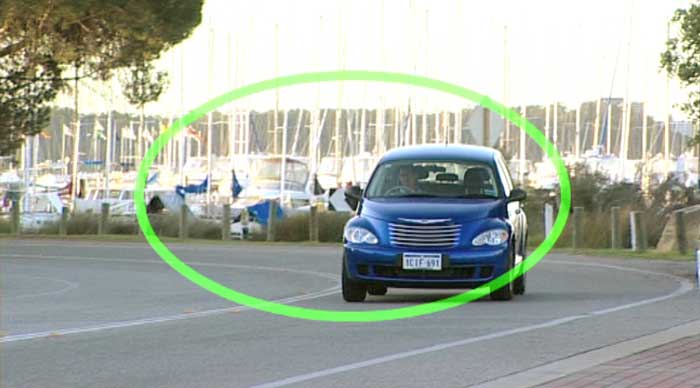
Getting back to the job at hand, as you can see there are a number of problems with this picture. Firstly, if you look at the whites in the foreground in the arrow sign, you can see that they are too blue.
Secondly, the foreground of the picture is underexposed. But you can see from the bright background that if the camera operator had exposed it correctly, the background would have become completely overexposed. As it is, it's already a tad too bright for broadcast, which I can tell by turning on my range check under View > Range Check > Excess Luma.
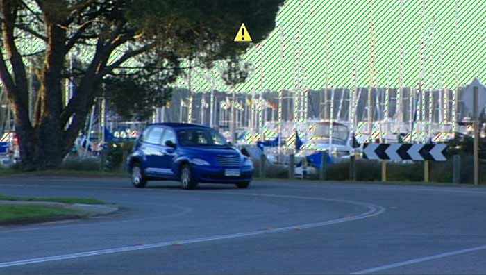
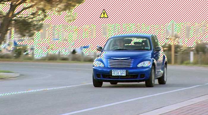
The yellow triangle tells me that the whites exceed legal limits, and the red and green zebra stripes show me the areas that are a problem.
So. How can we correct this clip so that it's the right colour and correctly exposed, without getting into problems with the very bright background?
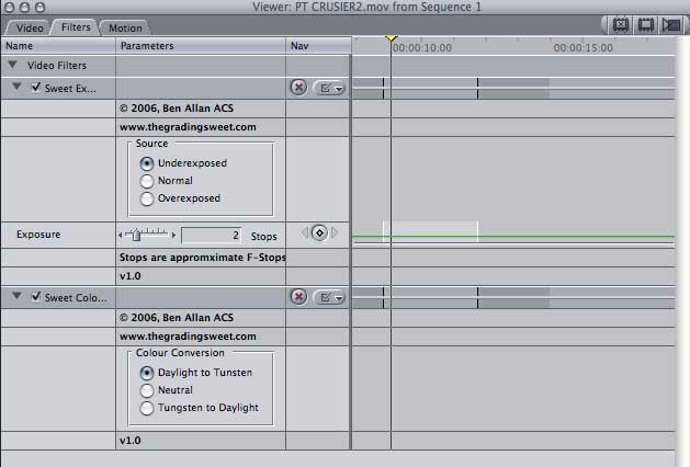
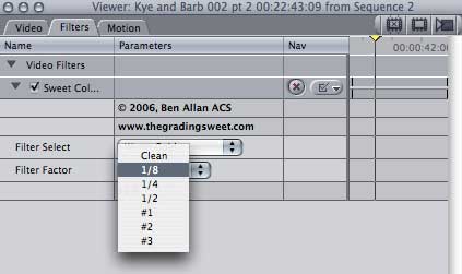
From the Grading Sweet the first filter I am going to apply is the Sweet Colour Temperature filter. As you can see it's a nice simple interface with three choices for correcting the white balance - daylight to tungsten, neutral, and tungsten to daylight.
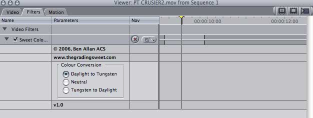
Putting it basically, this works in a similar way to white balancing your camera for indoor or outdoor light. Selecting daylight to tungsten will make your picture more orange, and tungsten to daylight will make it more blue.
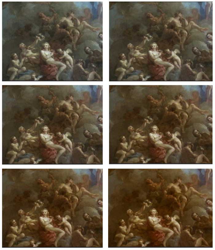
If I select daylight to tungsten I get this result.
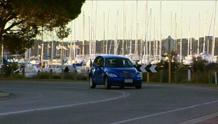
Which interestingly is quite close to this hand corrected version that I did for comparison, but took only one click.
As you can see in the frame viewer here this is an immediate
improvement on the colour temperature.
So now on to the exposure. I'm just going to ignore the background for the moment and concentrate on getting the foreground better exposed. From the Grading Sweet I select Sweet Exposure, click 'Underexposed' and knock it up two stops. The filter gives you a range of up to 8 stops both in underexposure and overexposure, so there's a ton of room for improvement.
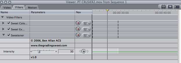
Next, because I can, I'm going to add a filter known as the 'Sweetener', to see what it does. The manual indicates that it 'Adds "richness" to any image' using a 'proprietary lookup table to enhance images'. Certainly sounds interesting.
After a bit of fiddling I settled for 30% intensity and I actually quite like what it does. In this picture the vision on the right hand side has been 'sweetened'. You can see that some of the dull wash has been removed, leaving the picture looking crisper. Nice.
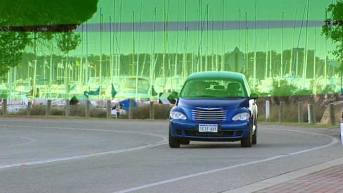
So the foreground is looking a lot better, but, as I suspected, now the background is even worse. The areas in red here are outside legal broadcast limits, and that means that this picture would be rejected for broadcast. So it's got to be dealt with.
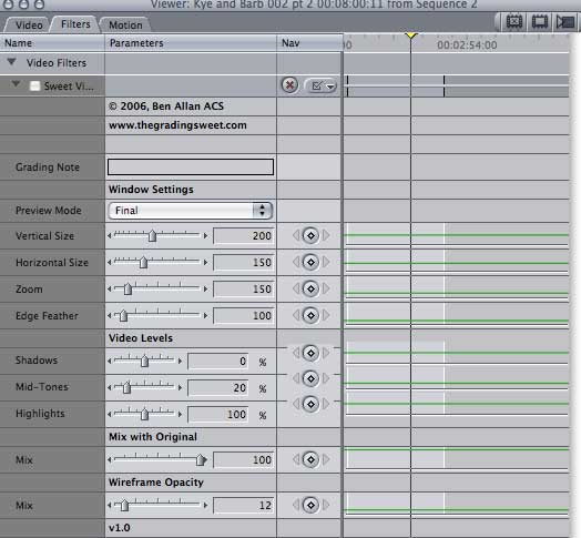
You can selectively darken parts of images inside FCP, but it requires time, patience and a tidy matte technique. Simply put, it's fiddly and the results (at least for me) are often not perfect. Luckily for me, in the Pro section of the Grading Sweet, there's a handy dandy filter called the Pro Window.
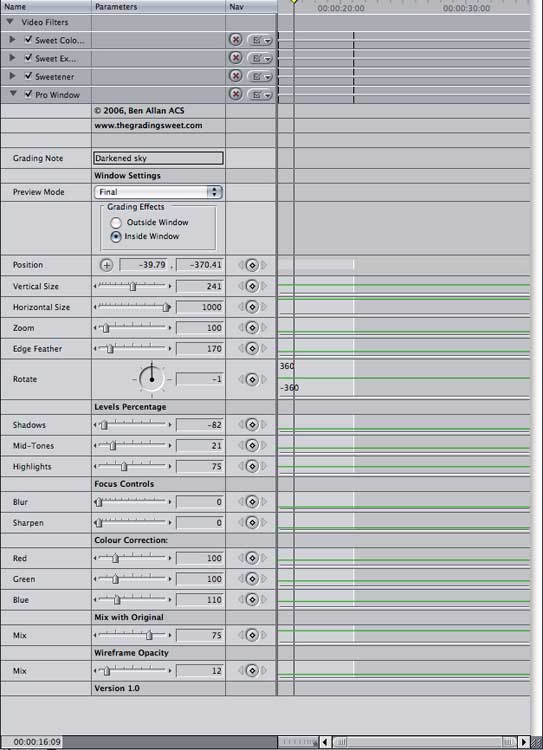
OK, yes, this one looks a lot more complicated than the previous filters, but looking at it step by step, it's all pretty self explanatory.
First of all there's the grading note window, which is a welcome addition because as anyone who does composites knows, once you start stacking effects it gets hard to remember what function each one is performing. You can stack pro windows to selectively work with several sections of the same image. So in here I've just made a note to myself that this is the Pro Window I'm using to reduce the brightness of the sky.
The Preview mode has three settings - Preview - which shows the outline of your circular window, final, which is your final result, and render with frame, which presents the preview during animation, as the Pro window is fully keyframeable. The green area here shows the outline of the window in preview mode.
You can choose to have the effects work inside the window or outside it, which is also great for instances like blurring out a background, leaving the foreground selection in focus. In this case I'm going to work inside the window, selecting the sky.
I can set the position and size of the window with a combination of selections from the position, size, zoom and edge feather sliders. Here I have the horizontal size set as wide as it will go and the vertical size at 80 to get a short wide window that matches the shape of the sky. With zoom at 100, edge feather set to 70, and the position adjusted by clicking the small cross next to the position slider and moving it around on the canvas until I am satisfied, I get this kind of window.
The width of the green overlay shows the amount of feathering that is being applied. The extensive feathering range gives an excellent blend from the adjusted vision to the unadjusted vision, to the point of seamlessness, which is very similar to the functions of high end colour grading systems. You can also rotate the window to get a closer fit to an object in your image.
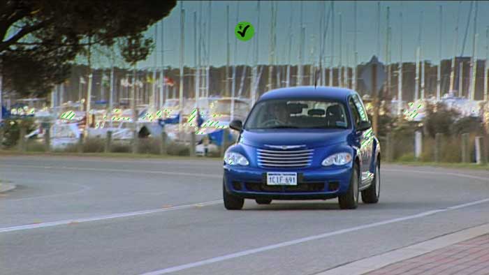
Next is the important bit for this image. The levels. I want to greatly reduce the brightness of the area inside the window, so I start by pulling down the midtones. This picture was a bit of a mess overall so I pulled down the shadows and some of the highlights too, until the picture finally got legal. While I was at it I added a bit of colour back into the sky with the colour correction sliders.
Sadly this looks quite muddy on a computer screen, even though it's fine inside FCP, which is why you should always do colour correction with a broadcast monitor attached. The green tick on the screen tells me that now it's not going to get the show rejected.
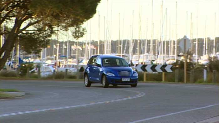
I've included a second picture that has been adjusted for the web, which is overexposed and looks washed out in FCP, but approximates what it actually looks like here on my TV.
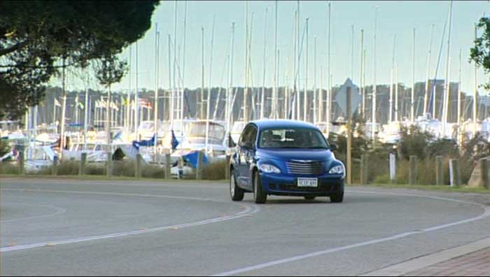
And now I'm pretty happy. You can see in the (web version) frame viewer that the before and after shots are like chalk and cheese. And best of all, it took me only a few minutes, even without having ever used the filters before.
So, great. You can do colour repair. But what about styling, I hear you say. I want that grungy hospital green and that lovely golden glow, you say. Well, yeah. So do I. And most of the time I want them fast, too.
So of course I'm excited to see filters with names like Colour Kit, CrimeScene and DayForNight in this package.
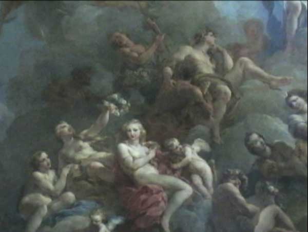
I decided for this section to first work on some mini-dv footage shot by my cousin while on holiday in Europe, just to give myself a worst case scenario. So these pictures are from a one chip camera shot by an amateur with only natural lighting.
Again, it's difficult to show correct broadcast images here on the web, so the following pictures will be adjusted for computer screens, not television.
OK. Let's see what the Colour Kit has to offer.
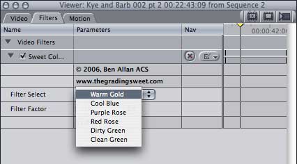
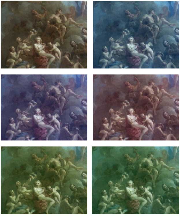
Each of these styles was achieved with just one click, and what's more, there are six saturation levels for each colour style. So, for example, you can add 'Warm Gold' to your pictures and keep ramping up the intensity until you are almost at sepia like this.
This is good news for those of us on tight deadlines, since actually deciding on and setting up styles is often what takes the longest. You can just say to your Producer or Director, 'What about this look?'(click). No? Then what about this?'(click), and go from there.
I've also found that if you add some primary colour correction to your pictures first, the results are even nicer, and can be individually manipulated.
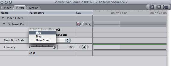
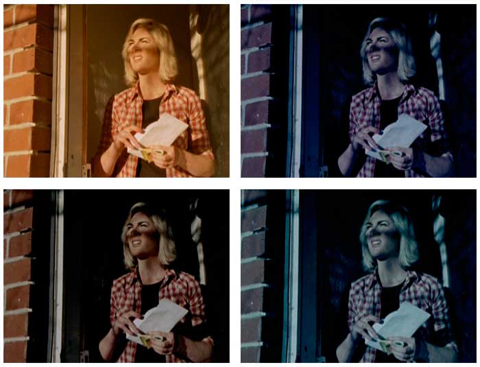
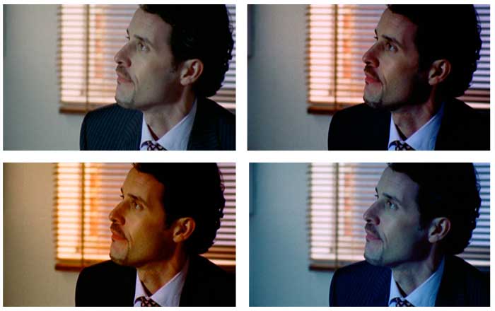
The standard kit also includes a Day for Night filter, which has several options for the kind of feel you want. Here's a simple daylight clip with one of each of the three options - Blue, Silver, and Blue-Green - applied. These pictures, by the way, are from a 16mm shoot TK'd to DVCAM (Bestlight).
The simplicity of these filters makes them especially good for novice colourists, who know where they want to go, but are often not quite sure how to get there.
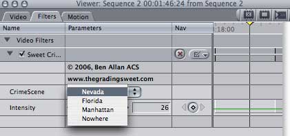
The same goes for the CrimeScene filters, which add quick and simple preset styles to your work. Just add the filter, choose a style, then adjust the intensity to your liking.
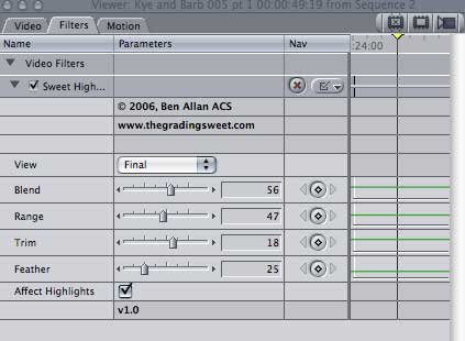
The last two items in the standard pack are the Sweet Vignette and the Sweet Highlighter.
The Vignette acts as a scaled down version of the Pro Window from the Pro kit, giving you the ability to darken or lighten an area inside a feathered window. The controls are essentially the same as the Pro Window's, including that nice wide edge featherer.
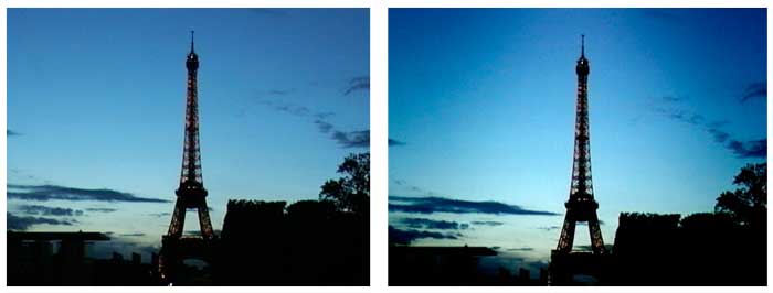
As you can see from my cousin's mini-dv shot of the Eiffel Tower, a good vignette can add a lot of visual interest. In this instance I also applied the Sweetener filter to increase the contrast to add to the effect.
The effects of the Highlighter are much more subtle. Most commonly it would be used to soften the highlights to take some of the harsh 'video' feel out of the picture, but it could also be used to add a misty 'romantic' softening.
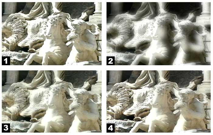
Using the View menu on the filter I am able to access the matte view of what I am selecting, which you can see in picture two below. Here I have used the range to select the range of whites I want to include in the effect, and the trim and feather to expand (or reduce) and soften the area affected. The Blend slider controls how strong the effect will be.
Picture three shows the result of the filter, but, as I said, this is fairly subtle, even though I have gone a bit overboard to make it more obvious. Picture four is probably the best example to look at, where the left hand side is unaffected, and the right hand side has been softened.
And that concludes our tour of Europe, and the Grading Sweet package. If you are in a more professional workflow situation, you might want to also check out the Pro Kit which has some great filters such as the Pro Workprint which basically mimics a film printer with Red, Green and Blue lights, as well as actually stamping the footage with all the relevant information.
Also, I've personally become quite addicted to the Pro Window. It's an excellent fast way to isolate and adjust parts of your picture without the need for layering and blending copies.
I hope this tutorial has helped you to understand the possibilities and benefits of even simple colour work a little better. And I hope it's helped you to be less afraid of messing with it. Make a copy of your project and start playing. Because that's the greatest thing about digital editing - even if you make an almighty mess, you can always press undo.
For more information on The Grading Sweet, check out their website at http://www.thegradingsweet.com/main/HOME.html
My thanks to Black Olive, Kye Hammond and Vic Miraudo for their kind permission to use the images featured in this tute.
Jude Cotter lives and works in the wilds of Western
Australia as a freelance broadcast editor, FCP trainer and trouble-shooter.
[Top]
copyright © Jude Cotter 2007
© 2000 -2007 Apple
Computer, Inc. All rights reserved. Apple, the Apple logo, Final
Cut Pro, Macintosh and Power Mac
are either registered trademarks or trademarks of Apple. Other
company and product names may be trademarks of their respective
owners.
All screen captures, images, and textual references are the property and trademark of their creators/owners/publishers.