
March 29, 2010
Controlling the Color Wheels in Final Cut and Apple's Color
By Patrick Inhofer
Owner, Colorist, Finisher Fini.tv
Why do different color wheels in different pieces of software and applications act differently?
How does that answer effect our approach to color grading?
Those two thoughts came to the top of my mind when reading Oliver Peter's excellent post, Grading with Color Wheels. Why don't you head over there and read that post? It's very informative and helps build the foundation for this post. I'll wait...
Understanding how the color wheels in your NLE process the image has a huge impact on how you approach your color correction. In this post we'll build out the concepts introduced in Oliver's article to give us a working methodology.
First, let's look at Final Cut Pro's 3-way Color Correction plug-in. I'll do the same thing Oliver has done. But since my shot has some pretty obvious highlights - for the sake of this example I'm going to drag the highlights and make them blue. Below is the Before / After images. I want you to pay particular attention to the brightest highlights in the waveform monitor.
(Images courtesy Chris Ripper, Resurrection Man)
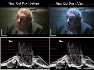
FCP: Pushing the Highlights Blue.
(click to enlarge)
I've noted the highlights with the yellow arrow. But also take a look at the midtones and near the blacks. You'll notice the waveform is identical. It hasn't moved a smidgen. Try this yourself with your own footage and with the scopes open. Concentrate on the Waveform Monitor. You'll notice that no matter how hard you push the wheels - the waveforms in FCP stay rock solid. I'm going to explain in a minute what this means to us as colorists (and why).
But first, let's move to Apple's Color and take a look at the same image - with a much milder push toward blue - and again, examine the highlights.
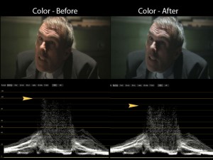
Apple's Color: Pushing the highlights blue.
(click to enlarge)
Again, I've noted the highlights with the yellow arrow. I've done a much much milder blue push, and the waveform is significantly different. In fact, if you do this with your own footage in Color, you'll see the waveform bounces all over the place as you push and pull your color wheels.
What's the difference between the Color Wheels in Final Cut Pro and Apple's Color?
In two words: Math. Audience.
It all starts with Audience. Final Cut Pro is primarily designed for television and television codecs. It works in YUV* color space. In English, this means the underlying image is processed first as brightness values (Y) and then the color values (UV) are derived with some math that use the Y value as a component in that math.
Said even more simply, current video codecs are built upon a simple fact from the early days of television: All color broadcasts needed to be backward compatible with black and white television. This was accomplished by grafting the color information (UV) onto the existing black and white (Y) signal. Thus - today in Final Cut Pro (and any other YUV-based color correction system), pushing and pulling your color wheels have zero effect on the brightness of the image... but the brightness values have a huge effect on color.
Apple's Color was built for film colorists and film workflows which are RGB workflows and use RGB codecs. Notice, there is no Y component in RGB. Each channel in RGB has brightness values built directly into it. Thus, the underlying math for taking a Lime Green image and pushing it around can result in the image getting darker and brighter depending on how far towards, say, Orange (or any other color) you start to push it. In RGB systems, how reactive brightness is to color changes depends on the underlying math the software programmers are using.
4 ways to put this color theory into action
How can we use these facts to our advantage? I've thought of four:
- In Final Cut Pro - Your initial corrections should begin with brightness, then make hue/saturation corrections, then tweak both as necessary. Again, since color information is partly derived from the Y values, any changes you make in contrast will have big impacts on color. Conversely, once contrast is set - pushing and pulling the color wheels will have zero impact on brightness. So, in FCP - First brightness, then color, then massage as necessary.
- In Color - There are no set rules. RGB light mixing is a dance. It's one reason why an outboard control surface is so useful in Color, the dance is much easier to manage and more intuitive.
- In Color - Often, if you have to fix footage with massive color balance issues and can't get the luminosity you want with the chrominance you desire because of noise, try bouncing out to FCP and see what the 3 Way Color Corrector filter gives you. It has saved me on more than one occasion. I can often boost Y pretty massively without introducing nearly as much color noise as I would in Color.
- Whenever you get a new color correction plug-in or on a new piece of color correction software - push the color wheels around while paying attention to your waveform. This will give you a good idea if the underlying math is YUV or RGB and inform you as how to best proceed with your initial corrections.
I hope this helps.
*Yeah, yeah. YUV is analog and technically we work in Y'Cr'Cb' or some such thing. I know. But this is the terminology that FCP uses. We've all been pointing this out to Apple for years. And we're pointing it here again. Until they fix it, I've put in the appropriate links for everyone's edification.
- pi
[Top]
copyright © applyPi Editorial, Inc. D/B/A Fini 2010
© 2000 -2010 Ken Stone. All rights reserved. Apple, the Apple logo, Final
Cut Pro, Macintosh and Power Mac
are either registered trademarks or trademarks of Apple. Other
company and product names may be trademarks of their respective
owners.
All screen captures, images, and textual references are the property and trademark of their creators/owners/publishers.


