September 5, 2005

 
Using Match Hue in FCP 5
By Andrew Balis

 
Match Hue is a feature in Final Cut's color correction filters that can sometimes greatly aid in matching the color balance of different shots together. This can be helpful for the novice and experienced user alike.

Match Hue is especially helpful when correcting shots that were photographed under different lighting or color balance, and these shots must play together as a seamless event. The next illustration is a good example of when Match Hue would be helpful, as these two images must play one after the other, and should be color matched to appear similar and help create the illusion that the scene is a continuous event in time.

In a nutshell, Match Hue works by giving you an option to sample/select a color from the "final" color corrected image (the medium shot on the left above), and then applying that color to the shot that needs to be corrected to match (the close up on the right above). By selecting in just the right places, you can re-balance the images to match, or at least get you going in the right direction.

 
Using Match Hue

Let's first take a look at the basic steps to make it work, using the same example images from before. Since it can get a little confusing at first when working with this feature, like how to sample and apply, and just which clip should be clicked on and when, let's draw out these first steps in detail.

1. Set up a window arrangement where you can see both the final (finished) and before image at the same time.

For this example we'll use a preset window arrangement. Go to the Window menu > Arrange > and choose Multiple Edits. After the layout is open, the screen windows should look similar to the example below.

2. Set Frame Viewer to View Finished Image.

In the window in between the Viewer and Canvas is a Tool Bench window, with a tab that reads Frame Viewer.

A Frame Viewer is capable of showing any one or two images from your Timeline for comparison purposes. For Match Hue, let's set it up to display the "finished" image, the medium shot, which in this example is one clip to the left of our close up. Therefore, the default here is just right, as the window is set to display the Previous Edit in the Timeline, as you can see from the menu in the bottom left of the Frame Viewer. If the finished image was in another spot in the Timeline, you could change this menu to show any image you want.

3. Apply color correction to clip to be corrected.

Place the Timeline playhead over the clip to be corrected, select it by single clicking on it, and go to the Effects menu > Video Filters > Color Correction > Color Corrector 3 Way.

4. Open the clip to work on it.

Double-click on the clip to be corrected to open it into the Viewer. Click on the Color Corrector tab in the Viewer window to bring the color correction interface to the front. The top three windows to the left should now look like the following.

5. Make the Match Hue sampling eyedropper active.
Near the middle of the filter controls in the Viewer is a Match Hue section as shown below.


   Match Hue sampling eyedropper

Click on the eyedropper and the button darkens somewhat. When you now move your cursor over a video image, the cursor will show as an eyedropper, as we'll see next.

6. Choose a color in the finished image and sample it with the eyedropper.

In this example, we set up a Frame Viewer, which now contains the finished image, the previous clip in the Timeline. In this case, you would click with the eyedropper on a color here in the Frame Viewer. I'll click on his cheek on the lit side of the face. We could have chosen another color in the frame, but here the skin tone is a nice rich mid-tone color, which is good for sampling.

After clicking on the face, notice the Match Hue section now contains the sampled color that was just taken.

Also notice a change in one of the auto-balance eyedroppers from their standard white color to green. In this case, it changed the eyedropper under the Mids color wheel to green.

This green colored eyedropper now performs differently than a normal white colored auto balance eyedropper which is used to make "neutral" type corrections, a different feature from Match Hue altogether.

This green eyedropper is used to perform the final step in using Match Hue. Its used to change a color into the sampled color. Just to give this eyedropper a name for this article, I'll just refer to it as the "green apply eyedropper".

7. Click on the green apply eyedropper under the color wheel in the filter to make it active.

8. Click in the Canvas, on the un-corrected image, on the same color that you sampled in the previous shot. In this case, I'll click on the face in the close up in the same approximate spot as in the medium shot.

Immediately, the image shifts to reflect the new auto color correction. It this case, it has changed the color of the face in the close up, re-balancing the whole scene, and now it matches the coloring of the medium shot.

Notice that the Mids color wheel has been adjusted to reflect the new color correction.

9. Fine-tune the color correction.

If Match Hue takes the image in the right direction, chances are you'll still need to fine-tune the coloring a bit.

If the color itself isn't quite right, drag the balance indicator in small increments in one direction or the other like the arrows show below.

If the color is too intense (or not enough), then drag the balance indicator inward or outward like shown below. Tip: Press and hold the Shift key as you drag on the balance indicator to restrict its movement in and outward along the same angle/line on the wheel. Additionally, you may find the overall Sat (saturation) slider could help as well.

 
Match Hue Controls Are Separate From Filter Controls

Although we sampled a color for Match Hue using the Color Corrector 3 Way filter on this particular clip, you may be surprised to know that once you choose a color, Match Hue is "set up" or "turned on" on every color correction filter you open, whether you apply a new filter or open a filter already applied to a clip. It's a global control, and that sampled color is available to all color correction filters until you reset the Match Hue controls. Because Match Hue is a global feature it gives you a shortcut to accessing that sampled color on many different clips quickly.

Because Match Hue is supposed to be a global control, resetting any individual filter doesn't reset Match Hue, and resetting (turning off) Match Hue can be done from any color correction filter, not just the one you first made the selection on. To reset a filter's brightness sliders and balance wheels back to their default, hold down the Shift key and click on any of the round, white reset buttons under any of the color wheels.

After resetting the filter, Match Hue is still in effect, as seen below.

To reset Match Hue, click on the round, white reset button in the Match Hue section.

This resets the sampled color, turning Match Hue "off" and the auto balance eyedropper on the filter goes back to its default functionality.

 
Using Different Colors In The Frame

Skin tone was used in the last example, but you can often use many other colors in the frame. In the above example, another suitable color in the frame would have been the blue of the poster behind the subject's head, the wall color, etc. Let's take a brief look.

Again the first step is to click on the Match Hue sampling eyedropper to make it active, and then click on a color in the "finished" image. In this case, I'll click on the blue poster in the finished image in the Frame Viewer.

The new sample color is bluish. Next, click on the green eyedropper in the filter to activate it.

Click on the same color in the image to be corrected, in this case, the poster in the Canvas. The image auto balances based this time on the difference in the blue from one shot to the next, and again, this would create a pleasing match between both images.

 
Other Good Uses

There are several times when Match Hue could be of use, like when there is a background element like sand, sky, ground, trees, a wall color, etc, as a way to match two shots together.

Here's one common scenario: your shoot consists of a scene photographed throughout different points in a day, and the natural differences in the outdoor color temperature over time can affect how well the images will cut together. Some shots may be warmer, others cooler. If the scene was filmed at the beach, for instance, you might be able to sample the sand in the background of different shots as a good reference color, then click on the sand in subsequent shots to match the overall balance of the shots. Just make sure to sample the sand consistently. For example, if you sample sand shot under sunlight, then apply this color to sand that was also shot under the sun. Conversely, if you sample sand from the shadow side away from the sun, then apply this sample to shots with sand on the shadow side.

 
When Not To Use Match Hue

Just as important as knowing how to use it, is also knowing where it is probably the wrong tool to use, and would produce undesirable results.

 
Sampling A Good Color

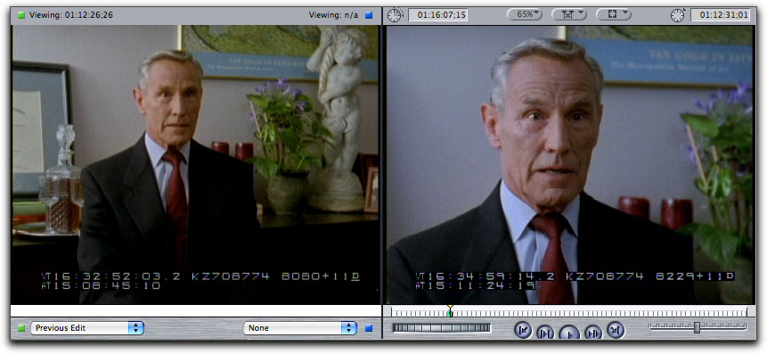
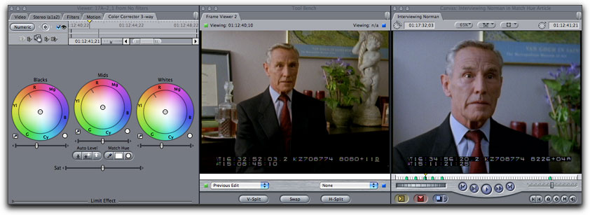
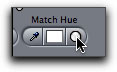
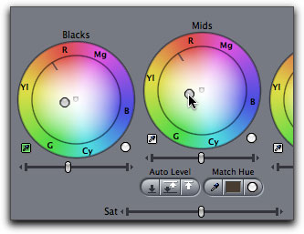
Match Hue isn't always going to work. It may not be able to sample a color well enough to use as a basis for correcting another shot. The example shown above is the best case scenario, when you have a color to sample that is "rich". The better the clarity of the sampled color, the better chances for a successful match. The colors we sampled in the previous examples were in the mid-range of the image, in other words, the colors weren't too bright or too dark. They also had a good level of saturation to accurately represent the color.

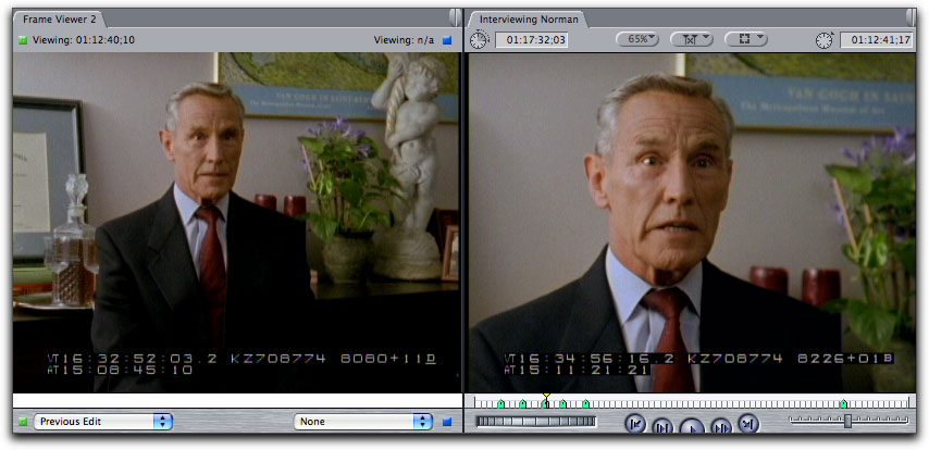
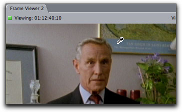
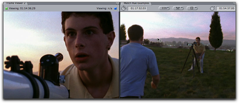
If the color is too dark, the results could be very different. Let's say that in the following example, the image on the left is the final/finished image, the wide shot on the right is the shot to be corrected. This scene can be matched, but its pushing the limits of Match Hue.

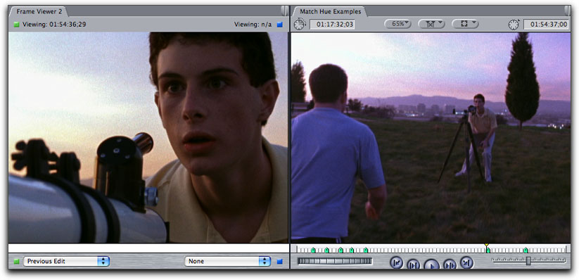
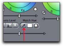
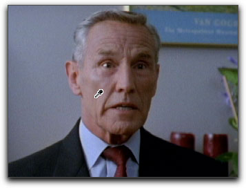
In this low key scene, there aren't many choices for a semi-bright color that's in both shots. The yellow shirt here may be the best choice. Because its in shadow in the wider shot, it would be best to click away from any part of the shirt in the close up that's in direct light. Once the shirt is clicked on, notice the results in the filter.

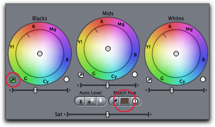
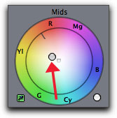
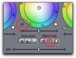
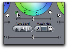
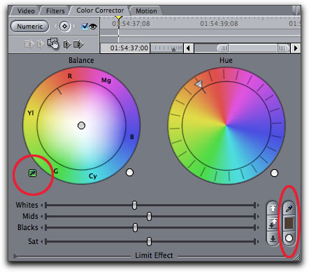
Notice that when sampling a dark color, aside from it being selected in the Match Hue section, this time the auto balance eyedropper that turns green is the one under the Blacks color wheel. This means that Match Hue will now perform by operating on the Blacks color wheel instead of the Mids color wheel.

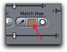
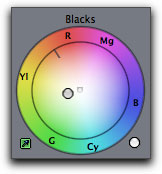
If we then click on the Blacks green apply eyedropper and click in the Canvas, we would be re-balancing the image based on the darkest part of the frame. Although it could color balance a good portion of the frame potentially, it could easily tint the blacks or deep shadows into an un-natural color, as shown next (I've amplified the result here a bit to be more easily visible in the article).

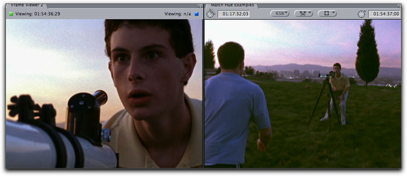
The result isn't too good for a couple of reasons. For one, although the image on the right is more yellow like the one on the left, it is not quite the right hue/shade of color. Additionally, because the Blacks color wheel was used to make the correction, we now have an un-natural tint in the shadows. Notice the clean, rich blacks in the image on the left, in the telescope and in the hair. On the image in the right, notice that the shadows have a yellow/green tint as you can see in the hair and the tree, not as pleasing as the close up.

Sampling and applying color from much darker colors would give worse results.

 
Working In The Mids

Instead, we want to try and apply our color correction to the Mids color wheel, even though its eyedropper isn't green when sampling a dark color. We generally want to make initial color adjustments in the Mids color wheel before possibly branching off into using the Blacks or Whites color wheels. The way the human eye perceives color in real life is similar to how a naturally photographed image appears. The darker a colored object, the less perceived color, and when its so dark that its considered black, it has no color at all. The same is true for white, we see less color the closer to white, and would want to perform color correction that is similar to how our eye expects to see it.

If we use the Mids color wheel, we'll adjust the majority of the frame except the darkest shadows and brightest highlights, hopefully leaving the whites and blacks as clean/neutral shades.

With this in mind, there are two ways we can take this darker sampled color and use it as a basis for correcting the wide shot.

1. Reproduce the effect manually using the Mids.

In the previous example, using the green apply eyedropper under the Blacks color wheel produced a color correction dialed toward yellow.

Grab the Mids balance indicator and drag it in a similar fashion to what was auto-corrected in the Blacks wheel.

Next, reset the Blacks color wheel back to the center of its wheel. The end result on the image is one that better matches the close up, still with a warmish color, but this time the blacks of the wide shot are clean and without tint.

2. Use another filter, the Color Corrector filter, to make the color match instead.

The Color Corrector handles color balancing differently than the Color Corrector 3 Way filter, and is sometimes a better choice when trying to match two dark colors. You can delete the Color Corrector 3 Way filter from the clip, then go to the Effects menu > Video Filters > Color Correction > Color Corrector. In the Viewer click on the Color Corrector tab to bring it to the front.

Notice that Match Hue controls are already set up (turned on) on this filter. As mentioned before, it's a global setting, so its on in every filter until it is reset. Since there is only one color balance wheel in this filter, then the green apply eyedropper under it is active for Match Hue by default.

This single color balance wheel is good for balancing a scene based on a dark color because its control is active on all of the color in the frame except for the deepest shadows or blacks. This is similar but not quite the same to the Mids wheel in the Color Corrector 3 Way. With this filter, you can still add the needed coloring to the scene but keep from un-naturally tinting the shadows.

 
All in all, Match Hue is a great feature if you have a quality color to sample from. Its not going to be one-click color correction, but it could help get you going in the right direction when trying to create consistency from one image to another.

If you liked the article, I hope you check out the new color correction training disc I'm writing with Ripple Training, that will be out later this year. For more info, go to: rippletraining.com

Andrew Balis is a cinematographer, editor, post production consultant and Apple certified instructor teaching classes in Final Cut Pro to industry professionals at Moviola Education and UCLA. He is co-author of the Apple Pro Series book Advanced Editing Techniques in Final Cut Pro 4. Andrew co-authored the original Apple certified curriculum for beginner, advanced, and effects classes developed at Moviola Education, and wrote the Final Cut Pro curriculum for the Apple Education/CNN Video Journalism classes offered in the K-12 market.

Video footage examples from Interviewing Norman by Stolen Apple Productions. Other video footage is from No.11 by Mike Elkins.

[Top]

copyright © www.kenstone.net 2005

© 2000 -2005 Apple Computer, Inc. All rights reserved. Apple, the Apple logo, Final Cut Pro, Macintosh and Power Mac
are either registered trademarks or trademarks of Apple. Other company and product names may be trademarks of their respective owners.

All screen captures, images, and textual references are the property and trademark of their creators/owners/publishers.