White Paper DVX 100 May 24, 2004
Painting Images with the DVX-100
White Paper DVX 100 May 24, 2004
Painting Images with the DVX-100
By Dan Coplan
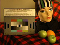
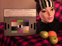
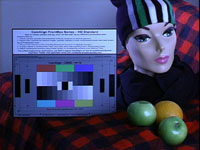
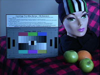
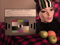
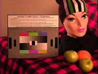
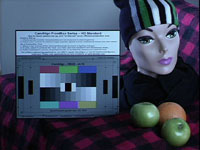
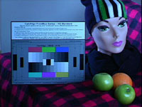
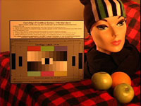
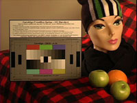
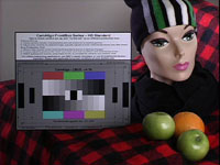
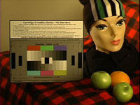
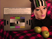
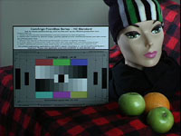
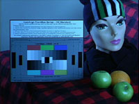
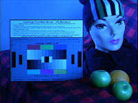
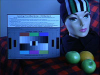
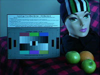
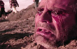
Painting Images with the DVX-100Chroma Temp affects the "warmth" or "coolness" of the image. For example, if you white balance the camera and the image has a blue color cast, adjusting the Chroma Temp towards "-7" (the lower limit of the control), will increasesingly balance out the blue as the image approaches neutral white. Increasing the control beyond neutral white will increasingly add orange warmth. The opposite is true for the other side of the scale. Chroma Phase shifts the overall color balance towards either magenta or green. A situation in which you might use this control is if you're shooting in fluorescent lighting and are having problems getting rid of the green color cast from the lights. By adjusting Chroma Phase towards "+7", increasing amounts of magenta will be added, neutralizing the unwanted green. These are great tools for the cinematographer. In addition to using them as correction aids, however, experimentation with these controls as a color palette with which to paint can bring new found creativity and character to your images. 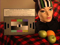 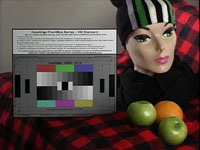 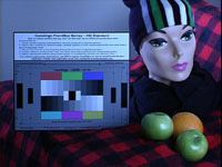 This scene was lit with tungsten lighting and the camera white balanced to the DSC chart in the scene*. The center image represents NORMAL. No correction was applied. The image on the left is TEMP -7. The image on the right is TEMP +7. Notice not only the change in color, but the feeling you get when looking at the images. Our model with the ski cap looks appropriately dressed for the "cold" scene on the right whereas she looks like she might start sweating bullets in the much warmer scene on the left. But that fruit looks awful tasty... 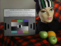 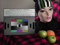  Chroma Phase was adjusted in this set of images. The image on the left is PHASE -7. The image on the right is PHASE +7. Notice the variety of interesting effects. In the left-hand image, the model's skin tone begins to take on a sallow complexion, yet the red in her lips, on the chart, and on the checkerboard blanket pop and become more saturated. As the phase is shifted/rotated towards green, the image travels through the warm region of the color wheel. Various elements, depending on their hue, are affected accordingly. The opposite holds true for the image on the right. While we may be inclined to think that shifting an image towards magenta would have a warming effect, the scene, while maintaining a degree of "rosiness", begins to take on a colder feel. Chroma Phase was adjusted in this set of images. The image on the left is PHASE -7. The image on the right is PHASE +7. Notice the variety of interesting effects. In the left-hand image, the model's skin tone begins to take on a sallow complexion, yet the red in her lips, on the chart, and on the checkerboard blanket pop and become more saturated. As the phase is shifted/rotated towards green, the image travels through the warm region of the color wheel. Various elements, depending on their hue, are affected accordingly. The opposite holds true for the image on the right. While we may be inclined to think that shifting an image towards magenta would have a warming effect, the scene, while maintaining a degree of "rosiness", begins to take on a colder feel.
The following images display what happens when you begin combining these various controls:
Chroma Level controls how much color is increased or reduced. Adding chroma level adds color saturation making images more vibrant. The downside is that colors begin to bleed or smear across pixels, particularly reds. Subtracting chroma level desaturates the image bringing it closer to grayscale and dulling the colors.
Now we're going to get a bit more experimental and really start to push these colors around. I talked briefly about setting your camera's white balance to neutral white and used my NORMAL scene as an example. There may be times when you don't want a neutral image, but rather are going for a warmer or colder feel. One way of doing this is to white balance your camera with colored gel in front of the lens. If you want a warmer image for example, placing a blue gel in front of the lens while you white balance will trick the camera into thinking that the white chart is blue. It will compensate by increasing red until it calculates proper white. Once white balanced, take the blue gel away and voila!, your scene will be warm. Varying intensities of gel as well as varying colors will affect how your camera compensates. The following images duplicate what we looked at previously, but this time based on new definitions of NORMAL:
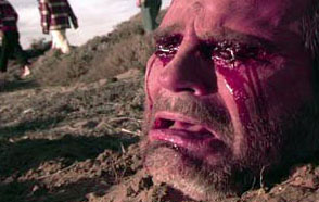
It's important not only to analyze the colors, but to pay attention to how image quality is affected. It's hard to tell with these images because they're small, but the more you push colors to their extremes, the more you compromise quality. I mentioned that red tends to smear. You can see in images with extreme reds that they look a little blotchy. On the other end of the spectrum, extreme blues will degrade the image because blue is the noisiest channel in the RGB signal. There are two methodologies to consider before you hit the record button. The first is to shoot everything neutral because then you have a clean image from which to manipulate to some degree in any direction in post. The second is to paint your images as described above, but lean them in the direction you want to go rather than going full out. By leaning your images in a certain direction, you instantly instill the feel you're going for and can leave as is, or if you want to take it further, you've already given your post process a step in the right direction and will reduce the amount of processing necessary. If you go too far, however, and decide later that you want to go the opposite way, you'll run into problems rectifying the color and likely introduce unwanted noise and artifacts into your scenes. The following images are from "Trespassers", a feature I recently finished shooting. The first image in each series was painted in-camera with no correction in post. The second image is a duplicate which I neutralized in post to show what the scene would have looked like had I not painted it.  
As should always be the case, experimentation and testing is in order before you shoot your final takes. Get creative. White balance to different colored gels. Use different colored light sources and see how those interact with the adjustments available in the camera. Most importantly, go out, be a Rembrandt, and have fun. * I highly recommend using DSC charts or DSC white cards from DSC Labs for white balancing the camera as they represent true white. The problem with white balancing cameras to white paper, t-shirts, walls, etc. is that often these items are not pure white and have a color cast to them that is hard to recognize with our eyes. The camera, however, reacts to these color casts and balances its white shading accordingly, giving an image that is tinted rather than neutral. Additionally, shooting a neutral chart (before painting) gives post a reference by which to match their system to the camera. Shooting the chart again after painting allows you to see not only how various colors and grayscale is affected, but allows you to accurately duplicate your look later whether in post or for pickup shots. Find out more about this at the DSC Labs website which has a wealth of great articles and info. |
|||||||||||||||||||||||||||||||||||||
© 2000 -2004 Apple
Computer, Inc. All rights reserved. Apple, the Apple logo, Final
Cut Pro, Macintosh and Power Mac
are either registered trademarks or trademarks of Apple. Other
company and product names may be trademarks of their respective
owners.
All screen captures, images, and textual references are the property and trademark of their creators/owners/publishers.