
The Basics - Titles with the DV Codec November 25, 2002
Great Titles with the DV Codec
By Philip Hodgetts
The Basics - Titles with the DV Codec November 25, 2002
Great Titles with the DV Codec
By Philip Hodgetts
OK,
realistically, they are going to be good titles. If you want great
quality then you will need to follow most of these guidelines
but NOT compress to the DV codec. The DV codec is not optimized
for text. It was designed for real-world images where images blend
together smoothly rather without hard lines. In this example see
how the edges blend together cross 2 or more pixels.

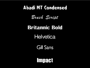
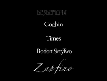
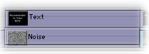
Font choice
San
Serif
Examples of Good Fonts
Examples of Bad Fonts
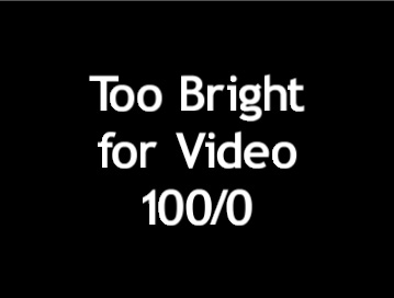
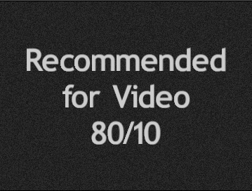
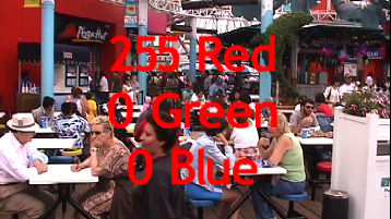
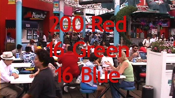
Color
& brightness
Legal
Color
Work
with the scopes
Color
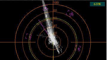
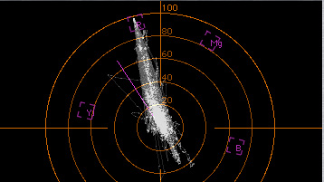
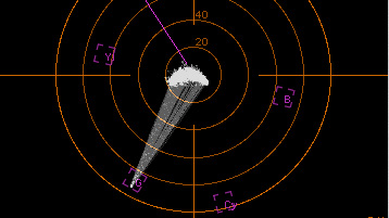
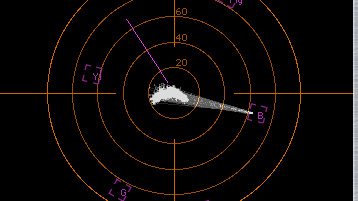

Rise
Times and Codecs
Text
can be overly sharp
DV
Codec does not like sharp, contrasty edges.
Whatever
you do ultimately it will be compressed to the output codec.
Pre-rendering
to uncompressed will not help and might make it worse.
All
the electronic factors that make the signal ring.
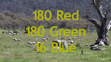
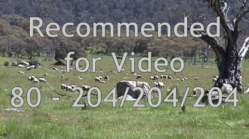
White
= 80%; Black = 6-10%
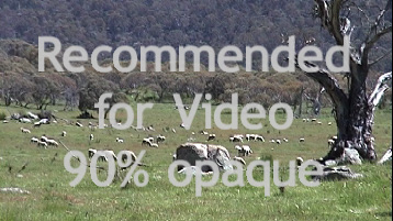
Reduce
opacity to 90%
Use
a Keyline
Prevents
color bleed
Provides
an interim color
Blur
Add
at least one pixel of mid-tone between black and white
Gaussian
Blur filter at .3
Philip Hodgetts is the author of the DV Companion 2 and co-developer of the Intelligent Assistance approach to "What you want to know, when you want to know, how you want to know." Philip has had his own video production company since 1980 and worked on everything from long form documentary to corporate video to national TV commercial (Australia) with a strong emphasis on education and training video production.
He fell in love with Non-Linear Editing the first day he saw an Avid MCXpress, and purchased a Media 100 in late 1994. His first exposure to Final Cut Pro was at NAB 1998 when the alpha version was on limited display and immediately recognised its potential. His first Final Cut Pro job was a TV commercial that was on air in PAL the week Final Cut Pro 1.0 was released. FCP 1.0 did not officially support PAL.
His current major project (apart from updating the DV Companion, extending the Companion concept to other software and building a new website) is editing a long form documentary with 40 hours of source tapes in Final Cut Pro across the Pacific. Editing in LA with a Producer making revisions in Sydney by sending Project files by email.
You can purchase DV Companion by clicking HERE NOTE: lafcpug gets a small percentage of sale
Copyright 2002 Intelligent Assistance, Inc and Philip Hodgetts