Software Review - Synthetic Aperture's Color Finesse December 16, 2002
Synthetic Aperture's Color Finesse v1.0.4
by Synthetic Aperture - www.synthetic-ap.comReview by Marco Solorio
Marco Solorio
OneRiver Media
Concord, California, USA
www.onerivermedia.com
Article, photos and images © 2002, Marco Solorio
November, 2002
Article Focus:
Don't have the hundreds of thousands of dollars for a DaVinci color-correction system? But you do have After Effects? In a jaw-dropping review of Synthetic Aperture's 'Color Finesse,' Marco Solorio shows how Color Finesse far surpasses the capabilities of standard color correction tools -- as well as the error-prone realities of using standard color correction plug-ins. The differences are shocking! Note: this is NOT an article on how to color correct (although some of the principles are explored in the article and there is much to be learned here).
WARNING! THIS ARTICLE REQUIRES HIGH RESOLUTION IMAGES
FOR COMPARISON PURPOSES RESULTING IN LONG DOWNLOAD TIMES!
Okay, let's cut to the chase... the Color Finesse plugin by Synthetic Aperture is by far the best color correction tool available for post production, save a DaVinci color suite costing a few hundred grand. Instead of writing an article review explaining the merits of such a fine product Color Finesse is, I will otherwise try to convince you that the current crop of color correcting/effect tools available today are junk and without this tool, you're missing out on superior color correction quality available in software form.
The best example I can use for relating Color Finesse to standard color correction/effect tools is by the following example. You know those great sounding speakers you can buy at the local audio/video/computer store? Lots of bass and bright highs with a lot of color? So why don't recording studios use these speakers? Because they're totally inaccurate! If you measure the frequency response of the speaker's output, you'll get a graph that's something akin to the Swiss Alps. Standard color correction tools are the same way. Totally inaccurate! View the results on a waveform monitor and you'll see a mix of clipping, noise gain, rounding errors, RGB gain, contrast gain, saturation gain, banding and some times errors so profound they actually create errors in the places they were supposed to fix! With Color Finesse, you're using a tool that is scientifically accurate, resulting in a natural, lifelike results.
Just like the inaccurate audio speakers you can buy at the store that boost specific audio frequencies to make them appear as if they sound good, so is the same with standard color correction tools. When using a standard brightness tool in Adobe After Effects for example, the result adds RGB gain to make it appear it's really bright, when in fact it's adding contrast and clipping for the illusion of brightness. Nothing too accurate about that!
About Color Finesse
Although packaged as a plugin, Color Finesse is really an application unto itself. When used in Adobe After Effects for example, it loads the Color Finesse application up in memory and keeps it memory (user definable of course). Instead of a cheesy little palette full of sliders and buttons, Color Finesse opens up its own full-screen graphical user interface (GUI). The interface is clear and understandable with oodles of visual feedback and options. It's very easy to quickly become comfortable with the interface and remember where things are.
The biggest feature of this product for me is its incredible resolution for processing. Its 32-bit per component processing makes it a 96-bit plugin! Wow! Working in 16-bit mode in After Effects is simply awesome. But more on that in a bit (pun intended). Many standard color correction tools give you options to work in HSL and RGB, but Color Finesse goes a step further and allows you to also work in CMY (Cyan, Magenta, Yellow) and also YCbCr (the digital equivalent of analog YUV). A plethora of scopes, waveforms, histograms and other displays gives you full monitoring of your color correction actions. And of course, there's the in-depth control of the color correction tools themselves. Everything from a single channel having many controls, to global settings allowing for automatic control. This is the real deal.
Comparing Color Finesse with standard color correction tools
In order for me to see how well Color Finesse compares and differs from the general color correction tools found in the likes of After Effects and Final Cut Pro, I used similar footage and did A/B comparisons with similar settings between the two. Color Finesse will do anything any other color correction tool has to offer. But it can go so much deeper with so much more control and accuracy. Let me discuss some of the simple tools and how they compare before getting deeper into the plugin.
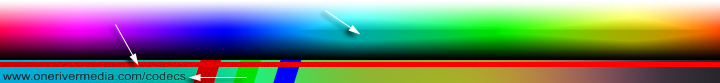
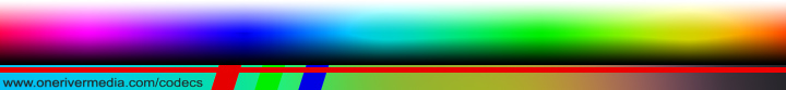
For some technical evaluations, I also used my 16-bit test image I use to test codecs with. The test image reveals a ton of information about these plugins. You can download my test image at my codec comparison site to perform tests on your own. The file is in lossless SuperPNG format.
Saturation
Adobe After Effects allows you to set the saturation of the Hue/Saturation plugin as far as 100. Stacking or doubling the plugin has no effect. With Color Finesse, I can slide the Master saturation value up to 300 (keeping in mind that 100 is the default neutral value). I can manually type in a maximum value of 1000. The biggest difference is that the standard AE plugin seems to add some contrast in the image with little accuracy in actually saturating the hues. Color Finesse on the other hand gives me more realistic and natural saturation amplification. It looks less "digital" and more lifelike. Interestingly, the standard AE plugin banded in 8-bit mode at 100% saturation and was "fine" in 16-bit mode (note the excessive green hues -- easier to view on a Macintosh gamma monitor). The Color Finesse plugin on the other hand gives me 99% of the same visual cleanliness in 8-bit mode from 16-bit mode with my test image. In fact, some tests showed no visual difference between Color Finesse's 8-bit and 16-bit testing because it always processes in 32-bit per component. Never once did Color Finesse ever give me poor results like standard plugins can when really pushing the limits to their extreme in 8-bit mode. Color Finesse really shined nicely in natural, real-world clips when pushing saturation.
Original source image (portion of full-size test image)
Adobe After Effects Saturation at 100% at 8-bit (note the banding)
Adobe After Effects Saturation at 100% at 16-bit
Color Finesse HSL Saturation at 300 at 16-bit
Color Finesse HSL Saturation at 1000 at 16-bit
So this makes things very interesting to think about. If you work in 8-bit mode and want to guard against banding when really pushing color controls, use Color Finesse to make sure you don't band. If you do work in 16-bit mode in AE, you'll need to use 16-bit compliant plugins to make sure your image doesn't bottleneck to 8-bit resolution. However, not all standard AE plugins are 16-bit compliant (like the AE Broadcast Colors plugin), so you'll again need to utilize Color Finesse to maintain quality. As you can see, Color Finesse already shows how it's the missing link to your post production workflow!
One of the interesting tricks with the Saturation tool is how the values work. The default value is 100 as this does nothing to the image. One would think that "zero" would be the best default number for a neutral position. -100 for desaturation, zero for default and +100 for amplified saturation. You'll soon realize this is NOT the correct way of working with true saturation. Read on.
Increase the number past 100 and you'll saturate the image. Decrease the number from 100 to 0 and you desaturate the image, where zero is a total grayscale image. Now slide the image even more to the left, past zero and you get a negative value. This negative value will slowly invert the colors and add saturation to that inversion! At a value of -100 you have a perfectly inverted image from the default 100 value. Now if you go past -100 (to say -200), you then add additional saturation just like you did above 100 (to say 200). When playing with the Saturation slider and watching the RGB Parade Histogram at the same time, this begins to TOTALLY makes sense, yet no other "saturation" tools do this.
Brightness
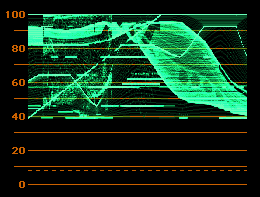
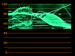
Yuck! The standard AE Brightness/Contrast plugin does a horrible job of this simple procedure! Once again, the AE plugin adds contrast to the image at 100% brightness. In fact, it appears to add RGB Gain, which "helps" it to make it appear brighter, when in fact it's dead wrong and inaccurate! Color Finesse is silky smooth with no hard contrasts between colors at 100% brightness on the Master setting. The AE plugin is so bad in fact that it actually introduced aliasing on some edges (bottom arrow) where Color Finesse did nothing of the kind. You can see where the RGB gain clipping blows out the highlights (left arrow) causing unnecessary contrast errors. The right arrow also shows the mid point in which the contrast errors occur. You can see this hard-edge line from left to right in the image (humps up in the blue area). You can also see the ugly aliasing in the URL text of the image. I'll never use the standard AE Brightness/Contrast plugin ever again!
Adobe After Effects "Brightness & Contrast" plugin at 100% at 16-bit
Color Finesse HSL Brightness at 100% at 8-bit or 16-bit
Left: Error-prone AE brightness with clipping everywhere. Right: Smooth Color Finesse result with no clipping.
Contrast
Although contrasting between the standard AE Brightness/Contrast controls and the Color Finesse controls showed similar results, it was Color Finesse that had a more "softer" approach to the task at hand. This again gives a more natural and lifelike feel to the affected image. However, if you really want that cartoon cel-like contrast appearance with hard edges, you can use optional controls in Color Finesse to achieve this goal with finite detail. You can even assign the mid-point of the contrast change. The amount of control is truly amazing.Final Cut Pro 3-Way Color Corrector vs. Color Finesse
Final Cut Pro's 3-way color corrector is actually a good tool. One major limitation of course is that it's limited to 8-bit processing. I can induce banding or aliasing with the FCP 3-way CC tool on extreme tests. Color Finesse of course does not band nor alias in the same examples. And as always, I have much more control of my accuracies. There is one major draw back to Color Finesse in FCP though... It only works in OS9 for now. This is actually a fault of Apple since they decided to not support Adobe After Effects compatible plugins in Final Cut Pro for OSX. So the work around is either use standard color correction tools within FCP at 8-bit processing, or run FCP in OS9 to use Color Finesse or export your edit out of FCP using Automatic Duck and import it in AE for color treatment there. If you want the most accurate color correction, then the temporary hassle will be worth the effort.
Unique Tools in Color Finesse
We've just sampled some of the simplicities of Color Finesse. When we look at the HSL controls, we can globally change the settings to affect the image. But going a step further, we can also adjust the following settings in each of the Highlights, Midtones and Shadows tabs. They include: Hue, Saturation, Brightness, Contrast, Contrast Center, RGB Gain, Gamma and Pedestal. The first four main image control sections, including HSL, RGB, CMY and YCbCr work this way. In other words, they have a global Master setting for color control, as well as individual Highlights, Midtones and Shadows sub control. This truly is the ultimate in finite precision.
Lets move down to the Curves pane. The Curves main image control section works a little like the first four main sections, in that you have a global master setting with additional component settings. In this case, you have a Master curve as well as a Red, Green and Blue curve (as opposed to a Master, Highlights, Midtones and Shadows setting). Each curve can have multiple spline-like points. You also have the option for eye-dropper control in black-point, gray-point and white-point values. You can even save your multi-curve data as a file to use on other clips. The only thing I don't like about the Curves section is that the I/O values for each point doesn't infinitely display in the feedback information. You must also click on a point of choice to get the I/O value if it disappears. This of course doesn't affect the image in any way, but continuous numerical value feedback is always nice.
The Levels section isn't anything new to users, but the way Color Finesse implements it is easier to interact with. This actually functions very much like the "Levels (Individual Controls)" plugin in AE. You have individual levels for Master, Red, Green and Blue (although no alpha channel control like the AE plugin). Each level has controls and dynamic histograms for both the input and output results. Simple, effective, accurate.
More than just a color corrector, but color creativity
Because there's so much color control with Color Finesse, you can actually use this plugin to perform some cool stunts. Let's look at the basic functionality of the Secondary section. To understand what secondary color correction is (as compared to primary color correction), let's imagine we have a shot of a talking head in front of a lake, but the white balance is off (giving us an image too yellow) with an overall dark appearance. With primary color correction, we fix the yellow cast to a more natural state as well as the brightness issue. For added effect, we also improve the saturation and contrast a bit too. Great, so the overall image looks nice. Except let's say the lake in the background is green due to toxic pollution and it's still green in both the raw video shot and the primary color corrected shot. We want to turn that green lake into a blue lake. Now we can move on to secondary color correction.The Secondary section can hold up to six individual banks (A-F) or "channels" as Color Finesse calls it. Each channel can eye-drop up to four color-points which is useful for keying in on a gradient-like color. This functions much like a chroma-keyer actually. You pick the color with one of four eye-dropper tools, apply your Chroma and Luma Tolerances, your Softness value and then apply your color effect to the selected color area. And remember, you have six, full channels to use this on.
Okay so now we want to turn our naturally green lake to blue. You simply dial in the green hues with the eye-dropper(s), apply your tolerances and shift your hue from green to blue. Maybe even add a bit of saturation to give it that Maui look.
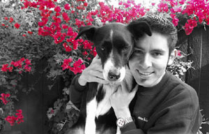
Here's a quick, creative example when using the Secondary section all by itself. Remember the movie Pleasantville where everything in the 1950's was black and white footage and as the story progressed, items in the scenes were given color? You can do the same thing with Color Finesse given the right conditions. I've used the image below as an example, although I don't think my dog enjoyed taking the picture with me (she's usually quite smiley). For the example I'll desaturate the image to grayscale and only make the red flowers appear in color (like what was shown in the movie).
Sample the red hue(s) from the flowers with the eye-dropper tool. One or two samples should do it. Click Preview. You'll instantly see the Pleasantville effect. Adjust your tolerances and softness for more accuracy. Make sure you keep the Preview button checked and click OK. If you change any other settings within Color Finesse, you'll need to go back to the Secondary section and click Preview again. Then render away.
Left: Original image with no effect. Right: Using the CF "Preview" button as a creative tool. Obviously the Preview button is to dial in your eye-dropper values and after you've done so you simply turn off the Preview and perform your color effects (like a hue shift from green water to Maui blue water). But using the Preview button can be a creative tool on its own!
Other tricks like turning a day shot into a night shot is easily done in Color Finesse and with no degradation to the image like pixelation or banding.
Color Finesse as a film stock emulator? That's crazy talk!
I actually found this out by accident while poking around the Color Finesse folder looking for something else! Apply Color Finesse to your video clip of choice. Once you're in the Color Finesse interface, click Load and go the the folder that holds the actual Color Finesse application (not the "SA Color Finesse AE" plugin found in your AE plugins folder). Open the "Color Finesse Presets" folder, then the "35mm Filmstocks" folder. There you will find twelve presets for various film stock.I went through all twelve of them and realized, "hey, this makes sense!" The reason for my excitement is because video has a linear level curve to it, where film has more of an "S" shape to it, meaning it gradually tapers from the bottom to the mid section, then gradually tapers off to the upper section. The RGB curves of the stock film presets did this as well, which is why it made sense to me. About half of the presets also included slight desaturation in the HSL settings, but not by much. These film stock presets were a lot of fun to play with and my favorite (with the type of clip I was playing with) was the Eastman 5298 EXR 500T preset. Obviously these film stock presets only work as good as the video shot, so don't think this is an auto-film-plugin. But it does yield favorable results. I'm just waiting for the "Saving Private Ryan" film stock preset. The "Puff Daddy" (or is it "P-Diddy" now?) film stock would be fun too with 50 stops, gray and black levels crushed to -5000 IRE and bright levels shot up to 12,000 IRE. But I digress.
Some of the film stock presets include:
- Eastman 5222 Double-X B&W
- Eastman 5231 Plus-X B&W
- Eastman 5245 EXR 50D
- Eastman 5248 EXR 100T
- Eastman 5293 EXR 200T
- Eastman 5298 EXR 500T (my personal favorite)
- Kodak 5246 Vision 250D
- Kodak 5247 Vision 200T
- Kodak 5277 Vision 320T
- Kodak 5279 500T (I also really liked this one)
- Kodak 5620 Primetime 640T
- Kodak SFX 200T
And after previewing all the film stock presets, I played around with my own "film" preset in which I called, "High Contrast Blue Metal". It took me all of about 5 minutes to create. I beefed up the RGB color curve a bit (mostly the Blue curve and clipped the bottom-left blue curve point to 30,0), desaturated the Master, Highlights and Shadows, saturated the Midtones, boosted the Master Contrast, decreased the Master Contrast Center and RGB Gain, added a bit of blue in the Shadow Hue Offset color wheel, added a tiny bit of boost to the skin tones in the Midtones and Highlights Hue Offset color wheel (nothing to the Master color wheel), added some RGB Midtone Blue Gamma, and finally used the Secondary color corrector to use four eye-dropper samples on skin tone values and increased the saturation to those skin tone samples. Eek!
Okay, sounds like a big mess, but with all these controls, one can go crazy! I wanted to create a cold, metallic-like effect with high contrast, crushed blacks (including very dark blue values, hence the clipped blue RGB curve) but with the ability to also preserve skin tones (but not to over saturate and create unbalance). The light and dark areas are sightly more desaturated than the other areas. The result is actually quite pleasing... and with no additional noise, clipping or banding! I also ran my preset through my main RGB test image which gave me far better results than I expected (little pat on my back). The image didn't look like it simply had a digital "blue filter" through it or a problem with white balance, but rather something that appears more natural and realistic (pat on Synthetic Aperture's back).
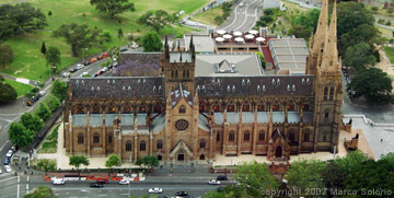
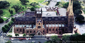
I initially used my 5-minute film stock with people in the image. I imported an image of a building (as pictured below) and the plugin worked great on it too (to my amazement once again). The reds are technically less saturated with the film effect and yet they add "pop" or separation from the rest of the image. When comparing the two on my NTSC monitor, the film effect is really cool. The small images below don't do it justice.
The left image is raw with nothing applied to it. The right image has my 5-minute film stock preset.
(Note that Windows monitor gamma appears darker in shadows than on Macintosh monitor gamma)Some other Color Finesse presets include:
- Day for Night 1
- Faded Color Neg 1
- Sepia 1 (very accurate with good use of the Hue Offset color wheels)
Visual eye candy galore
Obviously Color Finesse packs a punch with all of its color correction tools. But what's a tool if it doesn't have a visual way to measure its interactivity? You get a total of seven different ways to get feedback from your color corrections in the area known as the Analysis Window. Four of the seven can be viewed at once in a 4-up Combo View. The seven displays include, Luma WFM (Wave Form Monitor), YC WFM, RGB WFM, YCbCr WFM, Vectorscope, Histograms and Level Curves. What's cool too is that you're not limited to the "green" feedback display of old. You have the option of standard green as well as full color feedback display in both the WFMs and the Vectorscopes. In software form, this is equal to the best hardware based waveform vectorscope money could buy... and the display will never get soft! You also have optional settings to calibrate Color Finesse to your needs, including NTSC, PAL or ATSC, Video Level Coding (of 8-bit) to 0-255 or 16-235, option to select your black having 7.5% IRE setup and to calibrate the vectorscope to 100% color bars. Very nice indeed.Using the YCbCr WFM and the accompanying YCbCr pane, I had some fun playing with 4:4:4, 4:2:2, 4:1:1 and 4:2:0 clips and their associated component values. Using the Gain slider, you can decrease (or increase) each component value (Y, Cb or Cr) for the clip. For example, by importing in a 4:2:2 clip and adjusting the luma/grayscale (Y) Gain slider to zero, you create an image with no luma value but full color values (as found in the Cb and Cr components). You begin to see how the component values work in these compressed color space formats. In reality though, the YCbCr pane is a very useful tool for people working with video because, for example, you can adjust values in only the luma component (Y) without affecting the other two color components (Cb and Cr). However, this wouldn't be the best tool to use if you're color correcting with film as your master output format. Using the RGB and/or CMY pane would otherwise be better suited for film users for similar color correction options.
To compliment Color Finesse's array of technical visual feedback of waveforms and vectorscopes, the interface also has several forms of viewing and comparing your actual image. The default (and most used) display is the Result image,
The really cool display is the Split Source function where you have controllable points in which to split the image in any possible variation. One half of the image is pre-effect and the other half is post-effect. In the image to the right, you can see the Split Source view in action where the left portion of the image is low in contrast with a brownish cast and the right portion is color corrected. Very handy.
You also get a Luma display to help you quickly see which part of the image is getting affected when using any of the Highlights, Midtones and Shadows controls. For instance, if you use the Shadows tab within the HSL pane, you will be affecting the black areas of the Luma display. To further fine tune the ratio between highlights, midtones and shadow areas, use the Luma Range pane to dial this in. Need more dark areas of the image to be affected by the Shadow pane? Simply move the left curve's control point anywhere north or east from its original point-position or a combination therein (north east). It's all about accurate control with precise feedback monitoring!
A neat feature of Color Finesse is its Reference feature in which you compare your color corrected clip with other clips in your project. This is very helpful when you need to target the colors of your current clip to that of other clips in your project. Color Finesse even has a desktop-like built in interface (within the Color Finesse interface) to navigate your reference clips. This is great when you have a multi-camera shoot and one of your cameras wasn't calibrated to the other cameras. Simply color correct and compare your uncalibrated camera shot to your other calibrated camera shots. Very slick.
And because you can save all your Color Finesse settings as one, global file, you can simply correct one shot and apply those settings to all your other shots later on without having to manually input all the parameters. To simplify things even further, you can color correct your clip, hit OK, copy the "SA Color Finesse" plugin from the Effect Controls window in AE and then proceed to paste the Color Finesse plugin with all its settings to all your other clips! Now that's easy!
My favorite tool of all
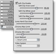
I've saved the Limiting pane for last because it's my favorite tool to use in Color Finesse. As a 10-bit uncompressed user for CGI, animation and other visual effects projects, there's no better way to make my renders meet the legal maximums of NTSC broadcast safety. Working in After Effects, you have the "Broadcast Colors" plugin. There's only one major problem with this plugin. The geniuses at Adobe only made it for 8-bit! So if you have a 10-bit clip and you need to run it through color safety by means of the Adobe 8-bit filter, you've successfully converted your 10-bit clip to an 8-bit clip (or a 16-bit comp to an 8-bit comp). With Color Finesse, you maintain your 10-bit, 12-bit or 16-bit clip (or comp) when legalizing color safety. And like Color Finesse's other color controls, the Limiting pane gives you a wide realm of clipping/limiting controls for optimum broadcast safety meeting your exact requirements.I compared the After Effects "Broadcast Colors" plugin against Color Finesse and as usual, Color Finesse shinned with flying colors. In fact, the AE "Broadcast Colors" plugin was so bad that the cyan and yellow hues actually produced an ugly result (error clipping) in my test image (shown in the image below with the arrow on top)... the area in which the plugin is supposed to cure the blown out colors! The red line with pixelation is a 16-bit ramp, created for codec testing, but more powerful here in color correction testing. The bottom arrow shows adverse contrasting in the text. Elsewhere in the image (cropped out) shows other contrasting errors. The results are quite astonishing to say the least, especially when you think a standard AE plugin is supposed to help your hot colors, not make them ugly!
Adobe After Effects "Broadcast Colors" plugin using "Reduce Luminance" at 16-bit
Color Finesse Limiting pane using Luminance safety at 8-bit or 16-bitFor my animation work, this is essential because I work in full (0-255) RGB color space where cyan and yellow hues will automatically get blown out first when introduced to NTSC. After the cyan and yellow hues come the nasty red hues and so forth. Oh and let's not forget about luma values... are your white values too hot? It's imperative that a visual effects artist working (and generating from scratch) in pure RGB color space understand the concept of legal broadcast NTSC/PAL color limitations and work in accordance within those rules. If not, you'll get yelled at somewhere in the pipeline!
Limiting may not be needed if you're final output is component video playback, film, digital output, web streaming, etc., but if your output goes to broadcast television or composite signal, then you'll need to follow the rules. Better safe than sorry!
So What's Not To Like? As much as I LOVE this plugin, there are a few set backs. The biggest one so far is that there isn't a Windows version of this plugin. Hopefully one will come soon as I can only image a huge increase in sales would be a welcomed sight for Synthetic Aperture! Sources say a Windows version will possibly be released sometime in early 2003.
There's also no support for Color Finesse in Final Cut Pro 3 under OSX. This is not a fault of Synthetic Aperture, but a fault of Apple for not implementing standard Adobe After Effect plugin types into FCP 3 for OSX. Apple says it should be implemented in the next release... whether that's a point-release to FCP 3 or in the next FCP 4 release is a secret they're keeping to themselves for now. So once again, the work around is either use standard color correction tools within FCP at 8-bit processing, or run FCP in OS9 to use Color Finesse or export your edit out of FCP using Automatic Duck and import it in AE for color treatment there.
A note about Color Finess image mirroring to NTSC/PAL output. I have both an AJA Kona SD and Aurora Igniter Film uncompressed NLE systems in my suites. Both these systems can give me NTSC/PAL output from applications like Photoshop and After Effects. AJA Kona SD goes a step further with real-time RAM playback and real-time comp window mirroring. The only problem is my capture cards don't recognize Color Finesse as an application for mirrored output. However, Color Finesse does support EchoFire output to NTSC/PAL output, which is a software utility that enables programs like Photoshop to output the image to hardware that doesn't support RGB output from the desktop by itself (like Pinnacle Cinewave). And guess who makes EchoFire? Yup, you guessed it... Synthetic Aperture. Hmm, a conspiracy theory here? Okay, no conspiracy theories actually. Hardware developers would have to write drivers for their capture cards to work with applications like Color Finesse, but Synthetic Aperture has done this work for them with EchoFire. So this can either be viewed as, "cool deal" because this mean a way to mirror out to NTSC/PAL via any capture card, but can also be viewed as, "bum deal" because hardware that can already mirror out to NTSC/PAL in other apps will need to buy the extra EchoFire software to make it work in Color Finesse. It sounds like a possible Color Finesse point-update will soon be released to support the latest EchoFire OSX release (EchoFire on OS9 with Color Finesse on OS9 currently function).
I also don't like the fact that you cannot scrub the video in the Image Window. A little QuickTime scrub slider would be a cool addition to this interface. Until then, you have to exit the plugin, click to a different location in the timeline and go back into the plugin again. Not too big of a deal really because one frame of the clip should do the job of representing the entire clip... but still! According to Synthetic Aperture, this is a limitation within After Effects. They're hopeful a resolution will pend in a new AE release.
As for alpha channel support, it sounds like there's quite a large request for it. This would also mean some slight reconfiguring of the interface to accommodate the extra real estate for the added channel. But it does sound like Synthetic Aperture wants it supported, so I'm sure we'll see it in a future upgrade.
And finally, it sounds like numerical values will be added in the Levels pane in the next point-update.
A 1.1 version update sounds like it's in the works and should be released in the near future. Some of the above issues will be fixed in the upgrade. The 1.1 upgrade for current 1.0 users will be free.
The Bottom Line If you don't already own Synthetic Aperture's Color Finesse, you're grossly missing out. Not only in preserving your high quality imagery, but by abstaining from regurgitated ugliness other standard color correction tools present you with. I cannot begin to tell you how important this plugin is if you want to maintain the upmost standard in quality control and natural visual beauty. This is easily one of the "top ten plugins required in your do-or-die plugin toolset". I'd give the plugin a perfect 5, but because it's not yet on Windows and it doesn't support clip scrubbing, I have to be honest and give it a 4.5 rating. Besides those two factors, the plugin is in fact a perfect 5 rating.
Download the software demo, try it out and you'll see how important this tool is. If you don't see how important it is, then you either haven't tested it long enough, or aren't comparing it to the standard batch of color correction tools that are available to you. In a nutshell, nothing comes anywhere close to the quality, accuracy and control that Color Finesse brings you. Hell will freeze over before I ever use any other color correction tool again. And if hell does freeze over, I'll use Color Finesse to turn the blue freeze back to red fire... in 32-bit no less.
Pros: Incredibly accurate 32-bit processor. Supports 16-bit AE projects. Results are accurate thus lifelike and natural. Vast amount of control and visual feedback with sub-level control (including controls on how the controls function). Works in RGB, HSL, YCbCr and CMY color spaces. Resolution independent. Optimized for multiple processors and AltiVec vector instructions. Can work with EchoFire for NTSC/PAL output from interface to hardware that doesn't support desktop mirroring. Cons: Not on Windows yet. No clip scrubbing capability. No alpha channel support (yet). Requires EchoFire for NTSC/PAL output from interface even if your hardware does support desktop mirroring, but better than nothing.
I give it 4.5 COWs
Price as tested:
Color Finesse - Web Delivery $575.00
Color Finesse - CD-ROM $595.00EchoFire - Web Delivery $255.00
EchoFire - CD-ROM $275.00Color Finesse / Echo Fire Bundle - CD-ROM $770.00 (Reg. $870)
Links: Synthetic Aperture - www.synthetic-ap.com
Marco Solorio is a multi-award winning digital media producer in the San Francisco bay area. He owns and operates OneRiver Media, which focuses on producing animated content for broadcast, as well as serving production needs for content developers. And of course, The Powerpuff Girls is his second most favorite cartoon in the world.
Article, photos and images © 2002, Marco Solorio