January 7, 2008
By Ken Stone
When we think about color correcting or color grading as it is often called, we are talking about changing any number of color and luminance attributes of our video. We can adjust for incorrect lighting, or improper color casts, create different styles or looks, adjust contrast, and alter the luminance of the video. Clips shot at different times, locations or cameras may need to be color matched. Basically speaking, we are talking about doing 'primary color correction' to achieve our color goals. There will be times when we need to correct or modify parts of the image but not the entire frame. We will want to target certain aspects of the image (color and luminance) while leaving other parts unaffected. This process is often referred to as 'secondary color correction'. We can create customized shapes or mattes, and then apply our grading to just parts of the frame, which can create some interesting effects.
In Final Cut Pro we are provided with a bin full of a variety of mattes that enable us to select different parts of the image for manipulation (garbage mattes, mask shape, etc). The mattes in FCP do the job, but if more than one matte needs to be applied, the process can quickly become limited and cumbersome. This is because FCP is an editing application with matting and color correction abilities. When Apple shipped Final Cut Studio 2, they included a new application in the suite called Color, formally know as 'Final Touch'. Color is not an editing application, it is a color grading application and because of this, matting abilities are not an extra feature but rather part of the structure of Color and as such, are fully integrated, extremely powerful and actually rather easy to use. In FCP we called these tools mattes, in Color they are called "Vignettes".
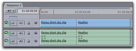
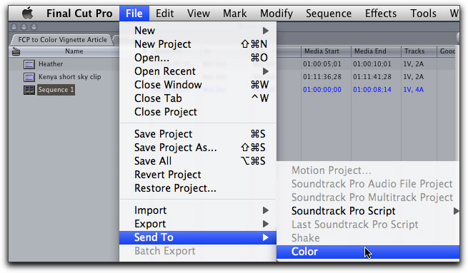
When we are ready to move clips from FCP to Color, we will use 'Send to Color'. When sending to Color, FCP will send the open or selected sequence. It is not possible to send just selected clips from the FCP timeline. Most often, sending the entire sequence is what we want. But, if you just have a few clips to work on, you can add those clips to a new sequence and then send that to Color, which is what I have done in this article.
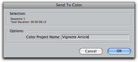
The 'Send to Color' dialog box will open and you will name and save your new Color project. The Color project file will be saved to the default location of; User's Home Directory > Documents > Color Documents.
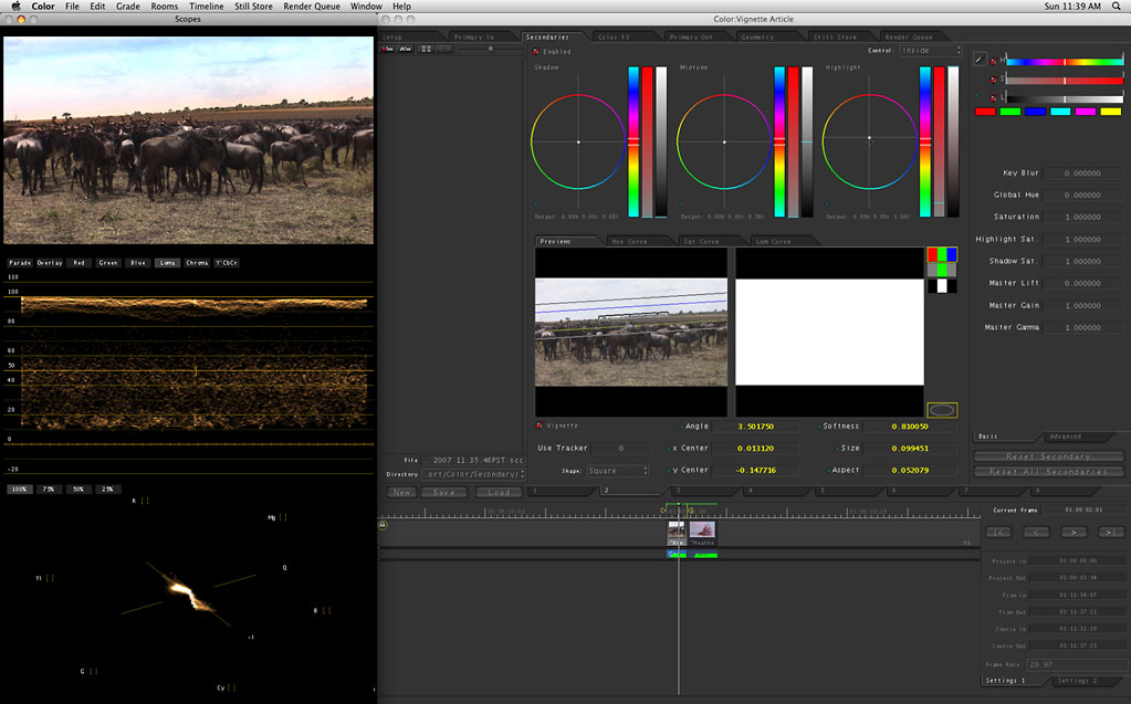
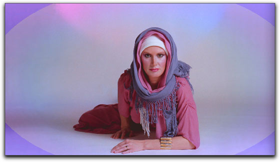
Note: because the Color interface fills the entire monitor screen, for this article, I will display just the section of the Color interface that we are working with. This way, the screen shots will not need to be reduced in size and will maintain legibility. Here is the full Color interface in all its glory.
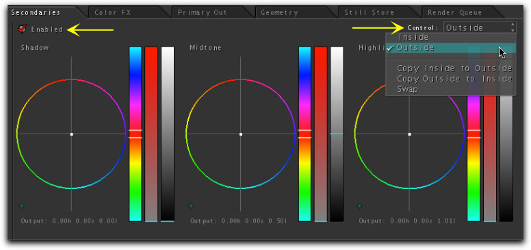
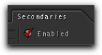
Setting up the Secondaries Room
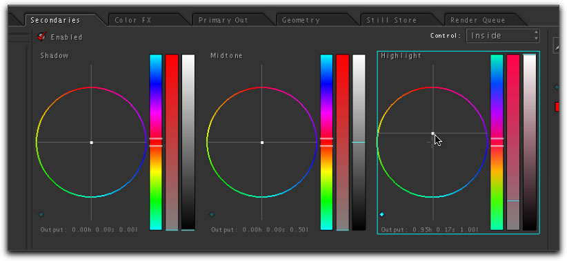
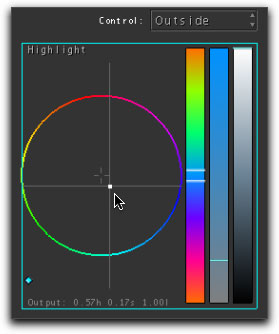
When Color launches, it will open up in the 'Setup' room. All the tabs in the Color interface are referred to as rooms, and we can navigate to different tabs or rooms for different controls. Click on the Secondaries Room tab as this is where we'll do our vignetting work. Just below the Secondaries tab is an 'Enable' button, which is an on/off checkbox for any effects created in this room. You must turn this on in order to work in the Secondaries room, otherwise you will not be able to see any changes you make. You will need to check the 'Enable' button in each sub-room you enter. On the right is the 'Control' drop-down menu. This menu allows you to choose which area of your selection your changes will be applied to, either inside or outside your selected area. In addition, you can apply effects to the inside and then switch the Control setting and apply different effects to the outside. If you forgot to set this properly when you started working, change it to the correct setting and then choose 'Swap', which will switch your effects to the new correct setting.
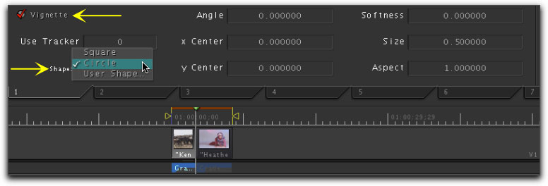
Enable Vignettes
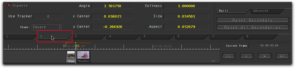
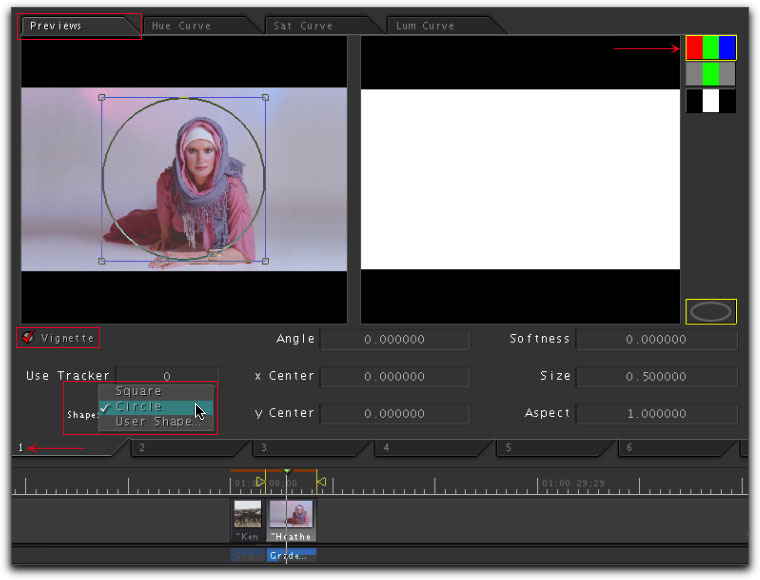
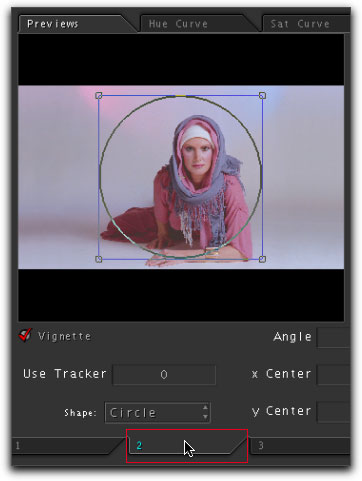
Towards the bottom of the interface is the 'Vignette' section. You must check the Vignette button to enable it. Just below the Vignette button is the Shape drop-down menu. You can choose from Square, Circle or User Shape. When using Square or Circle, you have complete control of the size, position, aspect, angle and softness of your selection from right here in this section. If you choose 'User Shape', Color will switch you to the 'Geometry' room, where you will be able to create your own custom shapes using 'B-Splines' and 'Polygons', which are customizable, allowing you to set any number of user defined points to create the shape. In this article we will be working with Square and Circle shapes.
Viewing Options
There is some confusion in the naming of two of the windows in the Color interface that show the video image that we are working on. While these two windows are distinctly different, often they are both called the 'Preview' window (in the manual and in the Color menus). For the sake of clarity in this article, I am calling the window that is under the 'Preview' tab, the "Preview' window. The image to the left, in the window with the video scopes, is what I'll be calling the "Viewer".
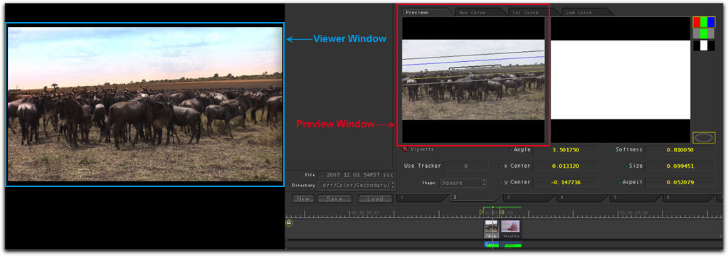
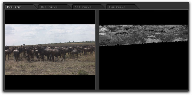
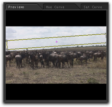
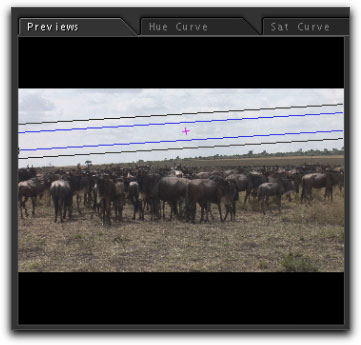
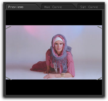
When you first open the Secondaries room, you will not see any thing in the Preview window, click on the Previews tab on the left to bring the Preview section to the front. You will now see your video with the vignette shape that you have selected, now set to square. In the picture below, lower right, is an oval vignette outline button with a yellow box around it. This button controls the yellow bounding box seen in the Viewer window, which is simply a graphical aid, that shows the edge of your selection and will not be part of the final output. If you don't like the yellow bounding box, click the button to turn it off. To the right of this section are three buttons which control the way that the large Viewer window displays your image. Color defaults to the middle button, 'de-saturated' view.
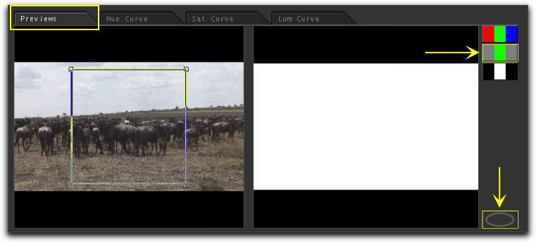
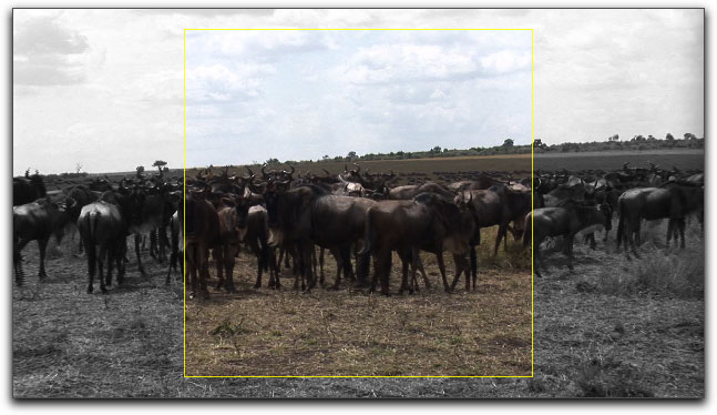
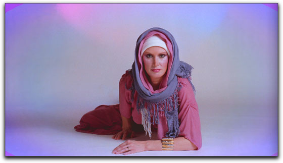
The de-saturated view displays your selected area, in the large Viewer window, with the yellow bounding box. The selected area is shown as saturated (colored) and the non selected area as de-saturated (black & white). The de-saturated view can be a very helpful visual aid in the placement of your vignette. If you are running Color with two monitors, the Viewer window will be placed on your second monitor at enlarged size, further enabling you to accurately make your selection.
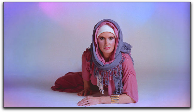
The top button is the final button which will show the effects of your vignette in the Viewer window. For the example below, I have pulled down the highlight saturation, darkening the outside area of my selection. When you relaunch Color, it will default to the de-saturated view, so you need to reset to the Final view to see the work that you have already done.
The bottom button is the Matte view which is most often used in conjunction with the HSL keys (Hue, Saturation and Luminance), also referred to as a chroma Key. The white area shows the selected area and the black represents the non selected area.
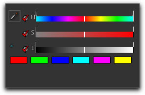
HSL controls, found at the top right of the Color interface, are used to select one color in the image, for manipulation, while leaving other colors in the image untouched. For example, this effect can be used to change the color of someone's shirt in the shot or even create what is know as the Pleasantville effect, where everything in the image is black and white except for the selection you made, which will remain in color. We will save HSL keys for another time.
Down the left hand side of the Color interface is the Viewer and Scopes area. This is where you will see the changes you make in your vignettes when the Final button is selected. This section of Color defaults to the Viewer window along with the Color scopes. As we will not be working with the scopes in this article, I can double click on the Viewer, which will hide the scopes and will center the Viewer in the window. Double clicking on the Viewer image will return the scopes to the window.
Resetting parameters in Color
Almost all of the parameter settings in Color, have a small, diamond shaped 'reset' button, found just to the left of each parameter name. When you want to reset a parameter to default (I do this often), place your cursor over the parameter, it becomes active, turning bright turquoise, with a box around the setting. Click on the button to reset.
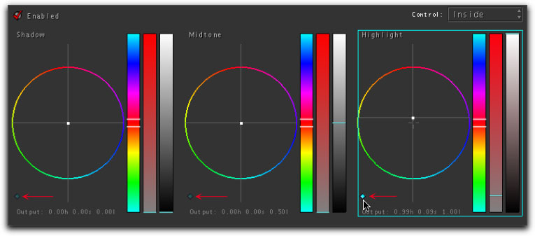
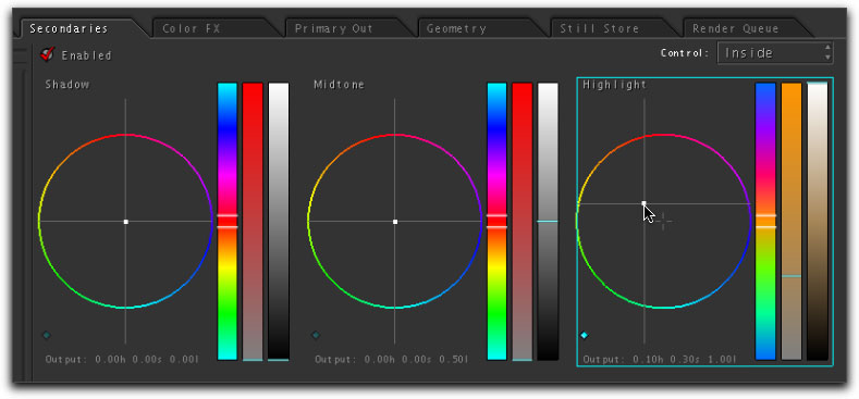
Each of the three color wheels, Shadow, Midtone and Highlight, have one reset diamond shaped button. Clicking on the button for any one of the color wheels will reset all three parameters for that color wheel, Saturation, Hue and Color.
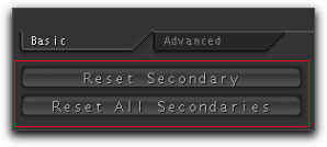
There will be times, when, after setting a number of parameters, you'll want to start over. To the far right, center of the Secondaries room, are two master reset buttons. The top one, 'Reset Secondary', will reset just the room that you are working in. If you have done work in several Secondaries rooms and want to reset them all at once, click on the 'Reset All Secondaries'. When you reset Secondaries you will need to re check the Enabled button, Preview tab, Final view and the enable Vignette.
Working with the square shaped vignette.
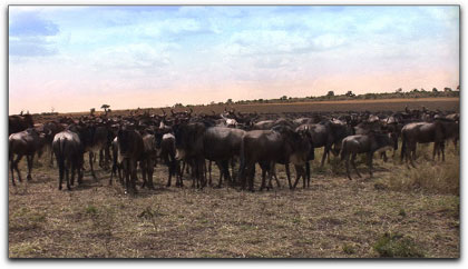
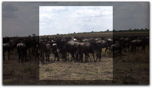
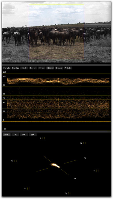
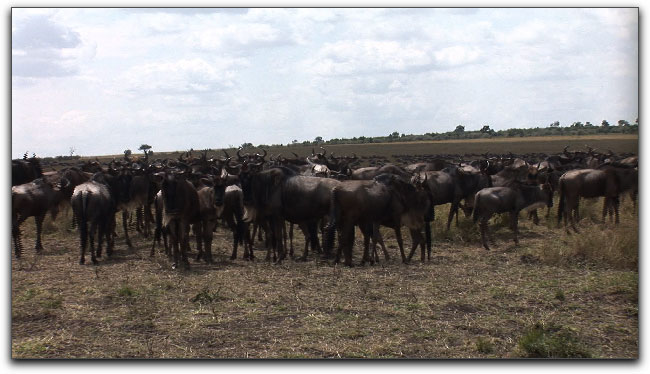
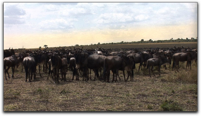
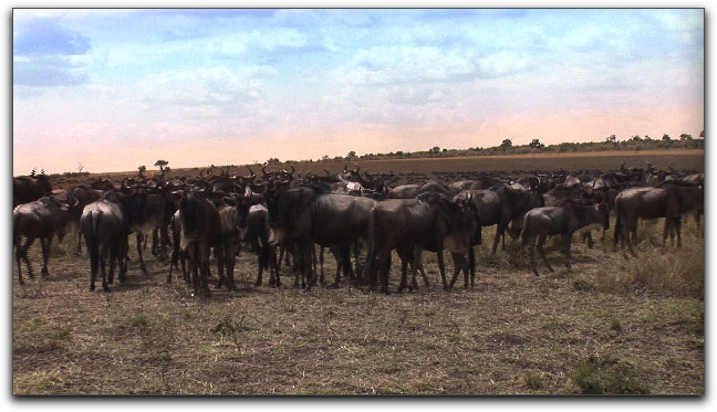
I have some footage shot by Steve Douglas while on Safari in Kenya. It's an interesting shot but I want a more dramatic sky so I am going to create several square shape vignettes to add some sunset colors.
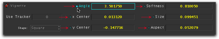
There are several ways to position and re size the vignette. You can reposition the vignette by clicking inside it and then dragging it to a new position. If you click and drag on one of the corner points you can change both the size and aspect of the vignette. Holding down the Shift key will constrain the aspect of the vignette as you resize. Holding down the Option key will keep the vignette centered as you drag. To rotate the image, hold down the Control key as you drag. I have deliberately not fully sized the vignette as I want to show the control handles of the vignette. Of course, when you are working with vignettes, you'll want to extend the borders out past the edges of the image to effect the whole horizon.
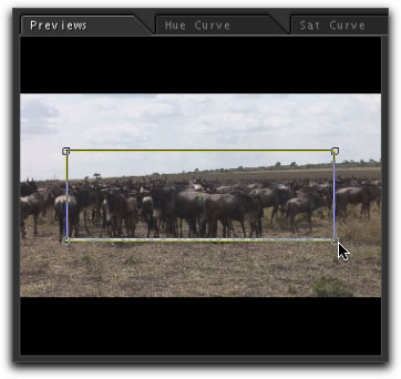
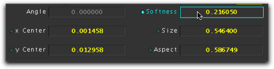
This is a good way to get started with general sizing and placement of your vignette, however, once you have enlarged the vignette out past the edges of the Preview window, you will no longer be able to see the corner boxes and make changes. To continue working with the vignette and to gain greater accuracy than dragging, you will want to use the specific parameters controls shown below. You can enter a numeric value into the settings boxes, but Color offers an easier way to make changes. You may know that Color requires a three button mouse and here is why. In the Apple System Prefs, set the middle button (the scroll wheel) to 'Button'. With your mouse set up this way, place your cursor over the numeric value that you want to change, it will highlight in turquoise. Click and hold down the middle button and scrub left or right. As you do, the numeric value will change and you will see the changes to the vignette in real time in the Viewer window. Dragging left or right will enable you to make very exact changes. The one exception is the 'y Center' parameter which is the vertical control. To make changes to this one parameter you will drag up and down, makes sense.
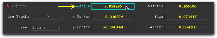
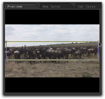
As the horizon line in the image is slanted we'll want to use the 'Angle' control to slant the vignette to match the horizon. If you'll look below, left, you'll see that I have left a small amount of space between the vignette and the horizon. This is because I plan to soften (feather) the edges of the vignette and, when softening, the vignette borders will spread out, and the bottom of the vignette will trap the horizon, below right. Using the 'Softness' control requires some understanding of how it works. The Softness control will be covered in detail in the 'circle shaped vignettes' section, later in the article.

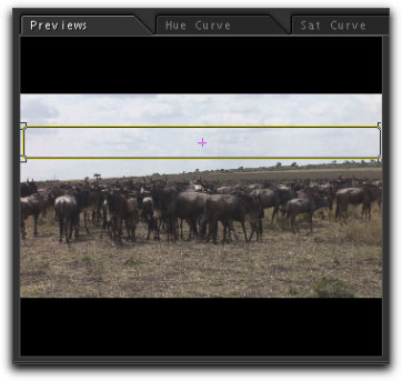
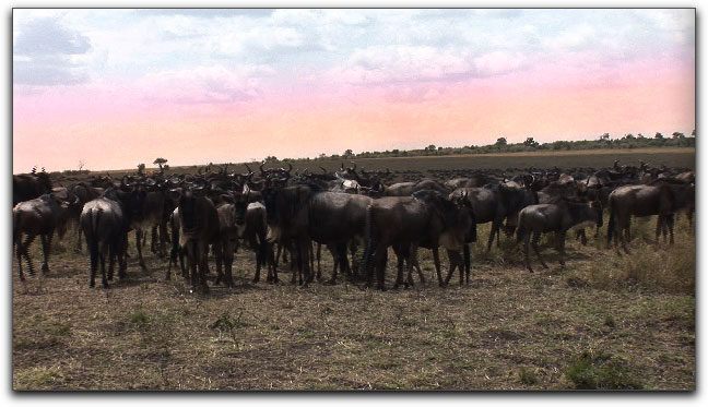
Now that we have set the vignette, it's time to change the color of the selected area. We will be using the color wheels to color the inside of the vignette. As the sky in this shot is almost completely in the highlight zone, I will use just the Highlight color wheel and move the color towards yellow/orange. After changing the color of the inside of the vignette, apply some softness to feather out the vignette so that there is a gradual color shift.
Okay, it's a start, a yellow tint at the horizon. In order to achieve the effect I'm looking for, I will need to add several more overlapping vignettes, each with a different color, each one placed higher in the sky.
Earlier on I said that Color was both powerful and easy to use and this is where these abilities come into play. The Secondaries room has 8 sub rooms, allowing up to 8 secondary color corrections or effects per clip. Each sub room can use either Vignettes, HSL keys or Curves to achieve effects. Additionally, you can change both the inside and outside of the vignette. To add a second vignette, click on room number 2. Each time you enter a new room you will need to enable the Room and Vignette buttons, select the Preview tab and click on the Final view button.
Using the square shape I have created another vignette, similar to the first one, placed a bit higher in the sky.
With the vignette created, the highlight color wheel is set to a more purplish color.
There are now two overlapping vignettes in place. I have exaggerated the colors of the vignettes so that you will be able to distinguish between them.
I have added two more vignettes to the sky, for a total of four. After having the four vignettes in place, I bounced back and forth between rooms, adjusting the size, position and softness of each vignette as well as the color and intensity of each of the vignettes. This 'tweaking' is very easy to do in Color, as all changes display in real time in the Viewer window. I then added one last vignette to the foreground of the shot, which I color corrected to lighten the shadows and midtones a bit.
Working with the circle shaped vignette.
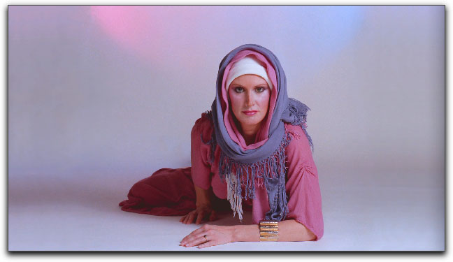
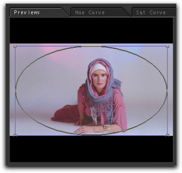
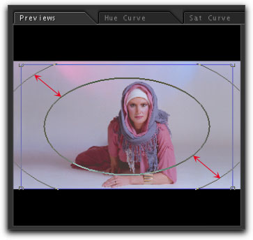
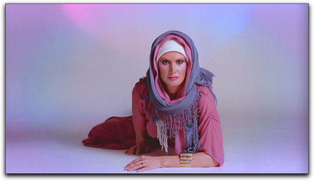
I have a fashion shot that is very dull (read boring) on the sides and with the expanse of background, the subject of the shot lacks attention. I can apply the Circle vignette to this clip to add some drama and draw the viewer's eye to the talent.
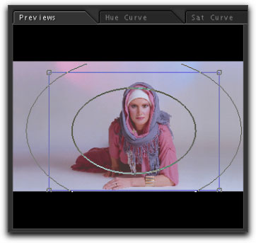
With the Secondaries room selected and enabled, I have moved the playhead in the Color timeline over my second clip and selected room #1. Then the Vignette button, Final preview button and Previews tabs are selected. Lastly, Circle is selected from the Shape drop-down menu. Each clip on the Color timeline gets it's own Secondaries room, so each clip can have up to 8 sub-rooms, 8 different vignettes applied.
I want to start working on the outer edges of the image so I have created my first vignette and sized and positioned it so that the outer edges will be effected.
Remembering to set the room to 'Outside', I have moved the Highlight color wheel towards magenta.
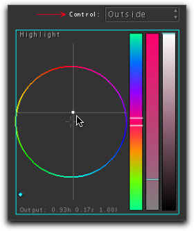
In the Viewer window we can now see the effect of adding magenta to the outside of the vignette.
Before any softness is applied to the vignette, the selection line of the vignette that separates the inside from the outside is a single line.
When we dial softness into the vignette, if the softness were applied to only the area outside of the vignette, then there would be a visible demarkation line at the boundary between inside and outside as the softness would stop abruptly at the border. So, when we apply softness to the vignette, the Color softening effect is applied to both the inside and outside of the border line, creating a smooth transition from inside to outside.
When softness is applied, the single border selection circle now becomes two circles. The inner circle represents the start of the softness or feather and the outer circle is the end of the softness. As more softness is applied the two circles become further apart. You will also notice that even while the distance between the two borders gets larger, the over all size of the vignette (inner circle) becomes smaller. As you adjust the softness, you may find that you may also need to enlarge the vignette to compensate. Aside from scrubbing in the Softness numeric box to change the amount of softness, you can also middle click in the Preview window and drag left or right to change softness.

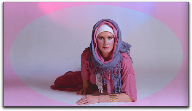
After softening the vignette, the border between the inside and outside of the vignette vanishes completely.
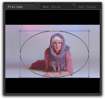
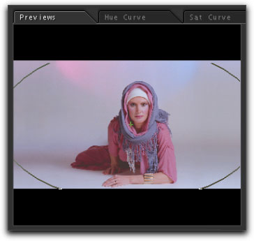
Click on room #2 to create a second vignette, which is placed closer in to the talent and drawn out to an oval shape. Remember that each time we enter a new sub room, we will need to Enable the room, click on the Preview tab, select the Final view button, enable Vignettes and choose our shape.
With the second vignette in place I have moved the the Highlight color wheel towards blue/cyan.
In the Viewer window we can now see the blue/cyan vignette added but not yet softened.

Again, adding softness.
The Viewer window now shows both the first and second vignettes applied.
I have added several more vignettes, each one moved out further to the corners of the image. Shown below without softness applied.
The final image shown below has five vignettes. Of course there was a good amount of moving between vignettes and making adjustments.
Back to Final Cut Pro
Final Cut Pro can work with a whole host of video formats, when we 'Send to Color', Color can read all of these formats too. However, once inside Color, all video is converted to and processed as RGB 4:4:4. Even though Color can read all of the FCP formats, it can not export in all formats. These are the formats available to Color for export.
- Apple ProRes 422
- Apple ProRes 422 (HQ)
- Uncompressed 10-bit 4:2:2
- Uncompressed 8-bit 4:2:2
- DV
- DVCPRO 50
- DVCPRO HD
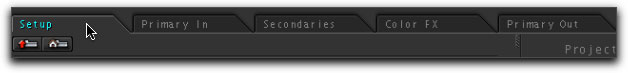
Let's take a look at Color's Project settings for this project. Click on the Setup Room tab at the top of the window.
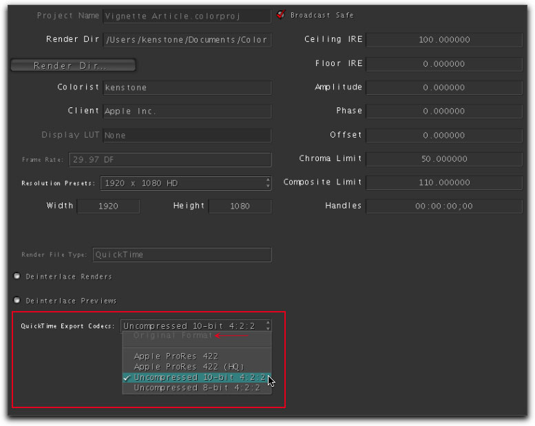
And then click on the Project settings tab further down.

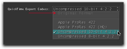
In the Project settings window you'll see the 'QuickTime Export Codecs' drop-down menu. This is where you will set your export codec for the return to FCP. If I had been working in FCP using either the DV, DVCPRO 50, DVCPRO HD, Apple ProRes or Uncompressed formats, then the 'Original Format' option would be available. As the video I sent from FCP to Color was HDV and HDV is not an available export format for Color, the 'Original Format' option is grayed out and Color has set the export format to Uncompressed 10-bit 4:2:2 for the return trip to FCP. You can choose any one of the export format options available in the drop-down menu, depending on your workflow in FCP. Note that 'Broadcast Safe' is enabled by default. Broadcast Safe is applied to previews and renders and is a global setting and should be either turned on or off for the entire project. It is recommended that you leave this on.
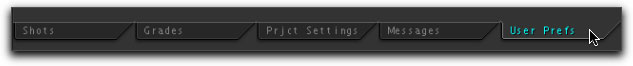
Still in the Setup Room, click on the User Prefs tab.
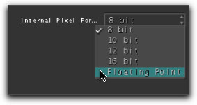
Lower right in the User Prefs window is the 'Internal Pixel Format' drop-down menu. You may want to set this to 8 bit while working in Color. However, when it comes time to export back to FCP, you may want to process (read render) your video at higher quality. 10 bit is usually fine for rendering, but Floating Point is the best quality if needed.
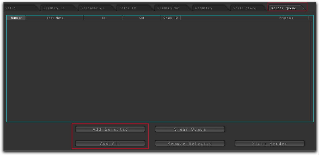
It is now time to render out the video in Color for it's trip back to FCP. Click on the 'Render Queue' room tab. When the window first opens you'll see that the window is empty and nothing has yet been placed into the queue. Click on the 'Add Selected' or 'Add All' button to place the video into the Render Queue.
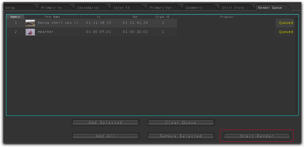
With our video clips now in the render queue, click on the 'Start Render' button.
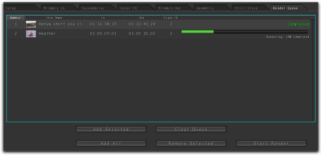
You will be presented with a render progress bar. The finished render files can be found in User > Documents > Color Documents > Renders > Project name. Each rendered clip will have it's own folder. While Color will default to putting the render files into your User account on your boot drive, this is probably not the best place, as render files are quite large. Better to put them onto your 'scratch' drive. To change the location for the render files, open the Setup room, Project settings tab, then click on the 'Render Directory' button. A navigation window will open up where you can change the location for your render files.
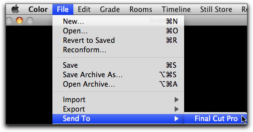
Now that Color has finished rendering it's time to send our video back to FCP.
The Sequence settings (format) for these clips in the FCP project is HDV and, as stated above, because Color can not export in the HDV format, I chose 10-bit Uncompressed in the Setup room, Project settings. When in the Project settings, you can tell if Color can send back to FCP in the Original format, if the 'Original Format' is available. Because I'm using HDV, the 'Original Format' is grayed out.
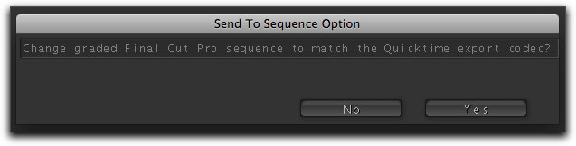
When I used the Send to FCP command, Color recognized that the FCP Sequence settings and the format for the clips rendered in Color do not match. Color gives the option of changing the FCP Sequence settings to match the format of the Color rendered clips or to leave the FCP sequence settings as they are. If you can send back to FCP in the 'Original Format', the 'Send To Sequence Option' dialog box will not appear.
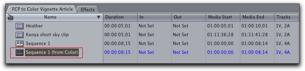
FCP will open and a new sequence, 'Sequence 1 (from Color) will appear in the Browser.
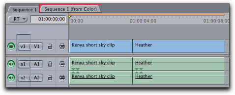
The new Color sequence in the timeline. Notice that because the format of the clips from Color do not match the format of the FCP sequence, a render bar appears.
Learning Color
Like many of you, when Apple shipped Final Cut Studio 2, which now includes the Color application, I launched Color to have a look. I must admit that I was a bit intimidated by its very strange and unfamiliar interface. Dark gray on gray, room tabs across the top and tabs along the bottom. It even has a section that uses Nodes. Yikes! The Color interface is so very different from what I was used to seeing in FCP, that I closed Color and continued to do color correction in FCP, after all, I have been doing color correcting for years and am comfortable using the color correcting tools in FCP.
Recently Ripple Training released its 'Color Grading in Color' DVD tutorial by Andrew Balis. As I had learned color correcting in FCP from Andrews' "Color Correction for Final Cut Pro", I decided to have a look at the new Color tutorial. When I first sat down to watch the 6 1/2 hour tutorial, it was not my intention to learn Color, just to get a bit of an understanding of the application. Boy was I surprised. First off, this new Color tutorial by Andrew Balis is about the best tutorial I have ever seen. Second, working through the tutorial, I discovered that, in it's own way, Color is very intuitive, logical and easy to learn and use. I have also discovered that what I learned doing color correction in FCP is applicable to working in Color. In Final Cut Studio 2, we now have a very powerful Color Grading application. If you would like to learn this program, I would highly recommend getting Andrew Balis' 'Color Grading' tutorial.
Enjoy,
--ken