March 3, 2008
By Seth Kenlon
COLOR is a powerful color correction environment that shipped with Final Cut Studio 2, but its User Interface is unfamiliar and may be intimidating. Luckily, the layout of COLOR follows a logic that is easily navigated and understood.
First and foremost, it is important to know that COLOR is intended as the last stop in your editing workflow. While there are provisions for re-conforming color-corrected footage to changes made in Final Cut, it is hardly ideal and not easily done. Therefore, you should NOT send your project to COLOR until you have truly achieved picture lock.
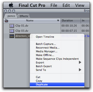
Being the last stop of your workflow, it is also advisable to first duplicate the sequence you're about to send to COLOR. This is easiest to do by control-clicking (or right-clicking) on the sequence in the FCP Browser and selecting Duplicate.
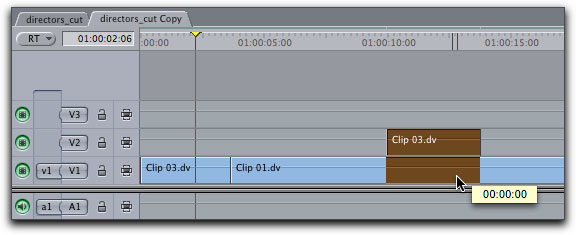
Now open the duplicate version of the sequence and collapse all video tracks, as possible, down to the first video track. While COLOR has the ability to see multiple video tracks, it works best with one.
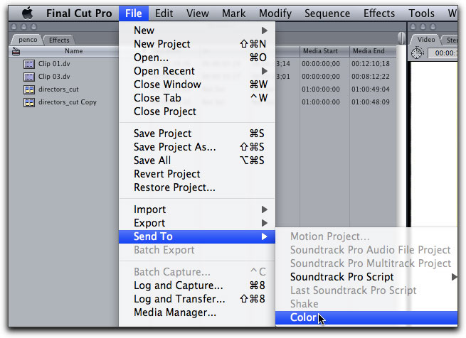
Once you have finished this, you are ready to send the project to COLOR. Make sure that the proper timeline is the active window, go to File > Send To > Color.
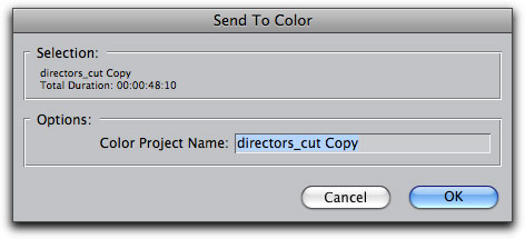
A dialogue box will appear, prompting you to name and save the project file for COLOR. This will become the project file you will open and access when working exclusively in the COLOR environment, since obviously you probably will not be color correcting your entire project all in one sitting.
COLOR launches automatically. The interface is simpler than it first appears; on the upper left is your viewscreen, below that your scopes, and on the right side are "rooms" indicated by the tabs on the top of the screen. It is the design of COLOR that you work your way through each tab, or each "room", correcting a certain aspect of the picture as you go.

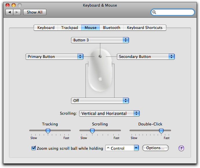
Note that it will be extremely helpful to have a three-button mouse while working in COLOR, with all buttons set properly. To set up your mouse, go to Apple Menu > System Preferences > Keyboard & Mouse > Mouse and be sure that your mouse buttons are configured as Primary Button, Secondary Button, and Button 3.
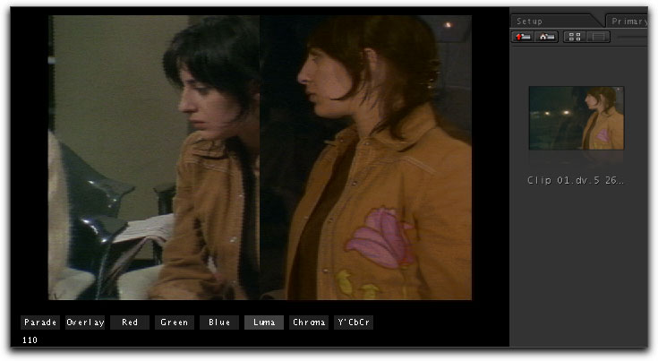
The Setup Room
When COLOR launches, it opens in the Setup Room. Herein there is a list of shots in the Color project. If you have logged and captured your footage well, with sensible and descriptive names, you may be able to navigate fluidly to specific shots you wish to work on from this room.
You can also review and change the preferences for your project here. Most importantly, you will be able to define where the files rendered out of Color will be stored.
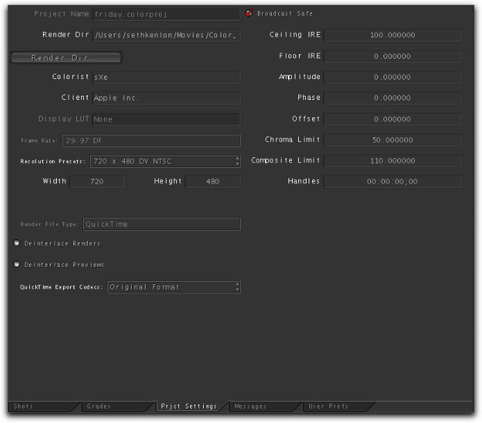
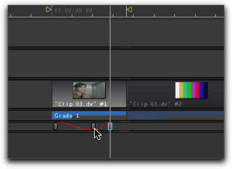
Otherwise, you will probably rely mostly on the timeline at the bottom of the screen. This timeline will persist through most of the rooms in COLOR and acts only vaguely like the timeline you will have been accustomed to in Final Cut. This timeline plays only one video region at a time, looping the region endlessly.

This is a great help when trying to focus on a single shot for color correction. Whatever region the playhead is over is the region that is selected; you can see the clips highlight as you move the playhead over them.
The Primary In Room
An advantage of COLOR is its ability to utilize an enormous range of color bit depth, whereas Final Cut Pro, for its friendlier interface and fluid performance, sees a more limited spectrum. This will be evident in other rooms as well, but let's start as we would on any project, in the Primary In Room. Click on the tab labeled "Primary In" to take yourself into this room.

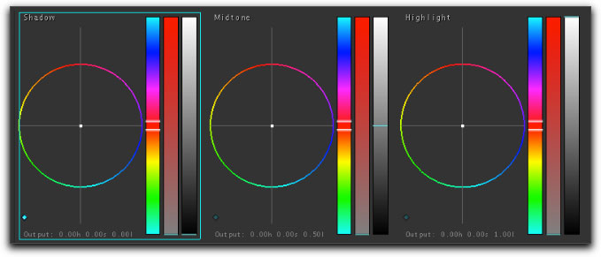
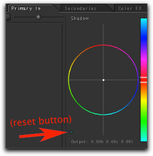
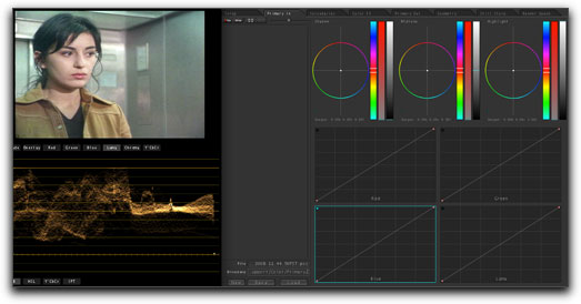
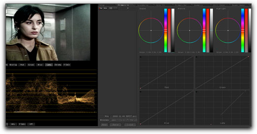
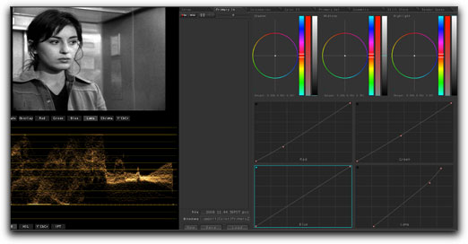
The Primary In room is where we will typically correct for global color adjustments. Perhaps the most common adjustment here would be correcting for something shot with a White Balance that favors Exterior light when it should have favored Interior light. In the Primary In room, you will see the familiar three-color wheel controls at the top. Remember that whatever clip your playhead is over will be the clip affected by the adjustments you make.
Let's assume that we are attempting to add warmth to a shot. This would be achieved simply by adding orange or amber to the shot, especially in the mid-range, where human flesh is found. Take the centre of the middle color wheel and move it toward the orange range; ie, toward the 10 or 11 o' clock position. Usually less is more, and a small adjustment toward orange will add a warmth to the picture that did not exist before. This can also be done in the shadows (the darker regions of the picture) or the highlights (the brighter pixels in the picture). You can also adjust the overall contrast of the picture by adjusting the contrast slider to the right of each color wheel. A good trick to emulate film, I find, is to "crush" the blacks and to add "punch" to the highlights. This increases the perceived contrast and helps the illusion of the picture having been shot on film, which has a wider latitude for shadows and highlights.
There is a reset or panic button on each color wheel located in the lower left corner of each color wheel sections. It is difficult to see (a common theme in COLOR's interface) so look hard!
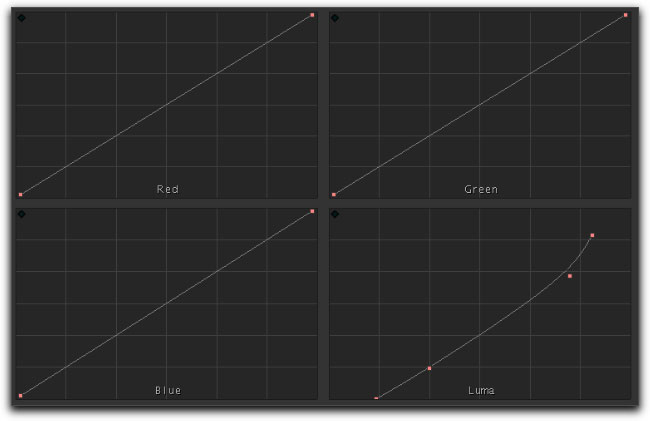
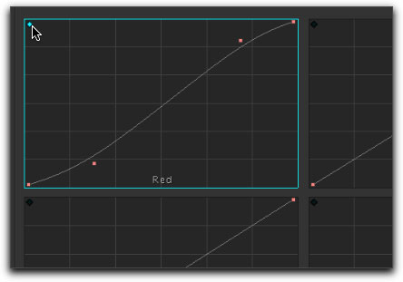
Below the color wheels are the all-important curve controls, which allow you to manipulate individual channels of color as well as the luma channel with precision. If you have used the curve editor in Photoshop, the concept will be familiar to you. The curves begin completely linear, ie without a curve. The lower end of the line represents that color's channel as it exists in the dark regions of the picture, and the top right end of the line represents that color's channel as it exists in the highlights. Moving the lower end of the line to the right will cause the colors in the dark ranges of the picture to become darker. Moving the right corner to the left will cause that color to appear in the highlights "sooner" than how it was captured, making it stronger in the brighter pixels of the frame. Clicking at any point between these two extremes along the line enables you to add a curve to the progression of the color channel, creating different effects that can be very subtle to very very outrageous. This is an excellent way of manipulating the very subtle details of the image's color channels, as well as the contrast (by manipulating the luma channel).
Try crushing the blacks and punching up the highlights with the luma curve editor by moving the foot of the line to the right, and the shoulder to the left. Then click and drag on the line to create a curve. Change the slope of the curve and see how the blacks and highlights and mids react. You'll see fairly quickly the power of this editor.
A variety of looks can be achieved quickly with just these curve editors; from sepia-tinted pictures, to a faux bleach-bypass, to intense color effects.
Original
Bleachbypass
Filmic

Fightclubish

Black & White
For whatever reason, the reset buttons on the curve editors are only visible when your mouse is over that curve editor, and it is located in the upper left corner.
As in Final Cut Pro, every setting made in each room of COLOR can be keyframed so that it will change over time. Keyframing in COLOR is done essentially the same way that it is done in Final Cut Pro, but with control-9 creating a new keyyframe, control-0 deleting a keyframe, and control-8 toggling between smooth and linear interpolation.
The Secondaries Room
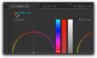
The secondaries room is the place to be for selective color correction or enhancement. For instance, if there is an instance of red in a film clip that you would like to brighten without brightening every other color in the frame, you can cordon off certain shades of red you'd like to adjust.
The first step is to enable the secondaries room by clicking on the Enable button in the upper left corner of the room. This is located just under the Secondaries Tab itself. It is rather counter-intuitive that the rooms are not enabled by default, so expect to forget this step frequently. On the other hand, you can use this Enable button to see the Before & After versions of your work.
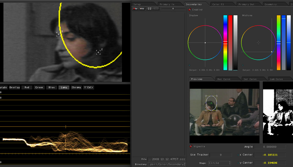
The most commonly used tool here is the Eye-Dropper, located in the far right column. After you click the eye-dropper, a red cross-hair appears over the frame. Click on the color that you wish to effect; as in Photoshop, the selection is limited to a small range of shades within the color you click.
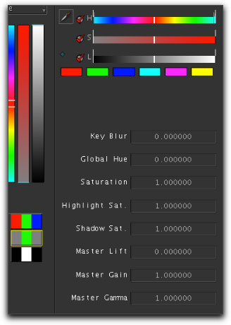
To add to this selection, you may invoke the eye dropper tool again, and continue to click on the color spectrum you wish to effect, this time holding down the shift key as you click. You will notice in the preview screen below the selection area that the masked area of your selection is displayed in grayscale. The strongest areas that have been selected show white, the areas that have nothing selected are black, and the areas in which there is partial selection are various shades of gray.
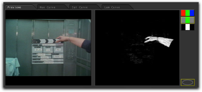
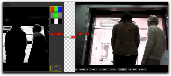
Note that there are three ways to view a shot by selecting one of the three buttons on the right of the Preview area. The top red-green-blue button is the "Final" button, which shows you the shot you are modifying along with any color correction you apply.
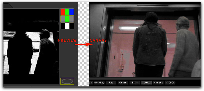
The gray-green-gray button is the "Source" view; this shows you the shot you are modifying without any of your secondary color correction.
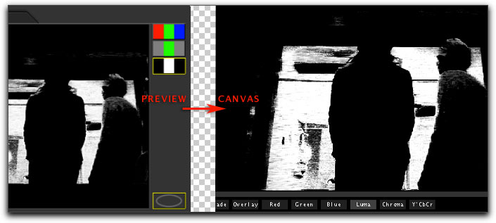
The black-white-black button is the "Matte" button, showing you in shades of gray your selection. Again, the white areas are 100% selected, the black areas are 0% selected, with shades of gray accounting for partially selected pixels.
You can further refine you selection with the controls located to the right of the eye dropper tool. If you have a firm grasp of hue, saturation, and luma levels, these controls will help you dictate specifically the range of a hue or hues that you wish to effect. Play around with these sliders to see what effect it has on your initial selection, and you may find yourself with a better understanding of color values within each pixel and how color correction works.
Once you're happy with your selection, you can make adjustments to the shades of color you've selected just as you would do in the Primaries room. The only difference here is that your adjustments will only be visible within the part of the picture that you've selected. This is a handy way to bring a little punch to certain colors; make your reds redder, blues bluer, and so on. To see your adjustments, make sure that you are looking at the full composited image (ie, your A nifty trick is to invert your selection by changing your effected area to OUTSIDE in the CONTROL drop-down menu.
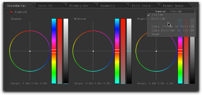
Now everything but your selected colors will be effected, so you can do tricks like de-saturating (with the property controls on the right) everything but a certain color, rendering your movie black-and-white with the exception of a single color. This is where Color's real power lies; it has access to a greater color depth than Final Cut Pro's color correction filters and can often isolate more precisely the color you pick.
The Vignette section of the Secondaries room, located on the bottom half of the tabbed area, is the tool used to mask off sections of the frame that you'd like to color correct. You can even do rudimentary rotoscoping here by combining it with the Geometry room. This has been covered in detail in my "Matting and Color Correction in COLOR" article here on kenstone.net so I won't repeat it. However, the Geometry room has another function: framing manipulation, which allows you to "pan and scan" on your footage.
A useful technique is to use this ability to enlarge the frame so that you can work more precisely on a mask or vignette that you are applying to the shot.
The trick is to enlarge the pan and scan into the area of the frame you'll be working with.
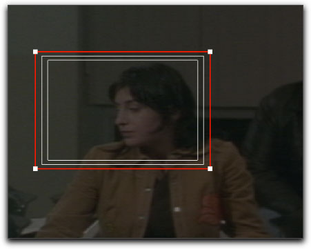
Then switch back to the secondaries room and adjust the shape in the enlarged frame.
Color FX
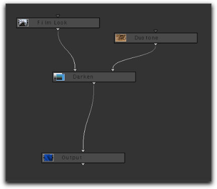
The Color FX room is a node-based effect area with both built-in presets as well as the ability to construct your own unique pipeline. This topic, too, has been covered extensively in other kenstone.net articles but I'd like to cover some quick simple points. For quick satisfaction there are presets in the Color FX Bin.
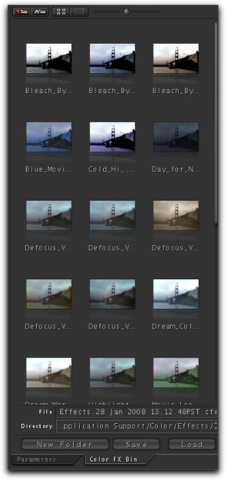
These are series of nodes strung together to create interesting and distinctive looks. To begin from one of these, open the Color FX Bin and drag one of the presets out to the work area in the middle of the screen. This displays all the nodes that produce the effect. Now click on the Parameters tab on the lower right to see the parameters of the node that you select. If no node is selected, no parameters will show in the right column. If only the Output node (the final node that simply indicates the end of the pipeline) is selected, then only a Bypass option will appear. Clicking on the other nodes will typically display more options, however. The Curve node, for instance, gives you a curve to modify the exposure of the picture, and you'll see the curve itself on the right panel when you click on the curve node. The Color node gives you a color matte that you can set in the right panel, but will be fairly useless unless you combine it (with an Add node or similar) with another picture.
There are many nodes that will do different functions, and some nodes work better when combined with others, and obviously they will all be effected differently depending on where they appear in your Color FX pipeline.
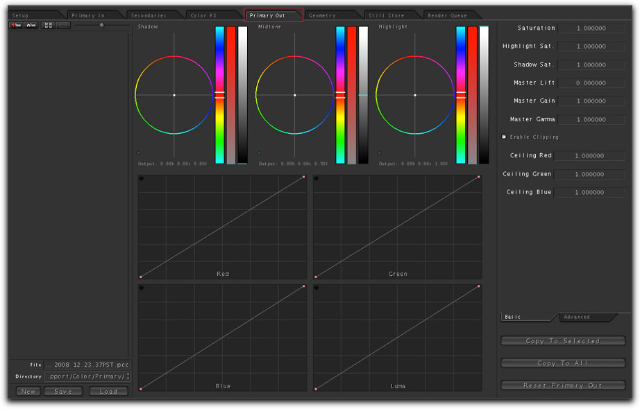
Primary Out
The Primary Out room is identical to the Primary In room except that it appears last in your overall pipeline and therefore affects clips as they appear through all the filter's you've applied so far. This is your last chance to make adjustments to ensure all your clips match one another, or that you are broadcast safe (if you are doing that manually), and so on. I use this room rarely but it's good to have a top-level room for last minute adjustments.
Geometry Room
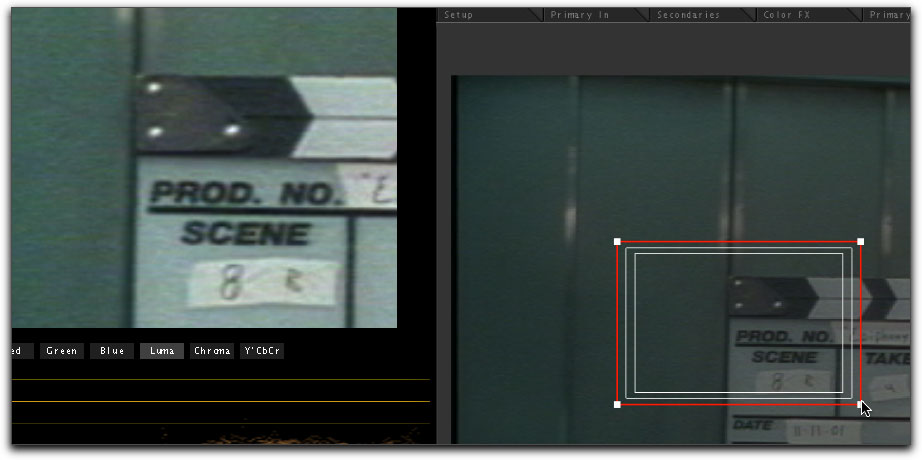
Now we come again to the Geometry Room, which, along with the Secondaries Room's Vignette function, has been covered fairly well in my article "Matting and Color Correction in COLOR" as well as on Ken Stone's article "Vignettes in Color", so I will not reiterate those here. However, the "pan and scan" functionality has more use than simply zooming in for precise vignette work. It can also be used to change the final framing of a shot.
If you have shot in a resolution higher than your intended final output resolution, then you can safely re-frame in the Geometry Room, and even build in pans and tilts in places where before there were none. This function is found in the Pan&Scan tab on the lower right portion of the screen.
Once you've clicked on the tab, you'll notice the outline of a frame encompassing by default the entire frame. Adjust the size of this frame by clicking and dragging the overlay's corner, and you'll see your new frame reflected in your preview window.
You can animate movement of this new frame by using keyframes; control-9 creates a new keyframe. Move your playhead to the next point in time, move your frame to its new position, and hit control-9 again. You've created a pan or tilt from the first keyframe to the second keyframe.
More elaborate "camera" movement can be done with the tracking function, which is robust enough to deserve an article unto itself.
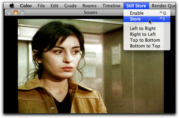
Still Store
The Still Store area is not a room as much as a library or storage space. This is a handy tool to match one shot to another, as it allows you to take a snapshot of a frame from one shot, store it in the still store room, and access it later to compare it to a shot you may be working on.
To make a still store snapshot, position your playhead over the frame you wish to use as your color grade model. Hitting control-I will take a snapshot, or you can use the Still Store menu > Store.
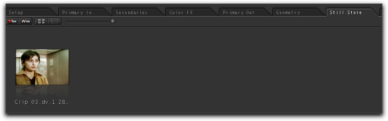
Either way, you will notice thumbnails being stored in your Still Store area of each snapshot you make.
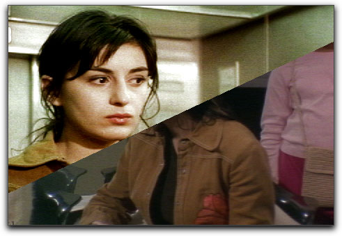
When you come to a clip that needs to match something you've made into a still store, go to the Still Store menu again and Enable the Still Store view.
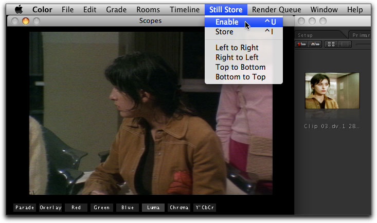
At first it may seem that nothing has happened. This is because no still store has yet been loaded, so move to the Still Store tab, select the thumbnail you wish to bring up into your preview window, and click the Load button.
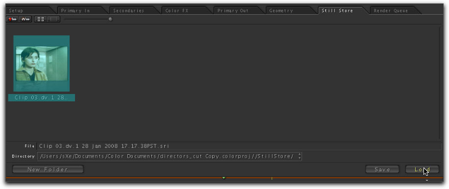
Now your Preview window is split into two halves: one side is the still store, and the other side is your actual footage. Turn your critical eyeballs on and start matching the colors.
To get a slightly different view of your still store, you can use the Still Store menu to move your snapshot to the top or the bottom of the frame, or the left or right of the frame. Also, you can adjust how much of your frame your snapshot occupies by using the still store parameters, again on the right side of the screen in the still store room.
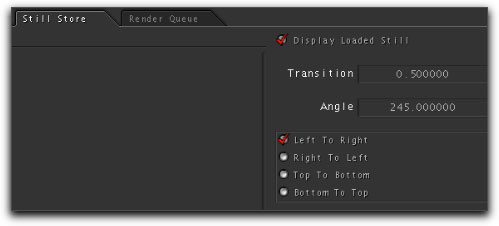
As you can see, you can feather or soften the edge of the division between the still shot and the footage, as well as its angle and position.
Render Queue
This is the final stop in the Color workflow. Here, you add all of the clips either one by one (Add All) or all at once (Add All) to the render queue.
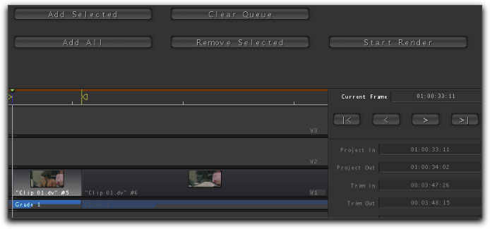
And here the clips will remain until you hit the Start Render button, at which point all the footage you've selected will be rendered with all the filters you've applied in Color. This is akin to flattening an image in Photoshop or Exporting to Quicktime in Final Cut Pro; the resulting footage is a new version of your material and cannot be changed or adjusted. Obviously you could always come back to Color and re-effect a clip and then re-render it, but the less you do this, the better, as render file management can get very confusing.
If you have only added selected shots to the render queue, Color will tell you that you have omitted some shots from being rendered. If you want everything to be rendered, you'll need to Cancel before rendering, and add the shots you forgot to add. Otherwise, if you intended only to render certain shots, allow Color to continue rendering.
At this point, there is an important choice you must make. Up until this point, you have most likely been working in a 12-bit color space - the default color space in Color's Setup Room. This is often the color space one works in to save system resources; anything higher on most systems will hinder realtime playback and slow performance in general.
However, Color has the ability to use floating bits; a method of storing extra information about the picture that could make quite a difference if it is going to be output to true High Def or film. Now that you're ready to render, you may wish to return to the Setup Room and change your color space from 12-bit to floating. It will take longer to render, but the resulting files will be a higher quality (and larger size), and will look better for it.
Rendering takes time, so at this point you'll want to either go on vacation or take a coffee break, depending on the size of the project. Understand, too, that you will need a lot of room for these new render files; do not attempt to render to a drive that does not have plenty of room on it because Color cannot tell you that there is not enough room until there is no more room left, at which Color will either notify you of the failure, or just crash (worst case scenario).
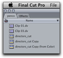
After all the files have been rendered successfully, you'll go to the File menu > Send to > Final Cut Pro. This takes the render files and assigns them to their corresponding video regions in Final Cut Pro, in a brand new sequence with "(from Color)" appended to the sequence's name.
Notice in the timeline that the video regions are now basically subclips, without handles on either end for extending your cuts. Again, Color works best as the final step in your editing workflow. While there are ways to re-conform footage and make adjustments after you've been to Color, it's a fairly complex process and risks cuts and edits not conforming correctly.
Conclusion
All in all, Color is a complex and powerful program. This article has touched on the very basics of its functionality, so the more you practise with it, the more you will discover. Happy correcting!
Seth Kenlon is a video editor and *nix geek. Recently his analysis of video codecs has appeared in "Linux Journal". He spoke at the Southern California Linux Expo in February of 2008 about video encoding and streaming. He is currently playing with render farms.
[Top]
copyright © www.kenstone.net 2008
are either registered trademarks or trademarks of Apple. Other company and product names may be trademarks of their respective owners.
All screen captures, images, and textual references are the property and trademark of their creators/owners/publishers.