| Studio Pro 2 - Menus |
December 29, 2003
DVD Studio Pro 2
All About Menus
Standard Menus vs. Layered Menus
Motion Menus: Compositing / Looping with Highlights
Aspect Ratios between Compositor and Photoshop
and Basic Scripting with three project examples
By: Alex Alexzander
[Main] [Chapter One] [Chapter Two] [Chapter Three]
Chapter One: Standard and Layered Menus
Standard Menus
- Standard menus
- Layered menus
- Simple highlights
- Advanced highlights
Layered Menus
- Working with PSD-based layered menus
Standard menus and layered menus basics
Standard menus may use one or more of the following types of assets:
- Single layer images for backgrounds
- Multi-layered PSD artwork for backgrounds
- MPEG2 video / motion backgrounds
- Audio assets
- Simple overlay PICT maps
- Advanced overlay PICT maps
- Shape and drop zone objects *New to DVD Studio Pro 2
- Button designations with text included in the highlights (simple and advanced) *New to DVD Studio Pro 2
- Templates and Styles *New to DVD Studio Pro 2
Layered menus use one or more of the following assets:
- Adobe Photoshop PSD compatible layered assets
- Overlay maps for simple and advanced highlight based button assignments
Standard Menus
Standard menus are a new concept in SP2. Standard menus are now a term used to define the non-layered menus within SP2. These new standard menus have much the same basis as the older non-layered menus inside SP1.5 as well as some new added features.
In prior versions, any menu that made use of a PSD based layered asset lost the ability to use audio and was always considered a layered menu. SP2 now allows for the use of PSD multi-layered asset and audio simultaneously. In fact, SP2 allows for the use of one of the three types of assets all of which may make use of audio.
- PSD based multi-layered backgrounds
- Single still image artwork such as PICT files
- MPEG2 for composite and video based motion backgrounds
Also new to SP2 is the ability to use new asset objects known as shapes and drop zones, which may be used in combination with any of the types of assets listed above.
As with prior versions, PICT based overlay maps that make use of simple or advanced highlight states may also be used in combination with any of the three types of assets listed above.
Shapes and drop zones allow for the use of their own MPEG2 video or still image assets. Shapes also allow the DVD author to drag and drop these video and still image assets into shapes and drop zones dynamically while authoring the DVD without any prior pre-compositing.

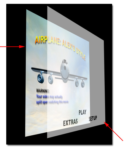
Standard Menu Sample
This rather busy standard menu is designed to show some of the new abilities you have. Two sections of the property inspector are displayed under the standard menu.
Blue section
The blue section shows that though this is not a layered menu, I am making use of a multi-layered PSD as my background. The text at the top, the right and left gold box, and the sky background are all independent layers contained as a PSD document. Note that the left property inspector states that an overlay PICT, as well as an audio asset is also part of this menu.
Yellow section
The yellow section displays two full motion drop zones, which are 30 second MPEG2 assets that sit above the gold boxes that are part of the background PSD document, as described in the blue section. Though this standard menu makes use of a multi-layer PSD for the background art, I am still able to create a pseudo-motion menu with the use of drop zones.
Green section
The green section shows the use of four buttons. These are not PSD selection states as are used with layered menus or PICT overlays. They are full-color shape objects. These shape objects also make use of simple or advanced highlights.
Red section
The red section is making use of a standard PICT overlay and advanced highlights. Note that just under the tabs on the left property inspector you will see a selection that states overlay: play_overlay_4_color.pct. That is my overlay map which, has two play buttons defined within the red squares in the menu image above. On the right-side property inspector, defined in the red section you will note I have the color settings tab open and make use of a gray scale overlay and advanced highlights.
So as you can see, there are many choices now available within a standard menu.
Layered Menus

Layered Menu Sample
Green section
Note the layer type as displayed in the property inspector. Here I have a multi-layered PSD document that defines the background sky, and each of three states of four buttons through the use of the layered PSD menu graphic.
Yellow section
The yellow section illustrates that I may use a layer from within the PSD layered document as an overlay layer.
Though many are in the habit of using a layered menu when lots of color is required, you lose the option for audio, motion and many of the options that make your DVD come to life. A little creativity with standard menus goes a long way toward achieving rich colors and advanced features through the use of shapes, drop zones, PSD layered assets and audio within standard menus.
Layered menus are exactly the same as in prior versions, with one exception: the way that you create them. In prior versions, simply using a PSD multi-layered asset defined the menu type as a layered menu where as now, new to SP2, you must pre-define your menu as either a standard menu or a layered menu. Layered menus do not have the use of audio as before. As shown below, you must choose a menu type within DVD Studio Pro, since you now use PSD based layers even in still menus.

Selecting a menu type inside DVD Studio Pro 2
SP2 uses a new outline tab that shows a graphical view of the following asset types:
- The DVD itself
- Menus (layered and still)
- Tracks
- Scripts
- Slideshows
- Languages
Layered menus are depicted with icons that have two pages, one behind another. Note that the outline on the left shows a standard menu as Menu 1, where as the outline on the right shows a standard menu as Menu 1, and a layered menu as Menu 2. This differs from the prior versions.
[ Selecting a menu type - SP1.5 ]

DVD Studio Pro 1.5 Menu Creation
A common source of confusion for new users of SP2 are these menu assets and their creation. In prior versions only a single Add Menu button was present. The asset you dropped into the menu asset in SP1.5 defined the menu type.
Simple Highlights
A simple highlight is a single key color in the overlay map that acts as an overlay to a background of a menu asset. The overlay map contains a key color that, if designed for simple overlays requires only 100% black set on a 100% white background. The 100% white will act as a transparency layer. The key map is used to change the black 100% key color into various other colors that act as the Normal, Selected, and Activated states of your button asset.
We will use the following:
- The Menu Property
- The Color Settings Tab
- The Style Highlight State
Background image with PICT overlay map
Here we see a single layer background with a PICT based overlay map assigned as the overlay asset in the menu property, general tab, overlay selection. As you can see the buttons I will define from this overlay are contained within the overlay map itself and not the background. This PICT is a gray scale document, 100% white background with 100% black as the text. We will use highlights to key the black color and change it into defined color states based on the button assets in a menu.

Simple Highlight Color Settings
Here we have a single background image. The overlay image has only three text areas at the bottom, which we will use to define our button selection states.
We define a button area simply by drawing a box around the text in our overlay. This is done on any menu by pressing down and holding the left-mouse button and dragging from the upper left-hand side to the lower right-hand side of the text area. You can see my play button has such a box around it. That button boundary is selectable. Once that button is selected we can adjust its properties in the property inspector.
Note the Button #1 box on the right with the tabs. We are using the color settings tab. We have three choices here. We can set normal from level 0 to 15. A 0 means no color or transparent. If we use level 0 here, we will not even know we have other button choices because we will not be able to see them. I want to make it obvious we have a few buttons to choose from so I will select black level 8. I can choose the black color, or from a palette of basic colors such as red, yellow, green, blue, white, and so on.
We have the normal key color finished, so now it is time to think about our selected key color. We want it to be obvious when a button is selected that using the menu with a remote will make instant sense to anyone. To accomplish this I will make the selected color level 15 and black. As you can see from the image, my Play button is a much stronger black than the other two options. Therefore it stands out and should be obvious to anyone that this is the current selected button in my menu.
Next, we have the activated key color. This button only shows up for a brief moment once you actually press the enter button with the remote. Once you activate a button on the remote, this is the response of acceptance key color. This is a fast color state change. No one will see it very long. As soon as you activate your selected button, it flashes our activated key color, and then the DVD follows the jump when the activated setting is assigned to this button. I made my activated state red, level 15.
Once you set these key color states settings for one button on a menu, the settings are continued to every button on that menu that is part of the simple highlights setting and set. As you click on the other buttons you have created you will notice that they are all already set with these same color settings. That defines a set of key colors. We have three total sets we can use within our menu.
Simple Highlights / Sets

Set 1, 2, and 3
Take a look at the blue boxes in the image above. This is our Menu 1 asset, which has a color settings tab. The middle box is the set number we are using, currently set to 1 of the possible 1, 2, and 3 sets. Below that are the color states specific to this set. Sets work with button styles, which we'll look at next. A button style lets me select a set, and sets are defined color states of Normal, Selected, and Activated colors for our menu button.
When we are in our Menu 1 asset, we use the Menu 1 properties, one of which is the Color Settings tab. Likewise when we select a button within that menu, we also have the same Color Settings tab. We can adjust the colors and sets in either area; the menu or the button property within the menu. The button property, however, allows us to configure the style, which is to say it allows us to choose which set of highlights that are available with that specific button.
Button Styles

Button Styles with Simple Highlights
Note the first two images on the left. The far left is the Menu 1 property, and to the right we have the button 1 property, which is using the Set 1 style for the Play button simple highlight. The last graphic on the far right illustrates the use of Set 2 as a style of the button 3 property. You define these color sets in either the menu or button property; however, you set the additional use of the set using the button style.
Let's look at the style tab.

Style Tab Settings
To apply the second set to a particular button within a menu we must select that button as I have here with Button 3, the setup button that is yellow. Again, in my button property I have selected the style tab as indicated by the red arrow in the graphic above the Button 3 property image directly above the menu image. Note the red arrow on the button property near the bottom, which points to the Highlight Set. This is our apply set to button property.
This simple highlight menu now has two sets of simple highlights within the same menu to choose from.
The Play button uses Set 1, while the Extras and Setup buttons use Set 2. In my example, the selected state for the play button is black level 15, but the selected state for the Extras and Setup buttons are Yellow level 15, compliments of the Set 2 style.
Advanced Highlights
Advanced highlights expand on simple highlights as discussed earlier. The use of overlay maps is also expanded with advanced highlights. Advanced highlights make use of overlays that contain varying levels of gray or chroma. In the following example we'll use a gray overlay map to add a two-color triangle highlight to our background menu.

PSD based Background
Here we see a PSD-based background for a 16 x 9 menu. This menu contains layers that can be turned on and off, making it very easy to keep some elements and remove others. You will note that I have guides going through each of the text buttons. The text you see as buttons will not change states at all. Instead, we'll use advanced highlights to depict which button is selected and which buttons are not by placing a two-color triangle next to the selected text button. Only one triangle will show at a time to indicate what the current selection is.
To accomplish this, I have created a PICT based overlay map that is exactly the same dimensions as my background PSD layers. In fact, I made the PICT overlay from drawing triangles next to the text buttons and then taking that layer with me to a new document so that the size would match perfectly. I created 100% black triangles with 33% black borders and painted the rest of the entire layer solid 100% white. When creating a new blank document of equal size, I simply drag the layer with my triangles from the layer palette to the background of the new blank document. This way, I can adjust the position of the full layer with the move tool inside Photoshop so that I get the perfect fit using the bounding box as a guide to the position of the new layer. You may also copy an entire layer and simply paste it into a new blank document. Either way is fine. The objective here is to have two separate documents of equal dimension. The background PSD is one of those and the other is the overlay map.


PICT based overlay for Advanced Highlights
Take a look at the overlay map. I have four triangles each of which is exactly positioned to point to one of my text buttons. In this advanced highlight, I am going to make use of 3 of 4 levels of gray. The background itself is 100% white, which will become my transparent layer. I do not have any way to position an overlay map on top of my background menu, so the white area is used to define the dimensions of my map. Without that, this wouldn't work at all. Take note that the triangles are solid black at 100% and I have a thick border around the triangles that is exactly 33% black. There is a reason for this, which we will go over in the very next paragraph. Also take note that the overlay map is only a single layer. Overlay maps must be a single layer and saved to the PICT format.

Advanced Highlight Properties
I can define up to three different colors. The fourth is my 100% pure white which we need to leave at level 0 because 100% white is used as our transparency key color. The other three are all shades of gray. The mapping Type option I have selected is Greyscale, not Chroma.
When using grayscale as I am doing, you have four total colors, which are really levels of black and white. Let's start from the top and work downward. The 100% black is my first shade of gray. That is the key color. By key I mean that in our overlay map anything that is 100% black is keyed to this slider. My triangle for example is 100% black and so I am able to select just those triangles from the entire overlay map and assign that triangle a new color. In the menu property above there is a mapping type: Chroma and Greyscale. I am using gray scale. Just under that are the three Selection States, Normal, Selected and Activated. This example shows the Selected selection state. The 100% black is my triangle key color and I have chosen White level 12 as my color to replace anything in the overlay map that is defined in the button boundary area I have defined. Where the blue water is, you will see I have a Button 1 defined space. That space covers my triangle. In effect, I am telling this property to act on the 100% back area insider that boundary.
Under the 100% black key, there are three other keys. 66% black, 33% black and 100% white. Just in case there are any stray dots in my map, I have selected 66% black to the same white level 12 as the 100% black area. Note that my triangle had a 33% black boarder around it as described above. I am able to key off that shade of gray and turn it into another color as well. Here is where it gets interesting. I will use this key to tell SP2's advanced highlight to show red at level 15 when it sees 33% black in the Button 1 boundary area.
The 100% white area is also keyed to black, level 0. This means it is transparent. If we change this to white level 15, we will simply see the entire overlay map and nothing else. We key the white background of the overlay by setting it to level 0.
This is just the selected state of my Button 1 asset. In the activated state, I change the 33% black key from red 15 to green 15. In the normal state, none of these keys have been set to colors you can see. They are all set to level 0. The purpose for that is that I don't want the triangles to show up normally. I only want selected triangles to show. Since we can have only one selected menu item a time, we will only see one of the triangles near only one of the buttons when that button is the selected button. Hence the user is aware which button is the current choice in our menu. As the user navigates up and down with the remote, the triangle will appear to move up and down signaling which is the new current choice. Even though I have four triangles, I can control when they show up by defining normal as level 0. Remember, level 0 is transparent.
My menu has the following key settings:
Normal:
- 100% black = color black level 0
- 66% black = color black level 0
- 33% black = color black level 0
- 100% white = color black level 0
Selected:
- 100% black = color white level 12
- 66% black = color white level 12
- 33% black = color red level 15
- 100% white = color black level 0
Activated:
- 100% black = color white level 12
- 66% black = color white level 12
- 33% black = color green level 15
- 100% white = color black level 0
So advanced highlights are like simple highlights, but with more color choices. PICT based overlay maps may contain 100% black and 100% white where as advanced overlays can make use of 100%, 66% and 33% black to define varying colors as highlights. Chroma works this same way, except it uses Black, Blue, Red, and White.
With all of this in mind I think we can now explore compositing which makes use of overlays, both simple and advanced, as well as multiple layers of video or other assets you might have. As you can see, overlays are a lot like stacking video tracks in your NLE.
PSD-based Multi-layered Menus
Sometimes you want absolute control over not just colors, but what is shown in each state of the button. Some would like to have a full color icon appear next to a button when the user selects the button and another completely different asset when the button state becomes active. While this is certainly possible with advanced highlights as shown in prior examples, advanced highlights are limited to single-color states, so adding completely different images as state changes are very limited. PSD layered menus on the other hand hold multiple layers of data, and those layers may be assigned to the various states of the button property.

Example: PSD based layered menu asset created with Adobe Photoshop
For example, I might have a PSD layered menu that has three layers displayed in the button's normal state five layers in its selected state and nine layers in its activated state. Though that is truly out of the norm, it is a possible option.
In my example I have taken a much more simple approach. Take note that each button has three layers. My play button has a play normal layer, a play selected layer, and a play activated layer. At the very bottom there is a layer named Layer 2, which is obviously the background layer.
When using a PSD layered menu such as mine, I will select that each button has the normal layer turned on at all times as well as the background. This way the user can see every button option in my menu. The Play, Play All, Extras, and Chapters buttons are each blue to white gradients with the name of the button's function inside. As the buttons become selected or activated, I have additional layers that will change the color of text inside the button. The big difference between this approach and the simple or advanced highlight approach is that I can use much more sophisticated colors inside my text since the changes are really the activation of layers created inside Photoshop. The obvious drawbacks of using this type of menu are the lack of audio and the fact that no motion shapes or drop zones may be used. I may, however, include a PICT overlay if I so desire, but that will not be needed.
If you are looking for a method to change the entire button color per state change, or even the entire background, then perhaps PSD based layered menus are perfect for your project.
Remember, you are not limited to one type of menu in any single project. Menu 1 may be a layered menu using whole layers for advanced color options and another menu within your project could be a standard menu that would make full use of audio and full motion.

Layered States
Once you have created a layered menu, and imported your PSD based layered menu you'll have some properties to set. Note the two property inspectors. On the right we have the menu property and on the left we have the button property.
Right side
Note the blue box that details two sections. On the top we have the menu a name, which is Menu 2. The name of the property is Layered Menu, telling us we are in fact using a layered menu. The larger blue boxed area has a selection for background. Here I am using the same PSD file that contains my layered button states. The background setting allows me to select any of the layers I want that should always be on. In this case, my background blue sky, which is called Layer 2 is switched on. Note the red arrow. This points to the name of the layer that is turned on and the name of the PSD document that contains the layer I want on. Just under the blue box I have a section and a selection pull-down that is set currently to, not set. This area allows the use of one of the PSD layers to become an overlay.
Left Side
Once you have defined your button areas it is time to define which layers of the PSD file will be used to designate the three states of each button, which are normal, selected and activated.
Note the green boxes, and starting from the top, you can see this is the property of the Button 1 designation. Because I am using a single PSD layered document for the background, and for every button I have on this menu, which totals four buttons, we will not need to activate them all for this one button property.
I like to help this process along by naming my layers in Photoshop to correspond to the layer selection states I know exist as options within DVD Studio Pro 2. To that end, I have created three layers for each of the four buttons. The first three layers at the top represent my play button and its three possible states of Normal, Selected, and Activated.
The Play Normal layer contains the button itself as well as the white text name of the button, which is 'Play'.
The Play Selected layer is the same text, only in a yellow color.
The Play Activated layer is also the same text, this time in a green color.

Normal, Selected, and Active Button States
Because I want the same blue to white gradient button, which is part of the Play Normal layer of each button to be visible at all times, I will leave that layer selected across all three of the possible selections. So Play Normal has three check boxes. That is because this series of check off boxes works vertically. Look at the Play Selected layer. It has one check box selected in the middle; however just below it is another check box that is checked in the Play Normal section. That means display both the normal state and the selected state whenever Button 1 is selected. Above that, we have the Play Activated layer Note the check box here. It is the check box of the activated state. Just under it, the selected state is not checked and under that, the normal state is selected. So the green color 'Play Activated' button text covers the white text of the 'Play Normal' layer.
This results in three varying layer states for each of the states of the Button 1 property.
[Top]
[Main] [Chapter One] [Chapter Two] [Chapter Three]
©Copyright 2003 Alex Alexzander
All Rights Reserved